- The client: an open innovation hub for the mobility industry
- The process
- The iteration
- The content
- The final stretch & the premiere
- Wrapping up
This project was developed with Carlos Hernández as Commit Sans, our design & development studio.
The client: an open innovation hub for the mobility industry
TrenLab is Renfe’s startup accelerator run by Wayra. In mid-August 2019 they hired us for a project a bit different from the ones we usually do. They were going to set up a booth at the South Summit, and they had a very cool idea to get people to come: a trivia game with questions about entrepreneurship and innovation.
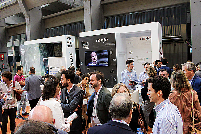 Photo of the TrenLab booth with people standing and chatting animatedly
We were really excited by the opportunity to make a game, as it’s something we’ve been wanting to do for a long time, and they won us over immediately with this phrase:
“You have total creative freedom”
The process
The kickoff
The first thing we did was to have a call with Luis Murrieta and Inês Oliveira, who were the ones who had the idea, to understand their vision of the project, and to be able to translate it into the design. Carlos Ruisanchez, a great friend of us who is now at Wayra, also made a surprise appearance on the call and contributed a lot of ideas to the project.
Immediately after, we began painting on our blackboard what the product looked like on different surfaces, and to study how other games do it. Then, we designed in Figma the flow of interaction with the product and the flow of a complete game, from the moment someone arrives at the booth until they finish it.
In the booth there would be a TV and flyers with the URL and a QR so that people could access as quickly as possible to a PWA assembled with Vue.js + Vuetify on Firebase.
The visual identity
We started developing a minimal visual identity. Before starting a project, we always try to have at hand all the necessary assets to design it, because we immediately start to layout; in this case, TrenLab was working on a rebranding, so we didn’t have much to start from.
We generated a color palette using Renfe’s corporate color #840065 as a base; I usually use Adobe Color, Colordot, Paletton, Material Color Tool and the Sketch Material Theme Editor plugin to generate all the shades of the chosen colors.
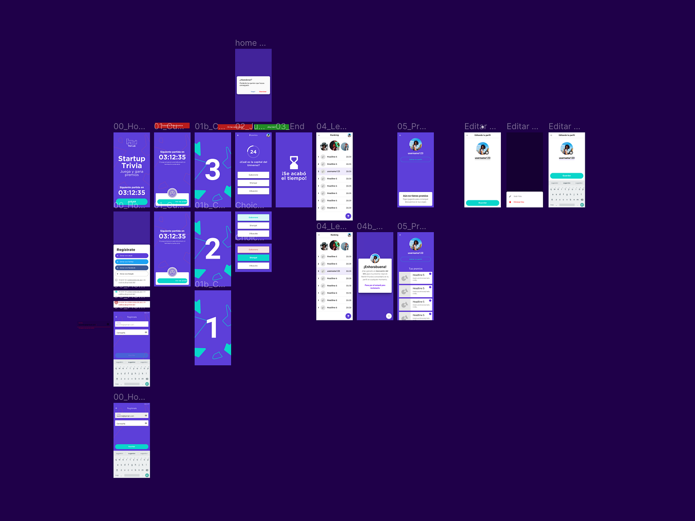
The workflow
When I migrated my workflow to Figma, I imported one of the UI libraries from the Theme Editor and customized it a little bit so I could generate projects more efficiently.
While I was advancing the design, Carlos was working on the system for adding questions and validating correct answers, and on a minimal version of the dashboard that we would deliver to the client so they could create and edit questions and schedule games at the times they wanted.
The team of Luis and Inês had an important level of stress for the preparation of the event, so instead of communicating the updates through mail or calls, we decided to make a small video explaining the first flow:
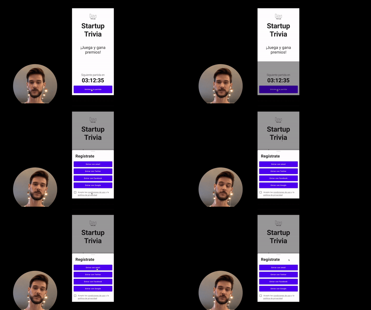 Me, explaining the first flow
A golden opportunity to generate leads (but not really)
In the first version, we had a login flow where players were asked for their job title and company. We decided to implement the social login with Firebase, as we’ve done before.
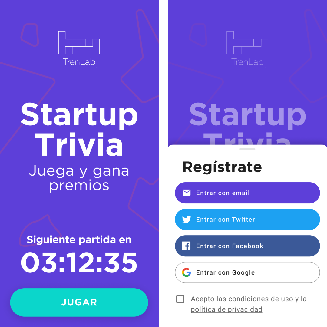 Two menus: one with the timer of the next game; the other with login options.
Luckily, we left it for the last phase of the project; you’ll soon see why I say luckily.
The iteration
In the final stretch of the project, two things happened: first, TrenLab finished their rebranding, done by Soluble, and sent us an updated brand manual specifying what colors to use for their identity, so we had to discard our initial visual identity.
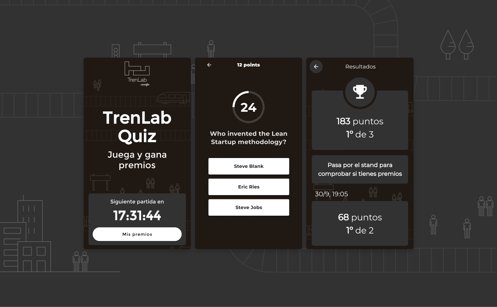
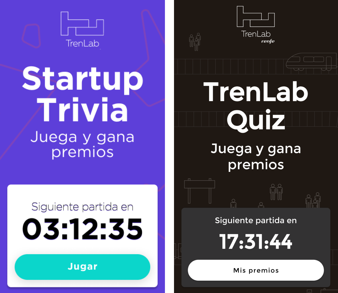 Before and after
At this stage, we were no longer working on Figma; we were coordinating using GitHub because the front end was about to be ready.
Secondly, a corporation with the size and responsibility of Renfe has a very intensive legal validation process that requires much more time than we had at the beginning of the project.
But what does the legal aspect have to do with a trivia game? Well, to log in you need a privacy policy, data use policy, security policy… depending on the contract and the project, you may also need a civil liability insurance, professional liability insurance, etc.
In short: we “decided” to remove the login and rethink the flow to play anonymously.
Luckily, we hadn’t yet implemented it. But the leaderboard, as we had planned it, was no longer viable.
 Before / After
There was one fundamental thing left to finish: the questions.
The content
The client sent us a lot of questions related to the industry, to open innovation and to their business, and they also asked us to write some more about the startup ecosystem.
We included accelerators such as Tetuan Valley or SeedRocket, well-known Spanish startups like Spotahome and OnTruck and iconic figures such as Steve Blank.
The interaction model to answer questions was pretty straighforward:
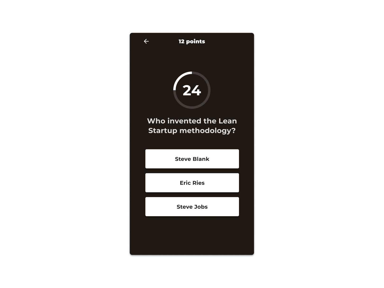
The final stretch & the premiere
Days before South Summit, we stepped on the gas and finished the last details. We even had time to work a little bit more on the dashboard’s usability.
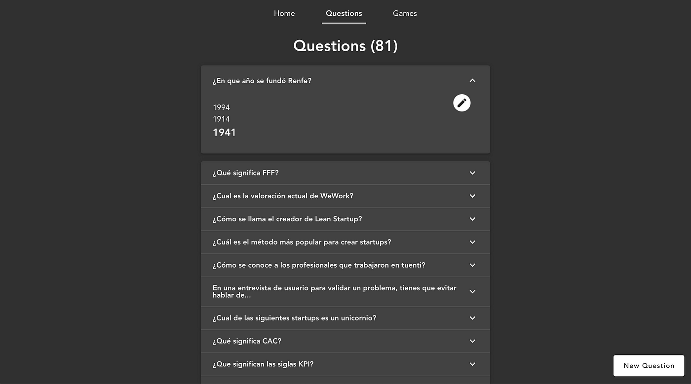 Screenshot of the dashboard
We sent another video explaining how the dashboard worked and how the game would look on TVs: a media query hid the information relevant to an “individual” user (points, answers, game history…) and replaced it with a question counter and a global history.
We were testing the game on the TVs at Google for Startups Campus -where we are based since 2015- and we can say that it is the most fun QA we have done so far.
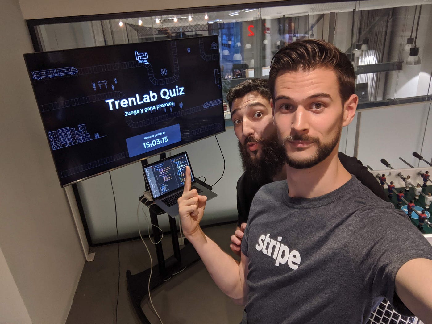
On Wednesday we got up early to go to South Summit to see people playing live. At about 40-50 players per game, it seems that the reception was not bad.
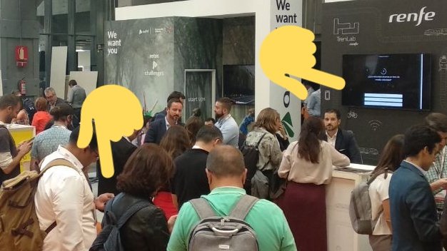
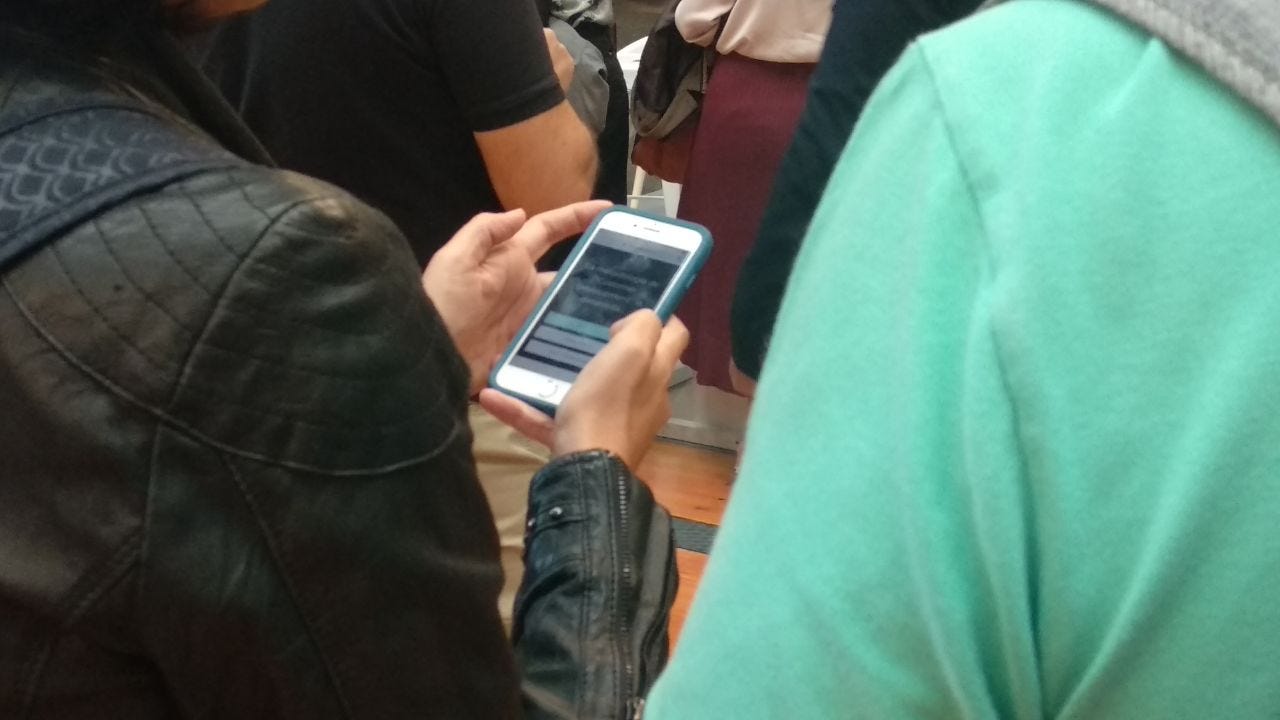
We were surprised that, despite having done QA intensively, people’s mobiles and the TV had a delay of about 3 seconds, which helped the more savvy participants to earn some extra points waiting to see the correct answers on the screen….
Luckily, we were there, ready to change the interface and make a real time display to make it a little bit more difficult for them.
Here’s a picture of the winner, excited to win two free AVE tickets to wherever she wants.

Wrapping up
In 2015 we made a similar app to gamify a Google event. Each activity you participated in unlocked you a badge. We were in charge of creating the content, and it turned out that all the illustrations and copy had to go through a third party who in turn had to send it to San Francisco for review.
In this project, the pipeline was similar, but with a tighter deadline. The difference this time was that we were prepared for any scenario. Having a workflow as optimized as possible and knowing how to be flexible is key to adapt to unexpected changes.
In 2015 we also found ourselves with savvy users, and although in 2019 we considered different use cases in which users could cheat, the delay with the TV was totally unexpected. Planning is fundamental, and experience helps a lot, but what really makes the difference is the ability to adapt.
The silver lining is: have a hyper atomized design system, modular code and no sloppy work, experienced people who know how to put out fires without getting burned too much, and you will only have to worry about finding the projects that really make you jump out of your chair.
If you already have such people on your team: congratulations! If not, drop us a line or book a meeting through my Calendly link in the banner below :)
