- The client & the project
- The process
- The illustration system
- Designing the games
- Launch and reception
This project was developed with Carlos Hernández as Commit Sans, our design & development studio.
The client & the project
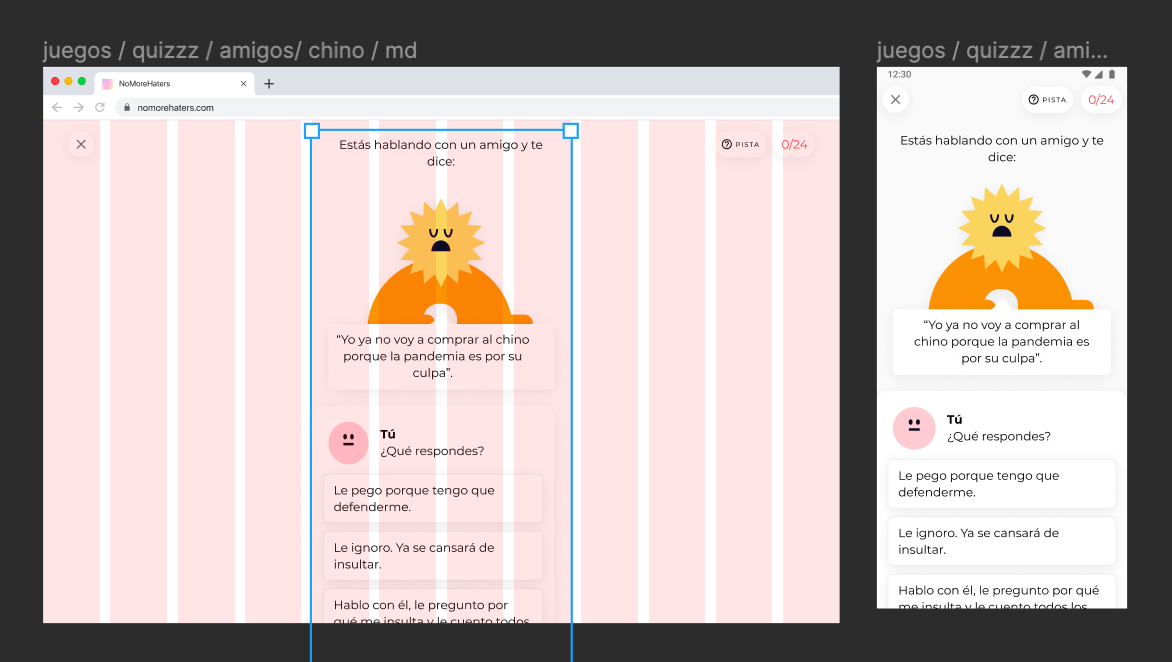
We still didn’t know what was a coronavirus by the time our friend David from Newtral Citymapper intro-ed us to David from Maldita.es, the press asociation that fights fake news; it turned out that they needed an extra pair of hands for a pretty cool project that was being cooked with FAD and Google.org
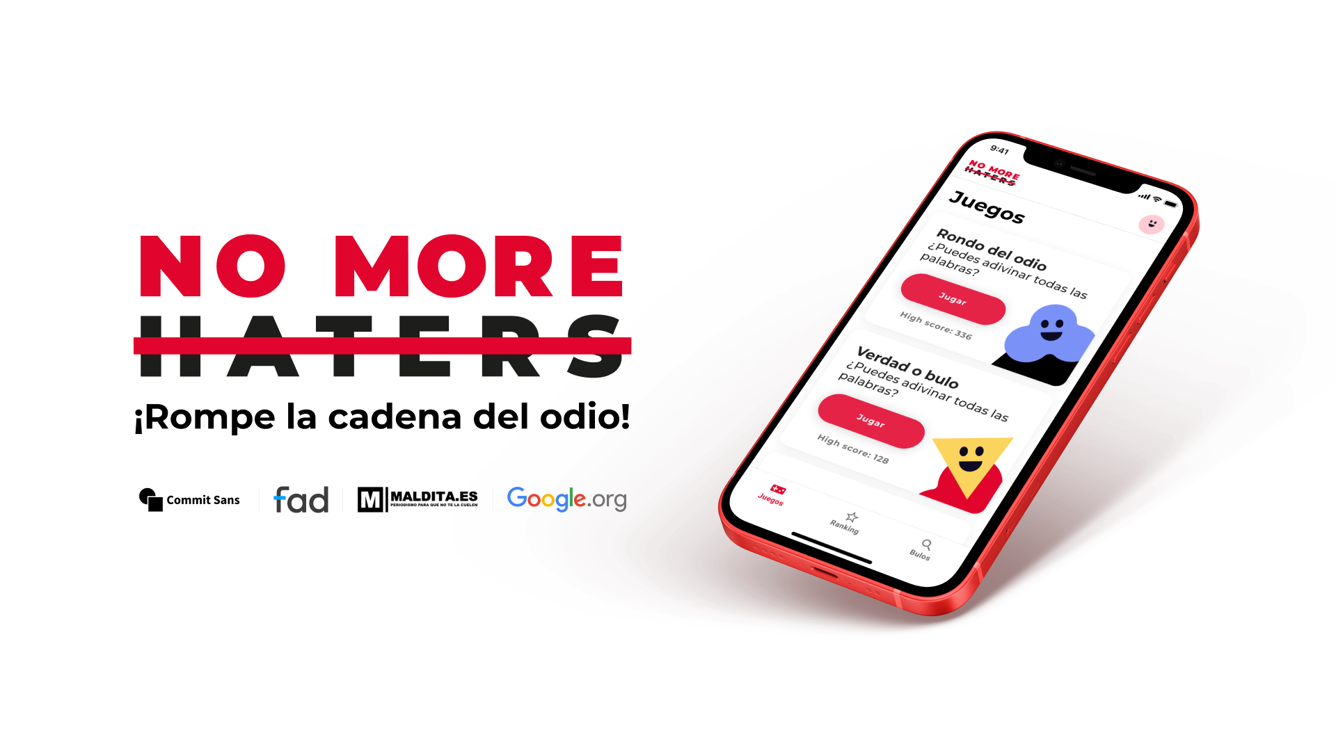
NO MORE HATERS was an app to help young people detect and fight hate speech. We would develop and design the product and game mechanics, and they’d produce the content. We had experience developing game mechanics and PWAs, and their team seemed really nice, so we offered them those two pairs of hands.
The process
Visual inspo / competition benchmark
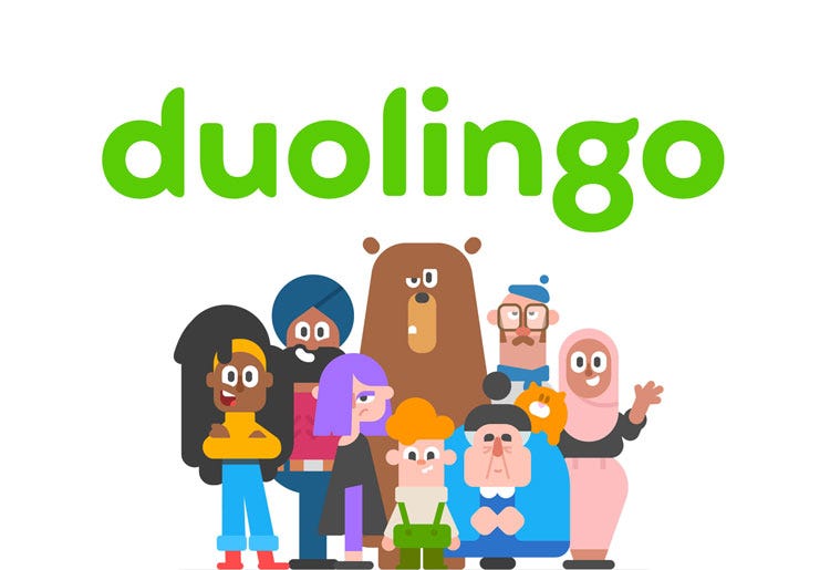
To find inspiration and build a sort of common visual universe, we started to review education apps (Duolingo, Memrise, Khan Academy…) and brain training type games (Peak, Elevate…). The product that inevitably came to mind when we thought of fun games for people of a relatively wide age range was Duolingo (below), which relies heavily on its original iconography and illustration.

Another great inspiration was the work done by Nexus Studios for Headspace:
When the starting gun went off, the Maldita.es team was still working on the content -which was also going to be multi-language- so we had to start designing without knowing how long the texts would be, what kind of scenarios we were going to have, etc. The content is, to a large extent, what defines the layout.
If you have big, cool images you can do this, and if you have eye-catching headlines and interesting stories you can do that, but because we had none of that, we rolled up our sleeves and started designing an interface full of placeholders that would soon start to take shape.
We also started searching for a partner to help us with the illustrations.
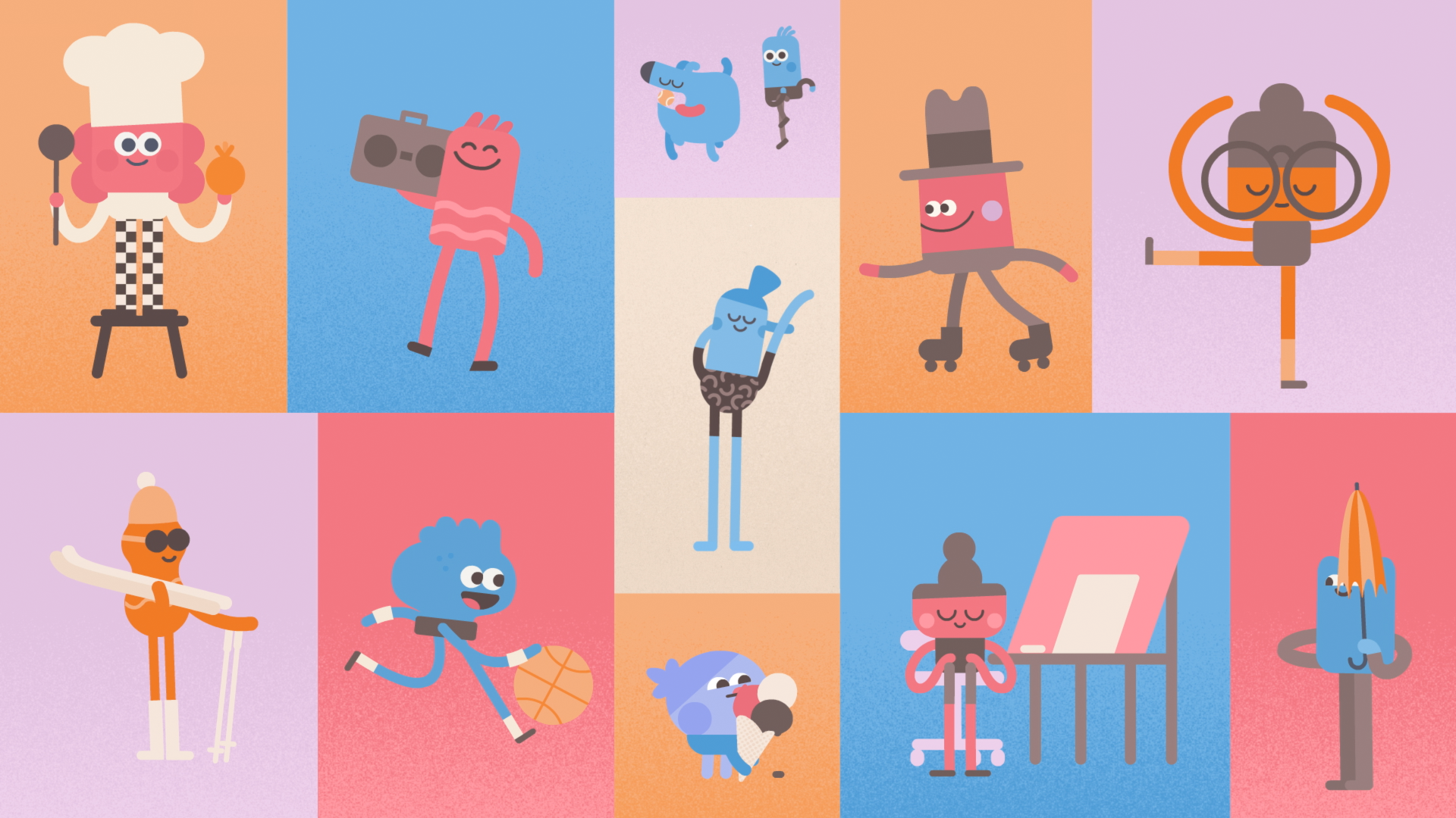
Designing characters without race, gender or age
As I was telling you above, one of our biggest inspirations for this project was Duolingo. A while back they updated their branding to include diverse characters to help them make the games and some interactions more friendly, and represent the different types of users that a global product can reach.
There’s no one at Commit Sans who has much of a knack for illustration, so we opened up the phonebook and started calling our buddies. Deivid Sáenz recommended us to talk to Silvia Fernández Palomar, the designer of Ferpal Sans: the typography for the San Isidro 2018 posters, which was later adapted by the Madrid City Council for its street signs.
We got in touch with her, and after talking for a while about her projects and our plans for NO MORE HATERS, we saw that working together could be amazing. We started with the briefing: we needed characters without gender or ethnic markers with a certain expressiveness for a digital product focused on people between 14 and 25 years old; not too childish, not too adult.
Why do I say with a certain expressiveness? Because we would use them to positively reinforce the users when they answered a question correctly, or to avoid discouragement when they made a mistake. They had to have a face, at least! In no time Silvia had a moodboard ready to help us find an identity that would fit the briefing.
We all really liked the neon blobs poster with the yellow background (top right, marked with a heart). Something like that seemed easy to design and hack. Silvia also liked the geometric shapes of the poster with the black background at the bottom right, and the idea of making modular characters in the central panel.
Silvia made us two proposals to share with the client so we could see how they felt about each of them: what they liked more about the first one, what they would like to keep from the second one, etc.
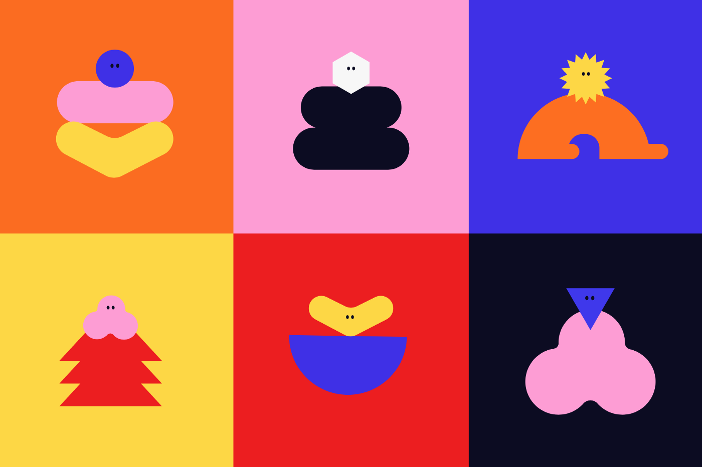
We liked the first one (left) much more for its potential to build an illustration system and adapt each character or each little head for each interaction with the product. Of the second one (right) we all liked best the idea that the dolls should also have mouths to better express emotions. Silvia iterated the characters in record time and sent us some possible UI applications that we loved:
 The updated characters from “proposal A” applied to the UI
We showed different variations to family and friends of acquaintances in the age ranges that Maldita.es had defined, and we immediately confirmed that NO MORE HATERS was starting to rock.
Brand ➔ User Interface
Laura from Maldita sent us the brand manual designed by NSUE and we opened a new project in Figma to start generating the type system and color system. For the type, Montserrat; for the color, the manual only included #e1052d and pure black #000000, so we started generating variations of red and left the secondaries, accents, etc. for a little later.
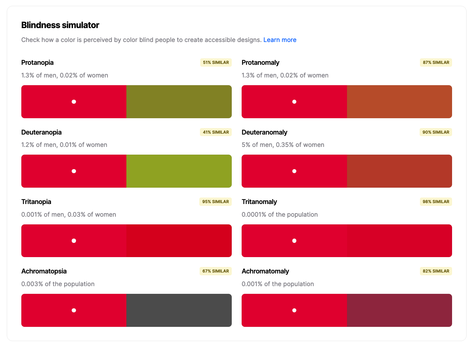 Coolors is an amazing tool for comparing harmonics and for simulating protanopia and other conditions
We turned up the black brightness a bit to avoid too high a contrast with the white background, but don’t tell that to the NSUE folks.
Front-end ⬌ Figma
We imported into Figma the Material components to make a first prototype. We already knew we were going to develop in vue.js + Vuetify, so if the designer (yours truly) didn’t get too clever customizing the Material components, we could go from prototype to real working thing relatively quickly.
The requirements were:
- Create an account (client requirement), and therefore:
- Edit or delete your profile.
- A way to access the three games.
- A way to see your score in relation to other players.
- A way to search for hoaxes using the Maldita.es engine.
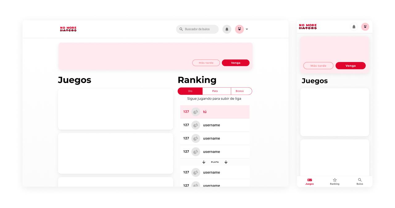
One of the use cases was for a teacher to open it on the class computers to play with the students, so the web app should also be able to be played comfortably from a big viewport. So we decided to create a container with maximum width that could display all the menus on any computer screen, big or small.
If the computers had older resolutions or aspect ratios, the container would fit the width of the screen without any problem. If on the other hand they opened the web on a giant screen (or ultra-panoramic, you never know…) the container would not scale horizontally: it would keep its maximum size.
This was the first draft:
One layout to rule them all
In smaller viewports (tablet, mobile…) the search engine and the ranking would become independent menus accessible from a bottom navigation, keeping games as the main menu.
We were going to have to compile the web to upload it as an app to the Apple and Google stores, so designing two interaction models (one for the web and one for the app) would have been a hell of media queries and user agents; despite the problems Safari has with this kind of navigation, we decided to go ahead with the bottom navigation. Many people have stuck with this before us, so it wasn’t (very) difficult to find tricks to make it less of a problem.
If you're interested in the technical side, check out our post in Products for the People (in Spanish)
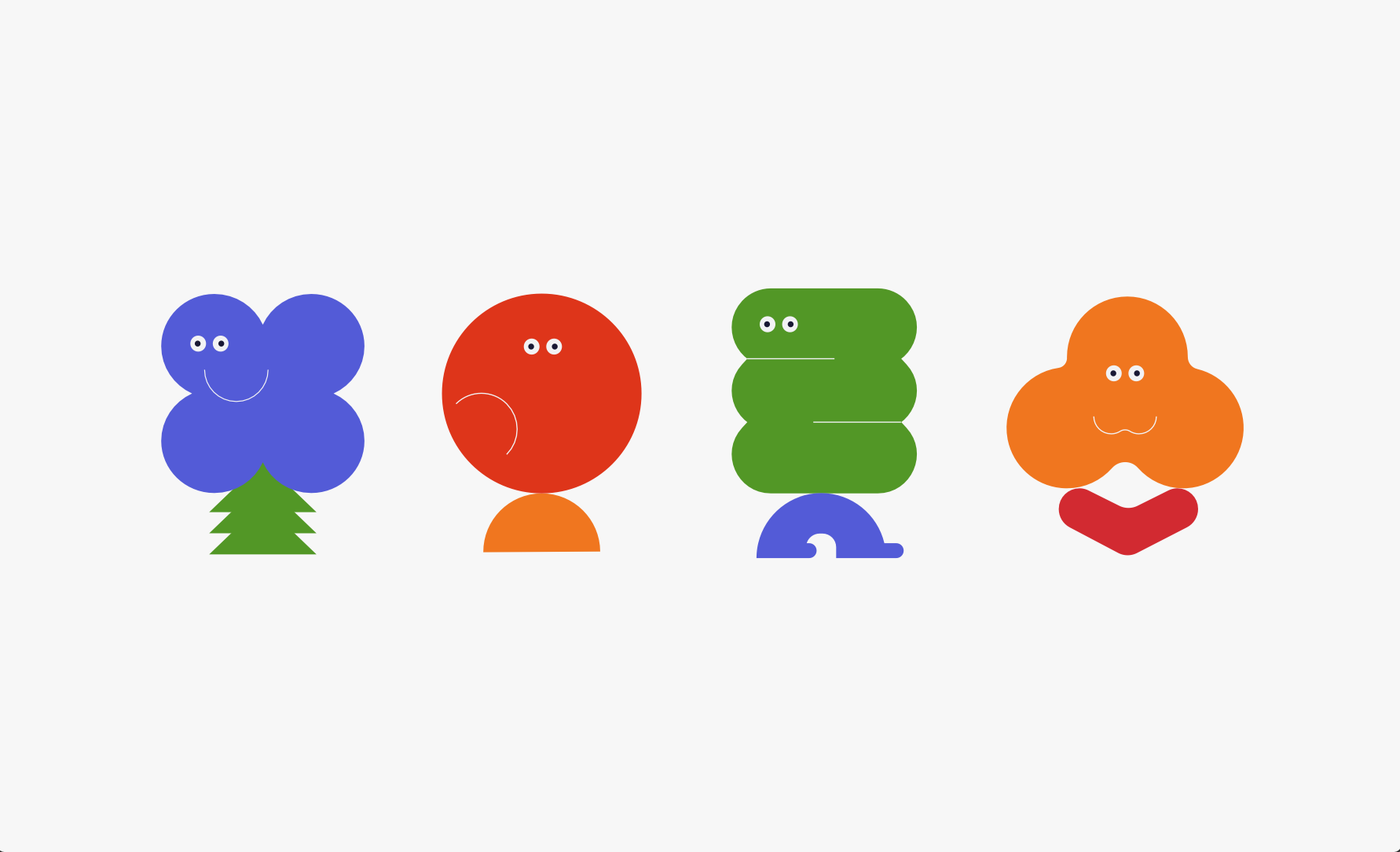
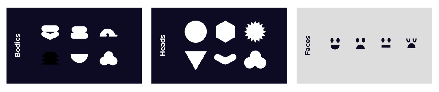
The illustration system
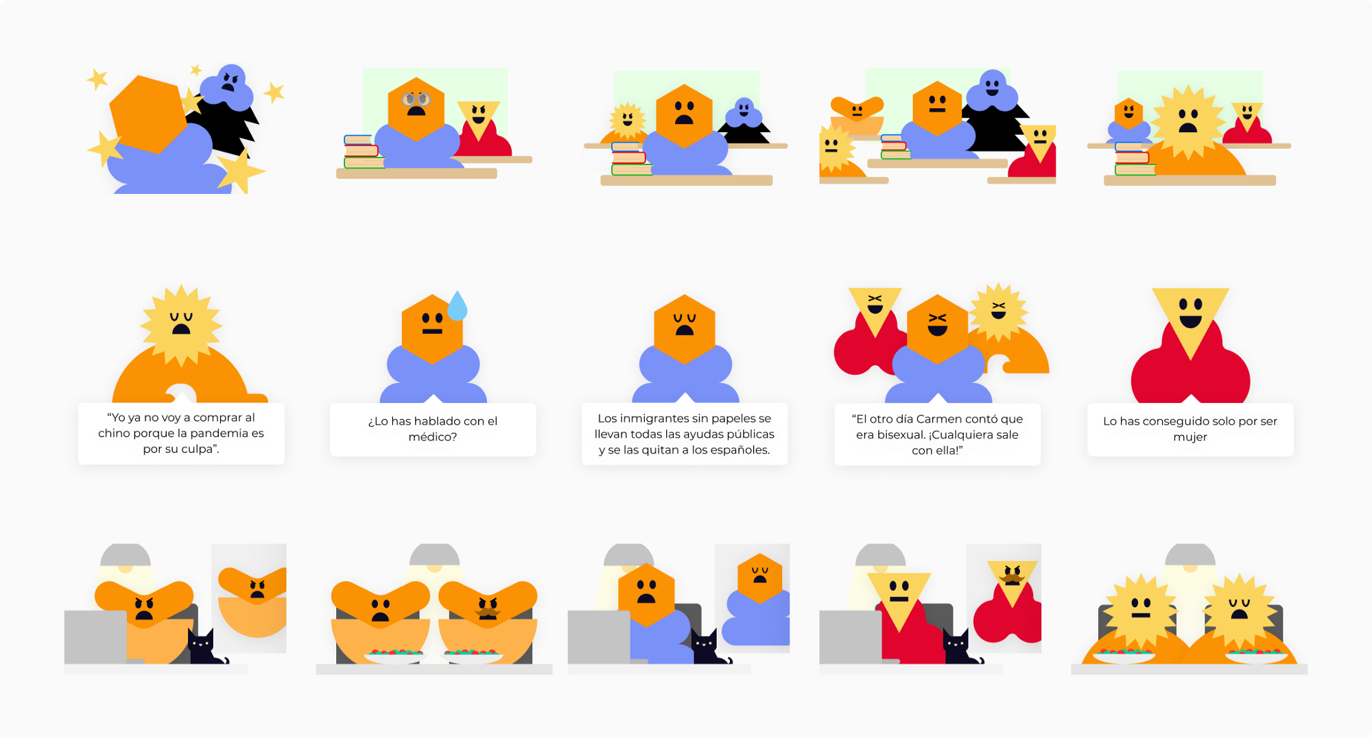
Having built the characters in a modular way, we were able to create a sort of character generator in Figma where we changed heads, bodies, faces or colors using shared instances and styles.
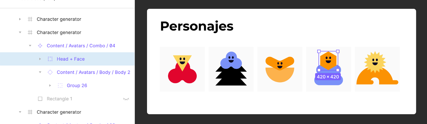
Here the pieces:
And here I’m showing the illustration system to Silvia (in Spanish):
From that frame we generated all the characters and created components that we would reuse as instances in all the sections of the product. Having a page with all the assets, Carlos could export the characters in SVG, PNG or whatever he needed without anyone acting as a bottleneck. It was also useful to share the progress with the Maldita.es team, and especially to coordinate the launch of the NO MORE HATERS promotional landing page with Pablo, their in-house designer.
Designing the games
The Rondo: juggling with the columns
The biggest challenge was the layout of the games. One of them reminds us of a well-known TV format that works great on big screens, but to no one’s surprise, not everything fit on small viewports.
 First prototype of the Rondo
For medium-sized viewports it was relatively easy to adapt, but for mobile we had to find a “creative” solution: the donut would only show visually what area you are currently in, but the letter inside the selection would be seen in a new block with horizontal scroll, adding a tooltip to highlight it:
First prototype of the Rondo
For medium-sized viewports it was relatively easy to adapt, but for mobile we had to find a “creative” solution: the donut would only show visually what area you are currently in, but the letter inside the selection would be seen in a new block with horizontal scroll, adding a tooltip to highlight it:
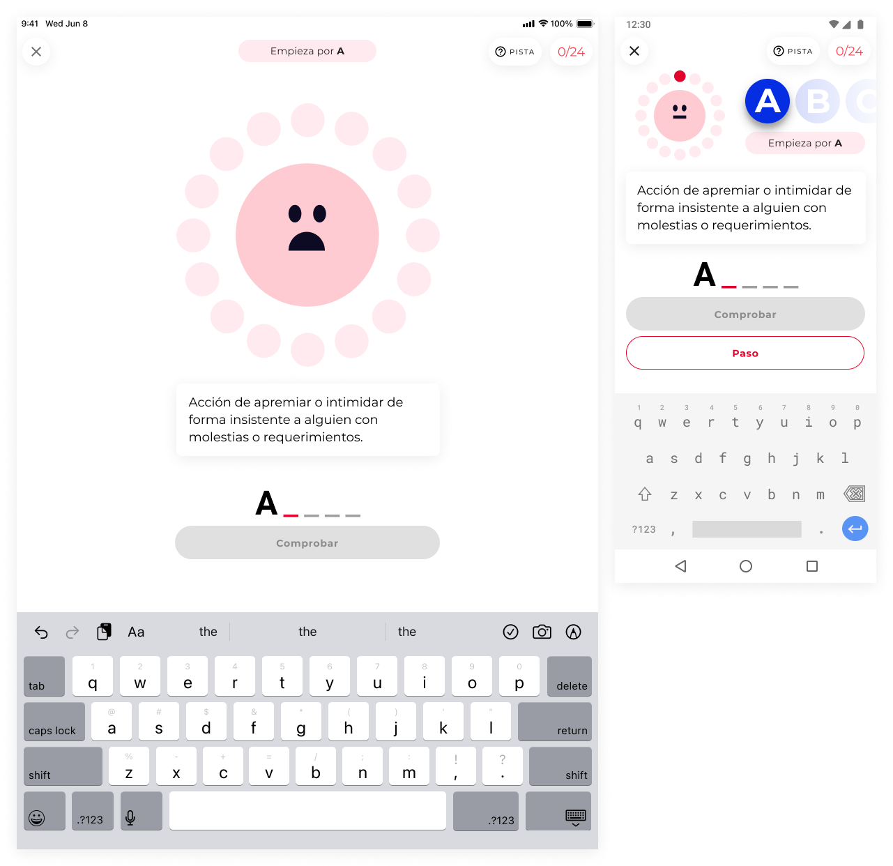
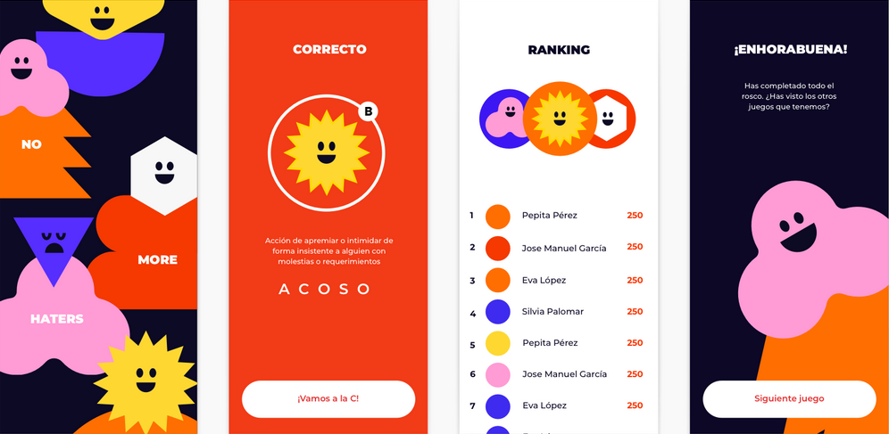
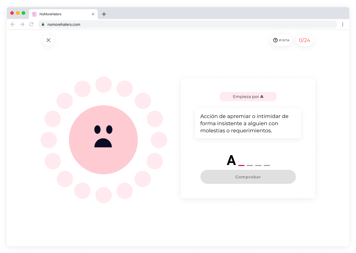
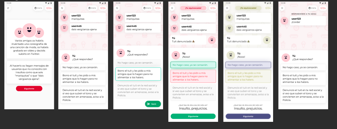
True or false
The interaction model might ring a bell, yes.
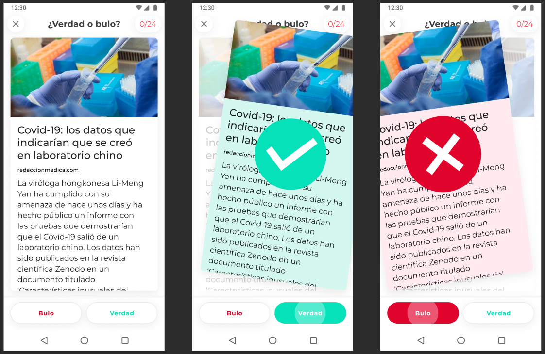
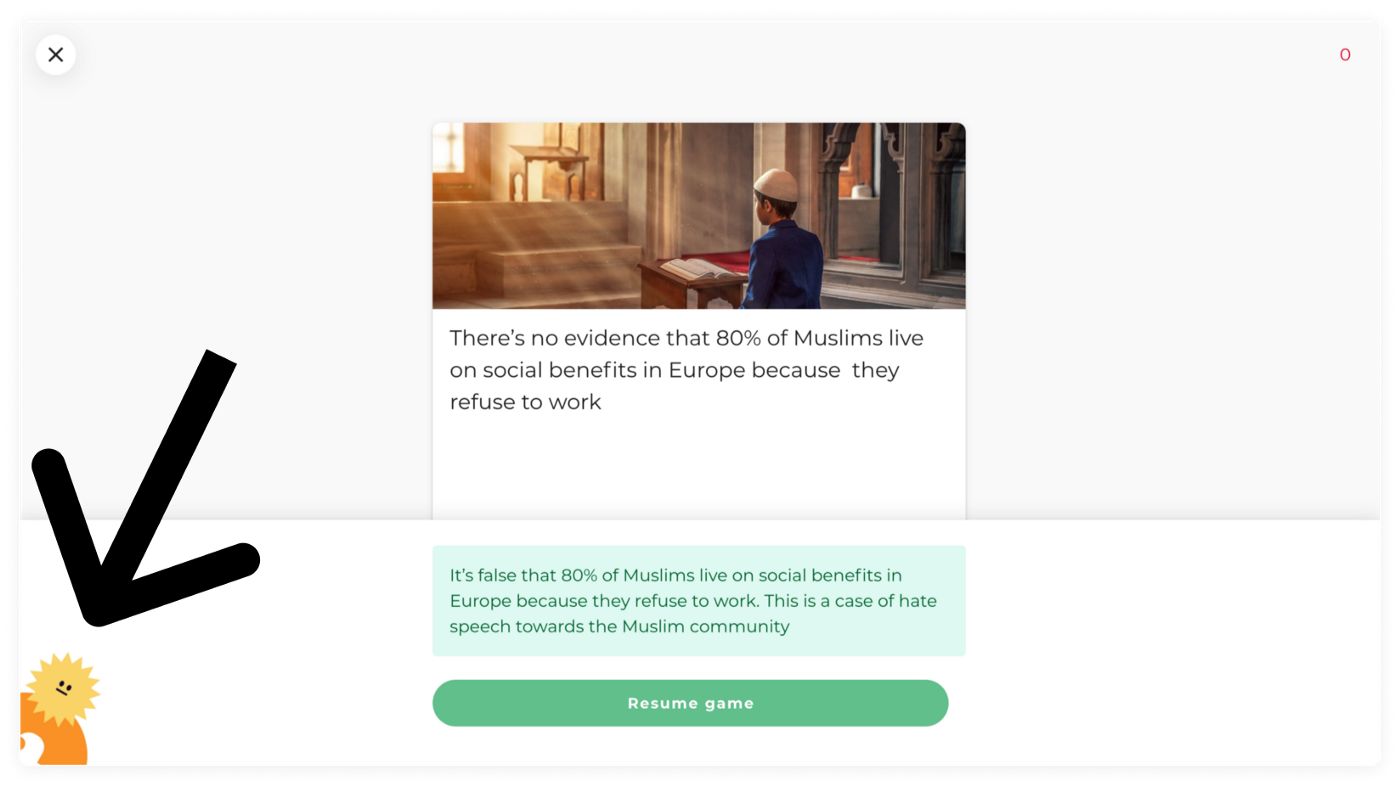
In larger viewports it worked exactly the same, the cards being a little wider. When you were wrong, we explained why, and we showed you one of the little characters that stares at you with a disapproving face.
The Quiz: mini-graphic adventures for everyone
This was, without any doubt, the most complicated part of the project from an interaction, planning and content design point of view. We agreed with the client to leave this game, initially known as “project x” for the end, since we knew it was going to be some kind of animated graphic adventure, but we didn’t know exactly what characters there would be, nor did we have a script, nor did we know how we were going to animate it.
Even before the kickoff we knew that things were going to get complicated, but we didn’t know to what extent.
In the first conversations with our trusted illustrator we told her about this game, and we told her that at some point we would ask her to design scenarios that would match the dolls we would soon start working on.
When Laura sent us the content, already in the final stretch of the project, we were immersed in the development, and after crunching numbers we saw that we were not going to have enough time to ask Silvia for that second illustration project, review it with the client, discuss it or iterate it, let alone animate it.
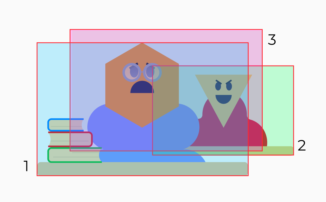
According to Laura’s script there were at least four different scenarios, so I rolled up my sleevs and designed and animated them over the weekend.
The first row in the screenshot above is “class”, the second “with friends”, and the third “at home”. The fourth scenario is “on Twitter”, for which we decided to simulate the UI of a social network instead of drawing a physical space:
To animate it, Carlos came up with the idea of designing all the scenarios with four levels of depth at most in mind. This way, we could copy and paste the animation properties of each depth level from one file to the next. More or less. Let me explain: this is the input animation that is repeated in almost all the “in class” vignettes. I have reduced the speed to 50% to make it more visible:

If you notice, there are three levels, and each one enters at a speed and in a direction:
 1. foreground character | 2. background character | 3. background (blackboard)
The head of 2. background character moves on the Y-axis to reinforce the evil chuckle. These values could be copied to other elements with similar structure to save time and effort. To make the animation, Miguel recommended us to use Keyshape, which is something like After Effects for dummies (it has the basic features to animate and export without all the complexity of a professional software used to do very complicated things)
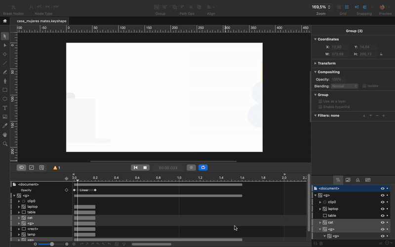 Keyshape workspace
From Keyshape you can export to Lottie, SVG, video formats and basically whatever you want. When we saw that SVG did not save correctly some of the properties that we had applied to the layers, we decided to try to export in WebP video (yes, WebP also has video codec), and one thing I tell you: the compression is spectacular. At least for this kind of images with flat colors and simple animations.
Launch and reception
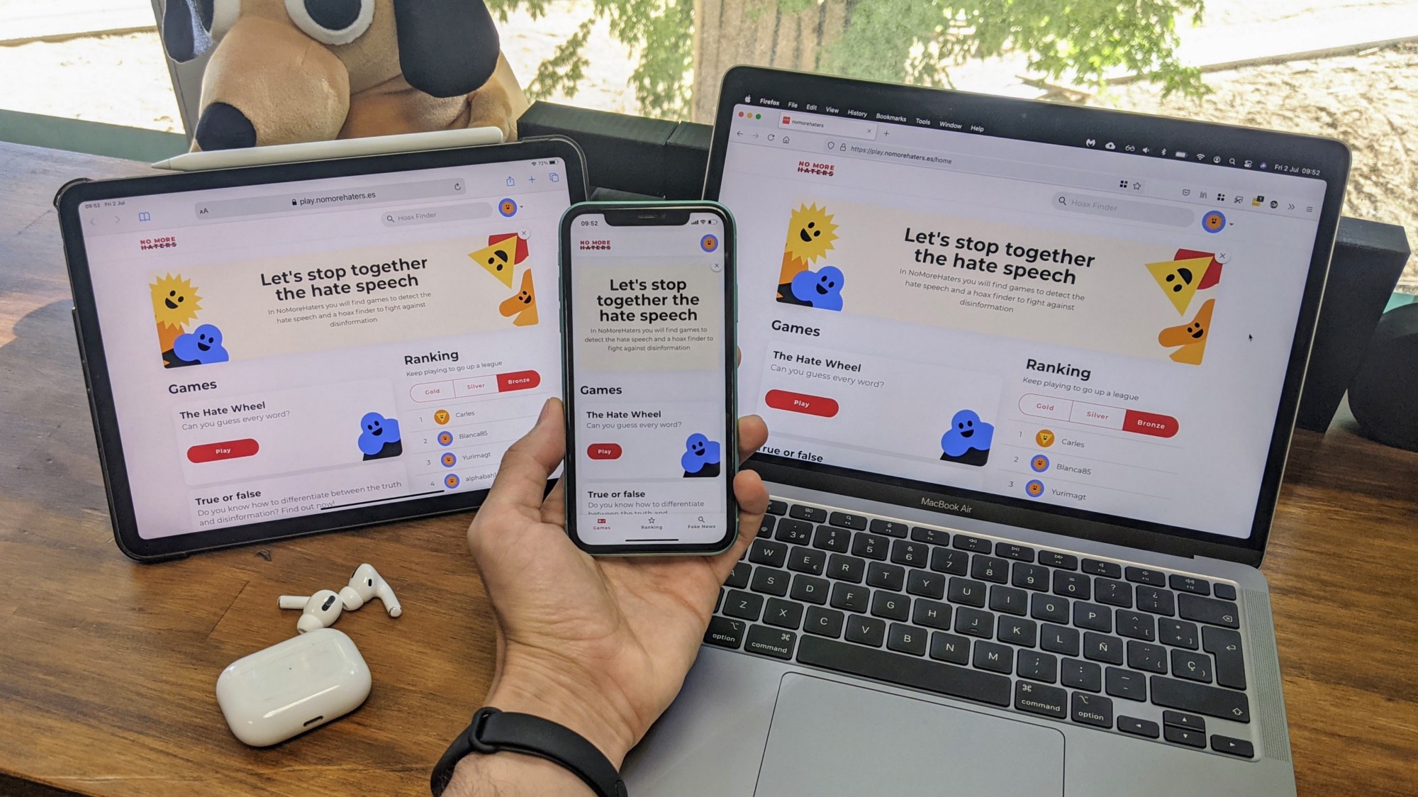
After three months of hard work and some more time of bugfixes and small updates, we finally finished NO MORE HATERS. The apps and the website have almost 14,000 users since its launch, but as you can see in the comments section of the campaign spot (above), there is still a lot of work to do.
And if you want to do your bit to stop hate speech and don’t know where to start, take a look at this.
Translated from the original published in Products for the People (in Spanish)