- The client: helping entrepreneurs grow
- The problem: surrounded by people, yet alone
- The process
- The Product(s)
- The First Iteration
- Going Global
- The Second Iteration: a modular architecture
- Wrapping up
The client: helping entrepreneurs grow
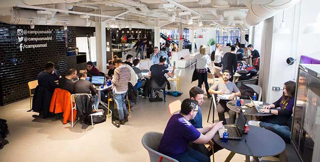
Google for Startups is Google’s effort to help founders from developing startup ecosystems connect with the world and grow their business. They work with their network of partners that operates 50 co-working spaces and accelerators in 125 countries, offering hands-on lessons for aspiring entrepreneurs.
In 2012 they opened their first physical campus in London, and after that, Tel Aviv, Madrid, Warsaw, Seoul, Sāo Paulo and Tokyo followed.
The problem: surrounded by people, yet alone
Your first day at a co-working space is pretty much like your first day of school. Usually there’s someone that explains to you the schedule, the rules and where you can pee. You know that you have to take your own stuff (say books, say laptop) and some money for food, but as soon as you get there you start realising that you don’t know anyone and your life as a co-worker is gonna be pretty miserable if you don’t fix that asap.
If you’re lucky enough to get accepted into one of Google for Startups campuses, you’ll be surrounded by founders, amazing technical people and so on, so you’ll want to meet as many people as possible while your –typycally six months– membership lasts.
The process
Digitalizing our informal knowledge
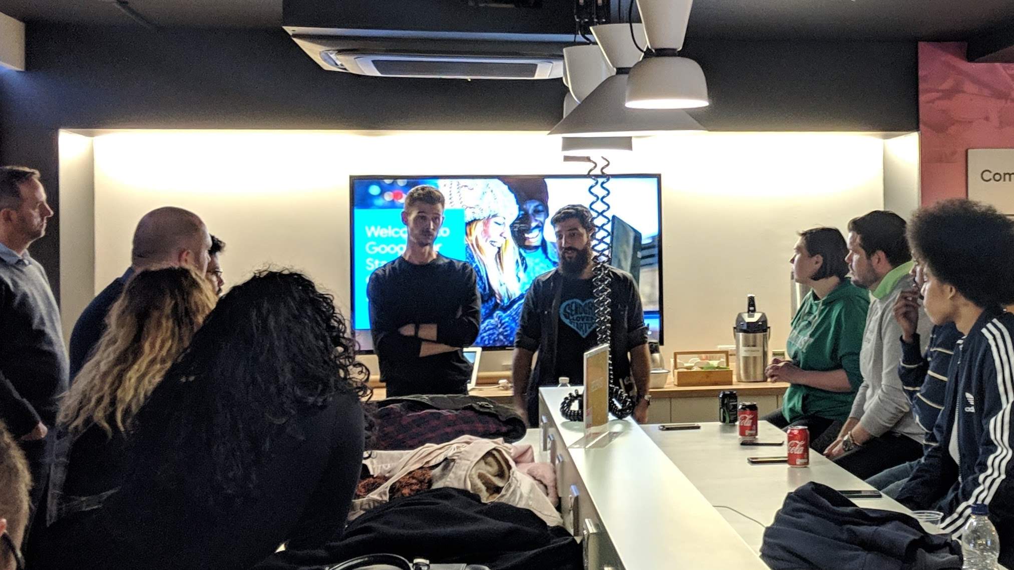
At that time, Carlos and I had been part of the Madrid community for 5+ years, so we had already met (almost) everyone. When the Campus team started exploring how they could help people connect inside the community, they didn’t take long to notice that we might have some insights on that.
Edu Duque scheduled a meeting with us that kickstarted the coolest project I’ve ever been part of. We had a lot of informal knowledge, and this was the perfect chance to organise it; we drafted a simple script, a list of topics that we wanted to understand better and started the first round of interviews.
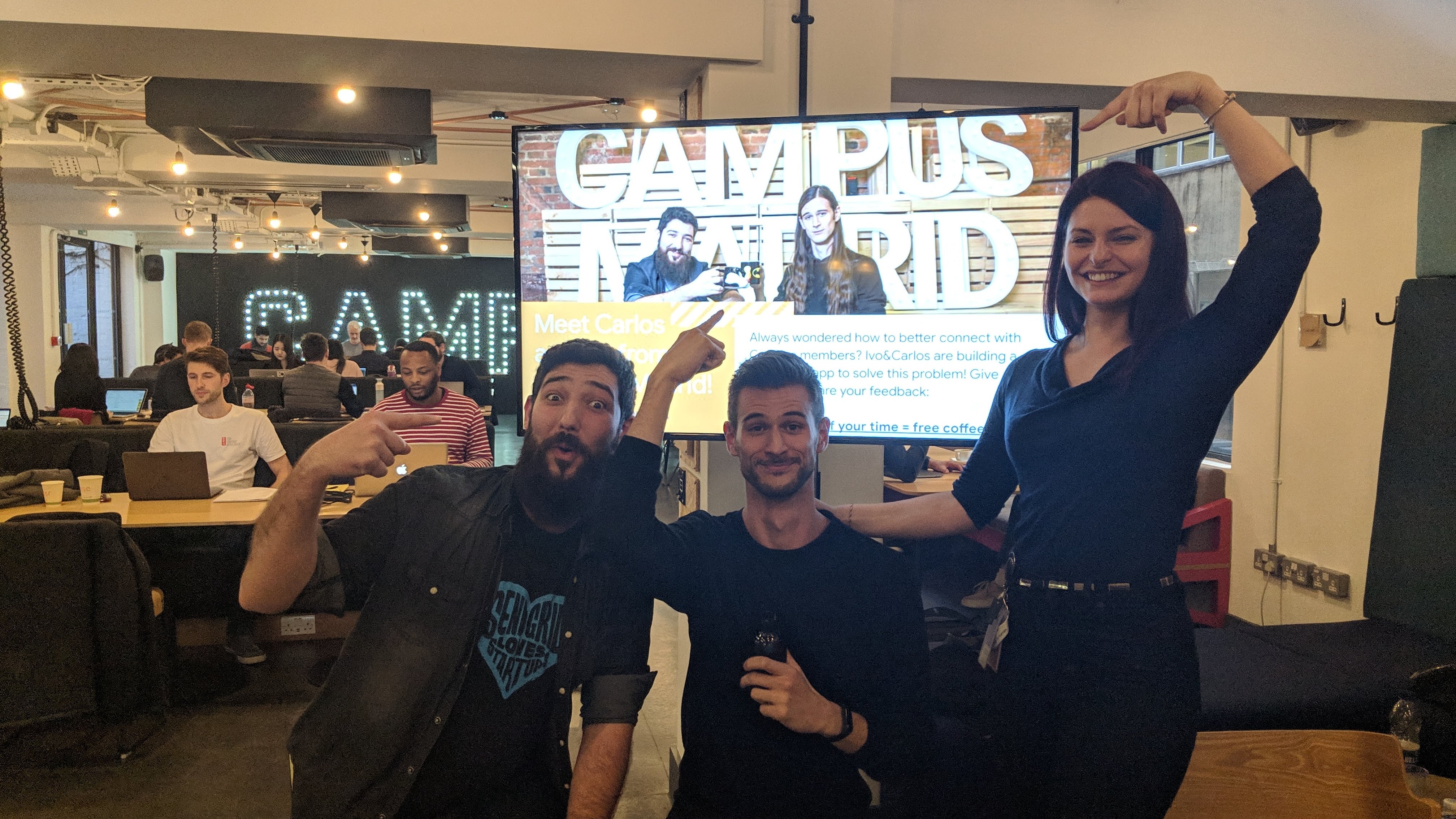
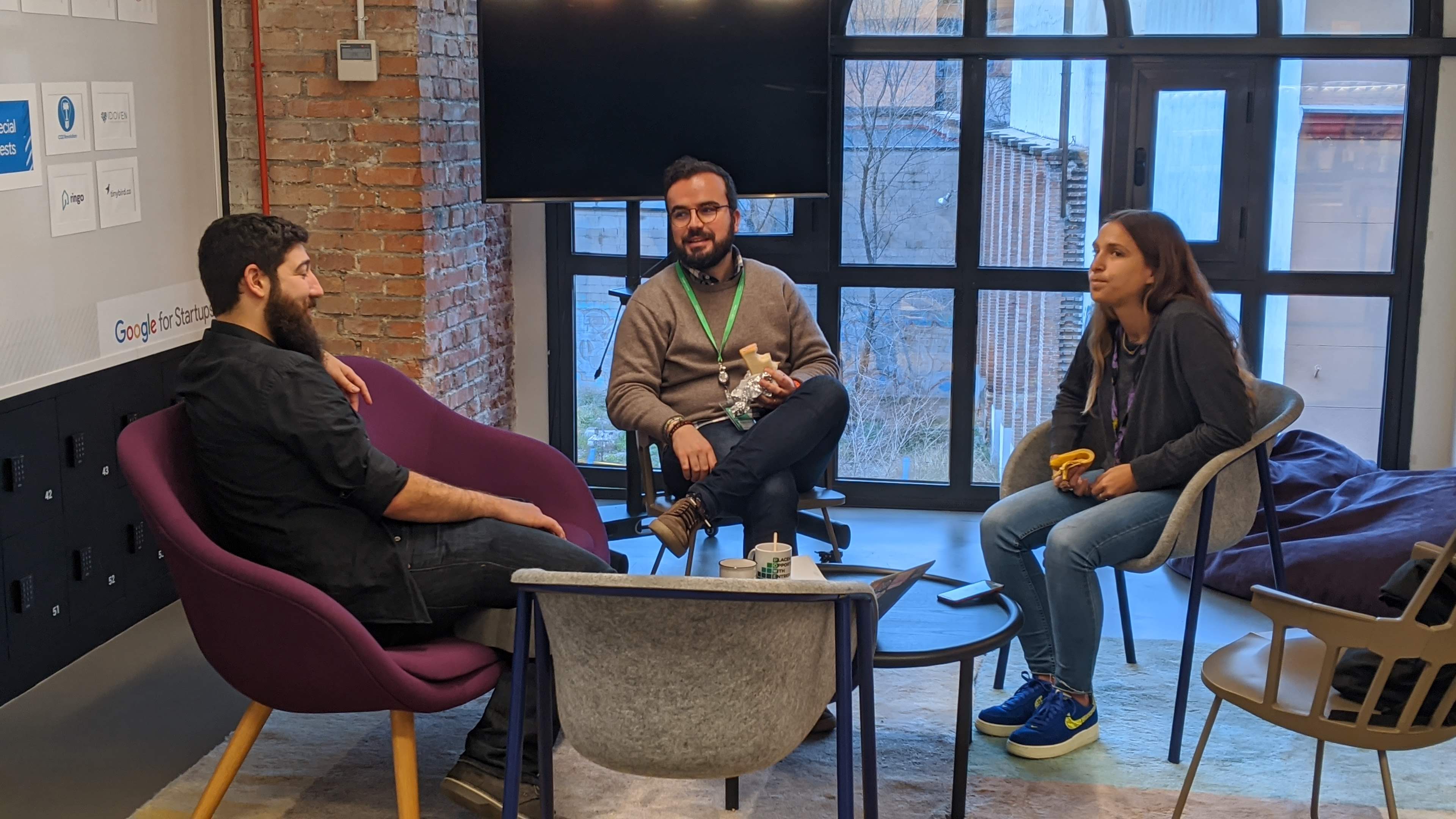 Carlos (left) chatting with two members of the Madrid community over coffee
The Research (part 1)
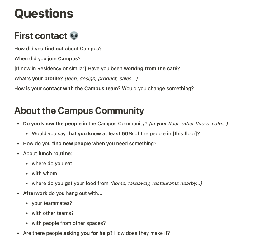
For our first round of interviews, we drafted a script with 5 categories of questions:
- First contact: how did you find about the campus?
- The community and you: what’s your role in the ecosystem (founder, employee…)?
- Your own ecosystem: are you part of other communities?
- Your needs: what are you looking for? (To hire if you’re a founder, new opportunities if you’re an employee…)
- Tools and processes: how do you communicate with your co-workers? And with your colleagues from the knitting meetup? And with your friends?
We wanted to know how people used the space. How and where they connected with other members. Who were they co-working buddies and how they met. What they expected from the space and if they were aware (or not!) of the things they had access to. For example: it was possible to ask for a passport to use co-workings that were part of the Google for Startups network in other countries, but… did members know? If so, how they found out?
We forgot to include something very important: devices they use and how. We'll find out more about this in The first iteration.
Early Findings
We soon realised that in the Madrid community people gathered around verticals (industry or profession). The secondary user was the space manager, but we had different segments of primary users:
- The well connected founder who wants to hire and to raise money.
- The not so well connected founder who wants to connect with other founders.
- The unhappy employee who is looking for new opportunities.
- The happy employee who just wants to socialise.
And the list goes on and on. But the key that made people connect was –given that people (in this context) know what they need– being able to discover who can provide it. We also found out that another reason to proactively look for new connections was needing help with a certain tool or technology (say Mixpanel or Python), but if you haven’t met at least one technical profile… who should you ask for help?
If you randomly talked with a connector like Carlos, he’ll ask you about your background and find good matches for you, so that’s the core need that we’d need to address: finding out who knows who (and who knows what) without a human acting as a proxy. To have a better understanding of all the parties involved, primary and secondary users, their needs, our (legal) constraints and so on, we spent a few days mapping it all.
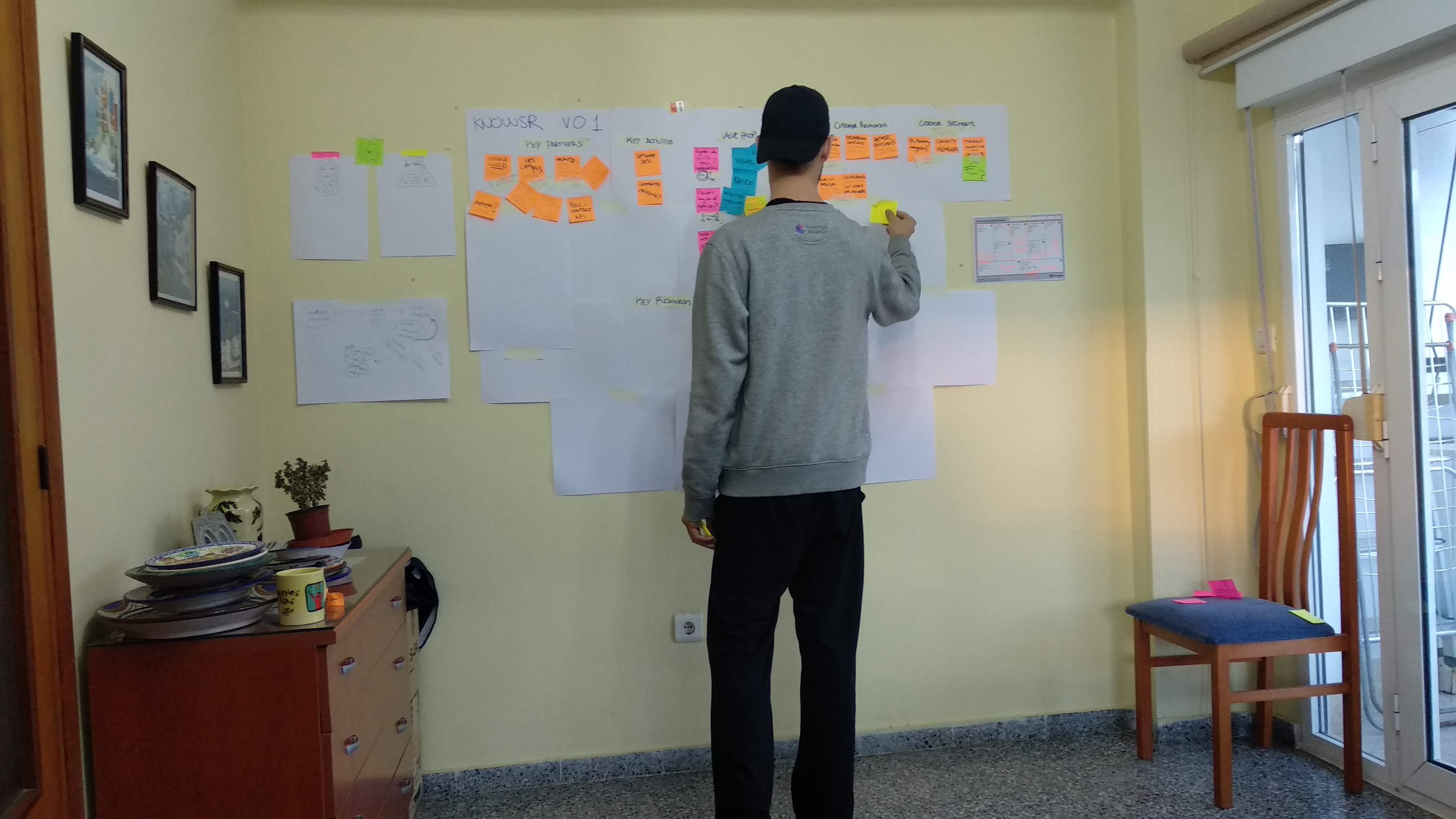 Me, doing what designers do
One of the first things that came up was the impossibility to implement a sign up/login feature. That required a long, painful and expensive process in close collaboration with the client’s legal team, and that sounded like a lilttle bit too much for a pilot. Not being able to identify users made our life 12% more miserable for a while, but we eventually found a workaround. We’ll get to that.
The Product(s)
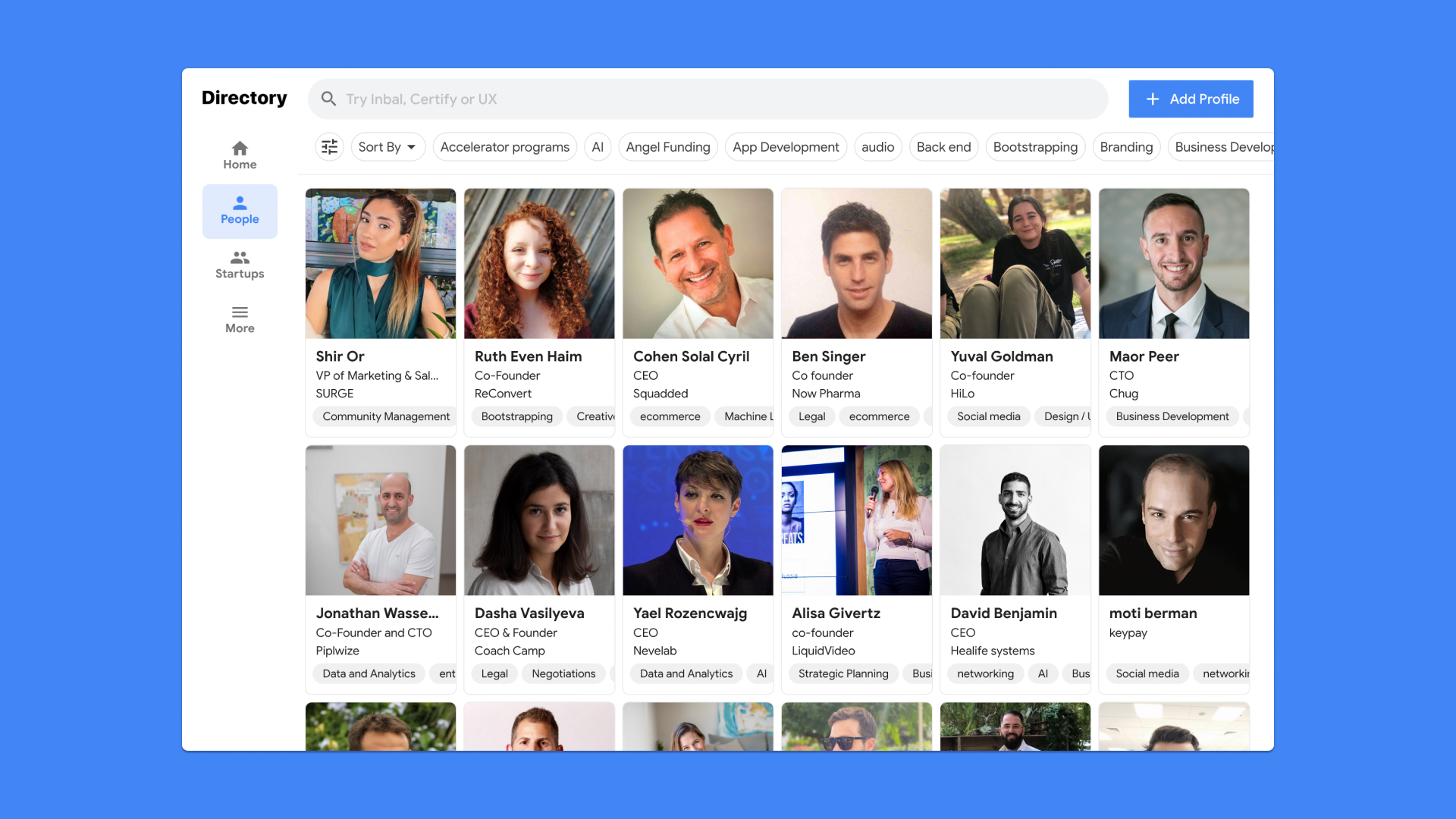
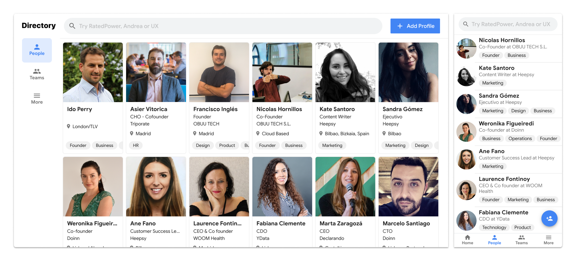
The MVP
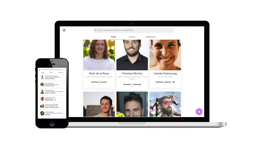
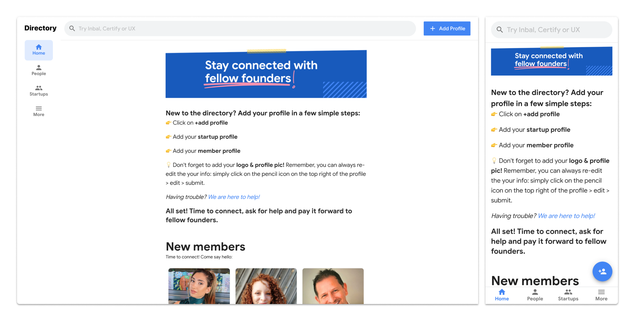
For the pilot, we decided to build a simple directory of people with the ability to search by name, company and skills; the back-end would be a simple Google spreadsheet managed by the Campus team.
 If you’re not embarassed by your MVP…
User-generated content is risky, so the Campus would provide professional headshots by Mario, their in-house photographer.


The (initial) Tech Stack
The front-end was built with vue.js + Vuetify, because:
- we had total freedom to choose the stack, and we wanted to learn vue.js, so this was a great chance.
- the directory was going to be promoted by Google as an internal pilot, so it needed to look like their products; Vuetify is an implementation of the Material Design principles for vue.js
We started styling our components using their brand book as reference and built a simple layout that worked great in mobile as well as in desktop.
The other product
A spreadsheet as backend was just fine for the pilot, but as the product grew, we ended up developing an actual backend with Neo4j and another tool for space managers to approve or reject profiles, to add people or startups manually and even to add and edit an FAQ menu. Didn’t look like an MVP anymore.
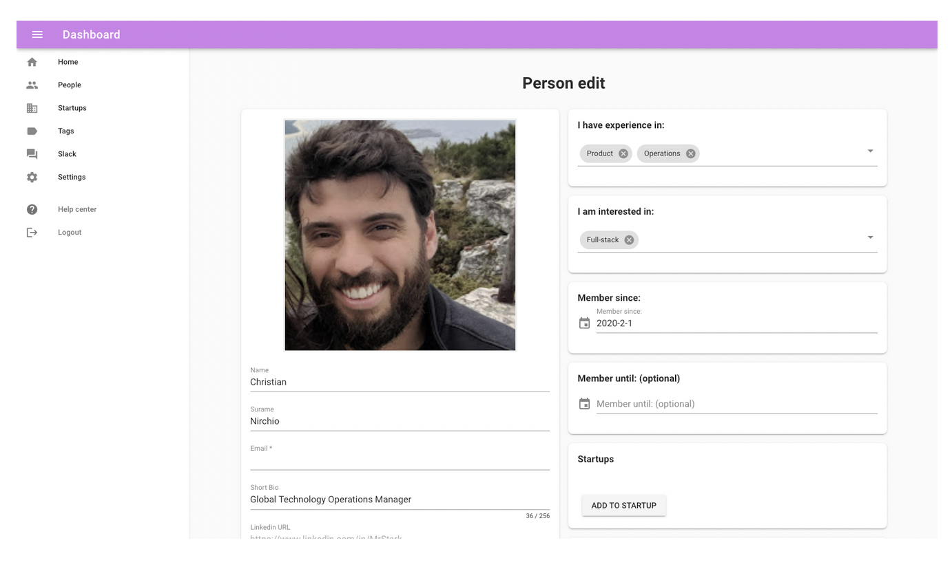 The first version of the admin back-office
The backoffice visual update took a little longer, as you might expect, but we’ve been working on a way to keep everything synced and reduce technical debt. Keep reading to find out how we’re doing it!
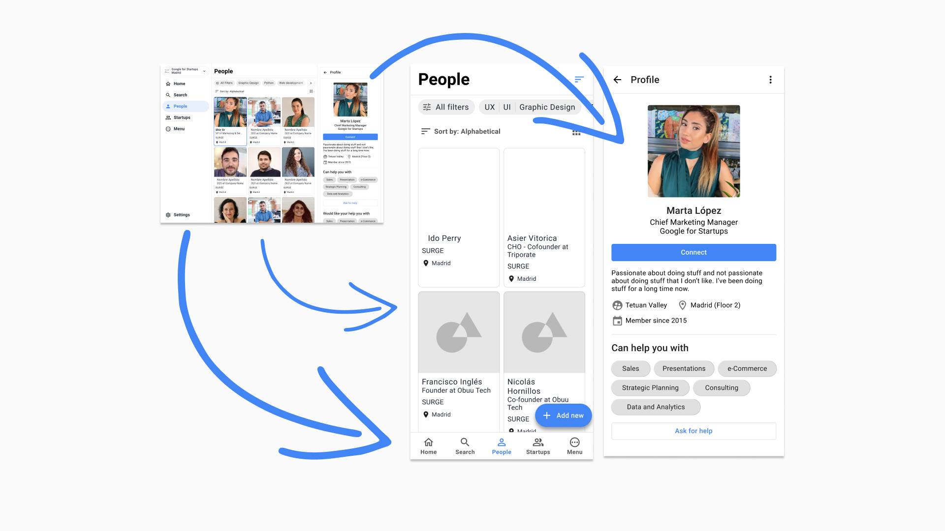
The First Iteration
Adapting the product to its context
The first version of the directory looked really cool on mobile, but for bigger viewports it was fairly ugly and difficult to use. On desktop, the directory showed a grid of (massive) cards, while for mobile we designed a small variant of our card component to show a vertical list.
We assumed that you wander around the space looking for someone on your phone, so we focused on the mobile UI, following the “mobile first” mantra. That was just plain stupid: if you visit the Campus, you’ll see almost everyone sitting at their desk, working on their laptops. Kudos to us.
After releasing that first version, analytics helped us realise that +80% of traffic came from desktop, so focusing on the mobile UI didn’t look like the best plan anymore. “Mobile first” doesn’t (or shouldn’t) mean “build your UI for small viewports and then adapt to the bigger ones”. It was meant for an era when clients still told you to make everything “responsive”.
We quickly iterated the interaction model, keeping all the good decisions we took for the mobile version but focusing more on the desktop experience. This was the first draft:
Around that time, Campus was changing its brand identity, so after receiving the new brand book, we tweaked the color scheme and some components and it ended up looking like this:
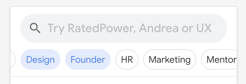
The Search Experience (1.0)
We designed that huge search bar on the top to gather data from search queries. It was amazing. Some people typed names like “Andrea”, skills like “UX” and “WordPress”, and we found a surprisingly large amounts of queries like “free beer” and “events with beer”.

And before you ask: no, we’re not building an event related feature (yet). Go find your own free beer.
We used some of this info to craft a new placeholder indicating what kind of things you can search for in one sentence: “Try RatedPower (a well known startup inside the community), Andrea (a well known person inside the community) or UX (one skill that most of people know–more than PHP, probably)”
But we soon realised that this tool is meant to discover, not to find, so there should be a different way of searching. By this time, the Program Manager was doing a great job getting members to sign up and fill their profiles, so we already had the data. We only needed to find a way to interact with it, and our take was this “quick filter” bar:
We remembered this quote from one of our interviews:
“The ability to see who has a similar skillset is a great icebreaker.”
With this bar, a user could select the skills they’re interested in and sort the content in different ways: alphabetically, by program and so on. Implementing that quick filter bar greatly increased profile views and search by skill, so it looked like we were headed in the right direction.
Going Global
The Research (part 2)
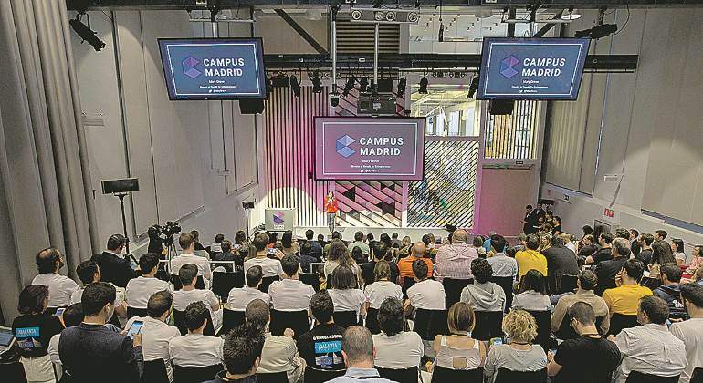
That initial pilot in Madrid had great engagement metrics, so the Google for Startups team decided to turn our little pilot into an offical product. We’d scale it to other 3 hubs (São Paulo, London and Tel Aviv), and then to all the remaining campuses (Warsaw, Tokyo and Seoul).
Always keeping in mind that the unknowns unknowns are far bigger than the known knowns, we concluded that we needed to visit all Campuses to do some on-site research before releasing a product within communities that (almost certainly) had different ways of connecting and communicating. The GFS team was absolutely on board with that idea, so they allocated some budget for this second phase and we packed up and spent some days in London, Tel Aviv and São Paulo.
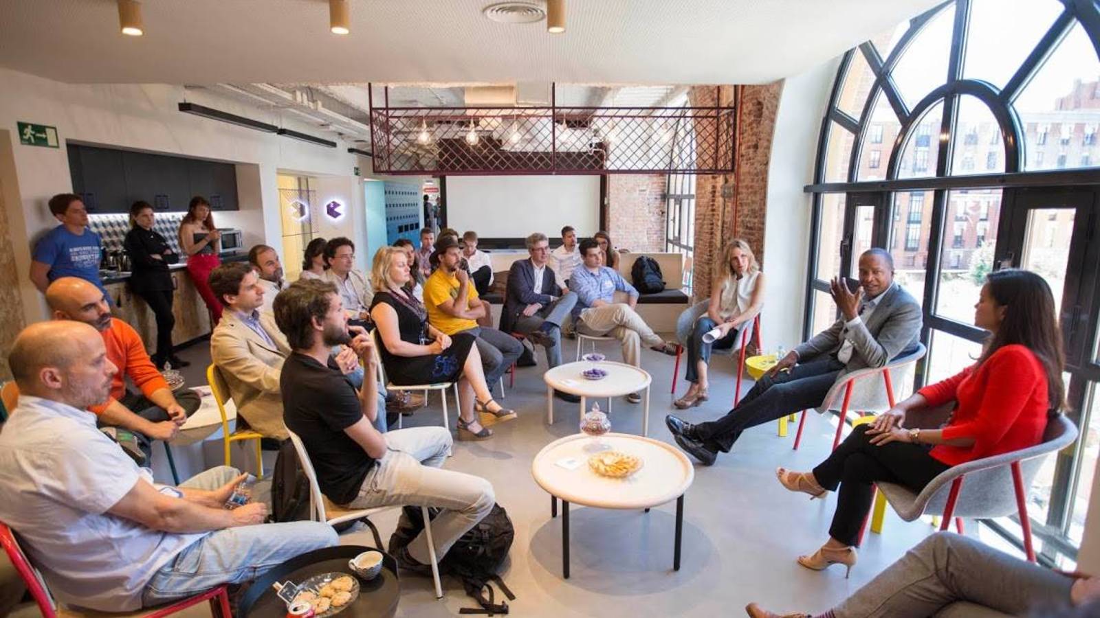
The Tel Aviv ecosystem was the most interesting: massive access to funding, hyper connected founders and lots of vibrant communities. We conducted another round of interviews and this time we documented it rigorously.
In Madrid, communities were vertical: fintech, product management or machine learning. When you leave your job to start a company, you have to start building a new network to get access to funding, hiring, mentoring and corporate clients. In Tel Aviv, communities were horizontal, probably because most of people serve in the army. That’s where they start building their professional network, so when they start a company, they’ve already met PMs, developers and would-be big corporation employees.
Most interviews were very informal, and one of us asked while the other jotted down absolutely everything, so we ended up with a lot of unorganised (=unusable) information that we needed to curate somehow. I was in a similar situation back when I worked at Arbor, and back in the day I discovered the open answer matrix.
It works like this: you run through all the transcription and group similar ideas into categories (e.g.: “I haven’t met many people from the 2nd floor” and “I know that on the café are one or two cool startups, but I’ve never met them” would be “6. No communication between floors”)
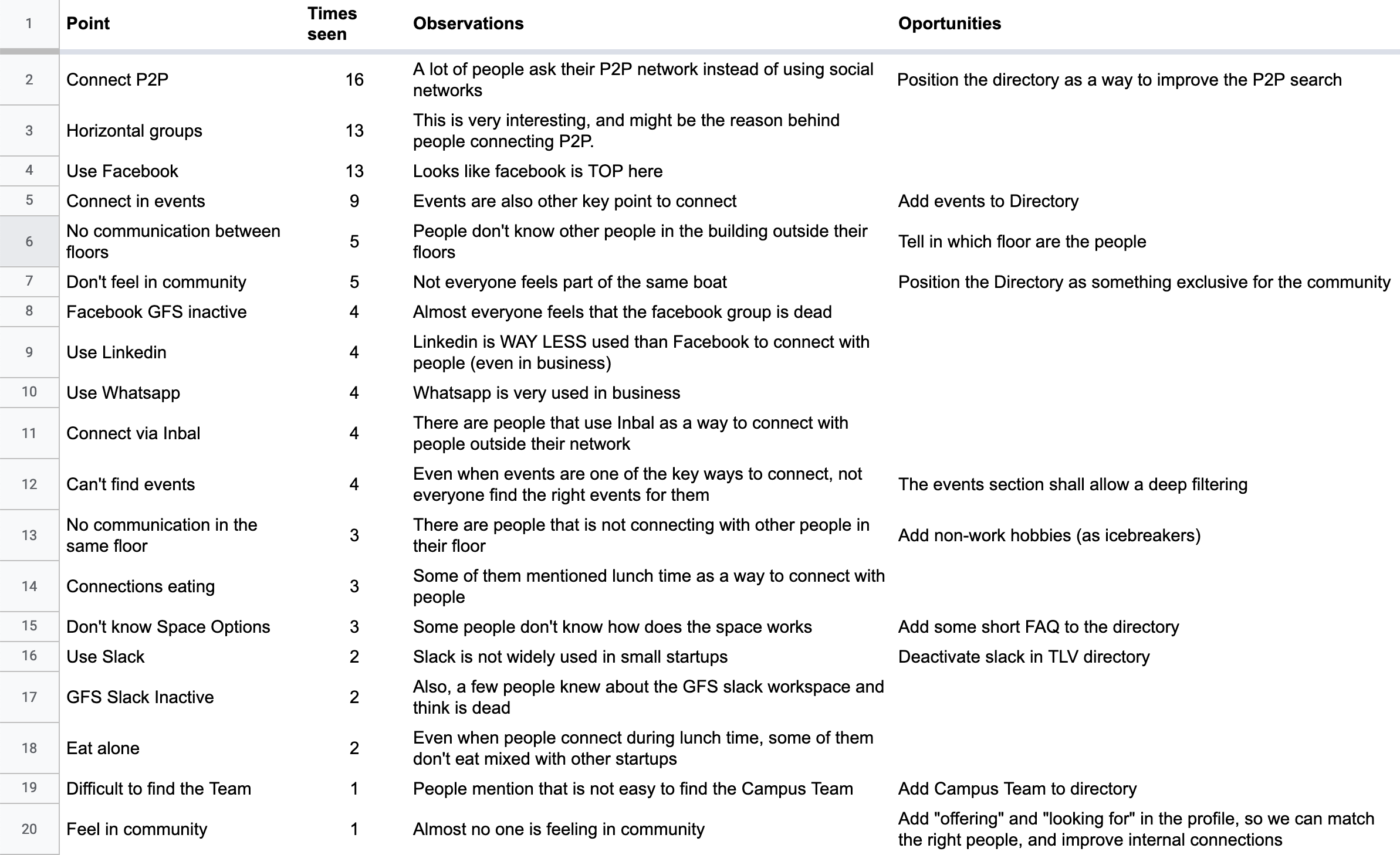
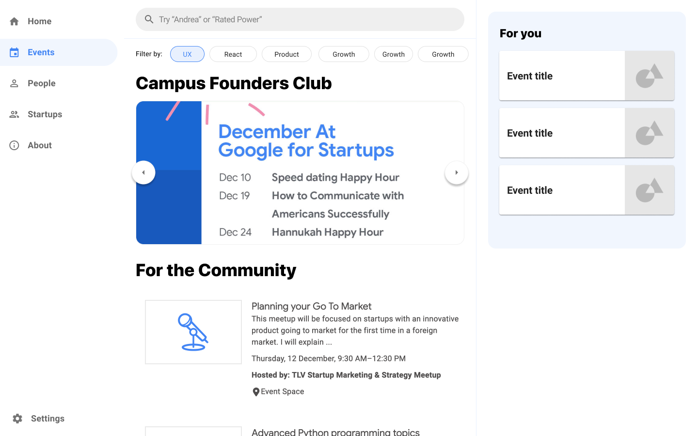
This gives you a clearer overview of what are the main topics that interviewees mention more frequently. As you can see, one of those topics is “events”, so one of our early explorative drafts in collaboration with Inbal, the community builder, was this events menu (still on our backlog):
This and other explorations made us realise that the whole layout and UI needed more than a few tweaks.
New needs, new features
During the last bits of the pre-pandemic world we conducted that research and worked in several improvements for the Directory.
In Tel Aviv we discovered that people use Facebook as we use LinkedIn here in Spain–if you want to contact the CEO of a company you want to work with, you send them a friend request. Because Facebook is used both personally and professionally (and because the product itself is designed to be and endless source of content) the number of daily notifications turns valulable information into noise.
That’s why we designed the Home menu, a place where the community builder can publish relevant community updates and notify members when there’s a time-sensitive activity going on (a small gathering with the founder of Waze, who is visiting the space from 12:00 to 12:30 and so on)
We also added a WYSIWYG editor to a backoffice that was already pretty different from that bareboned first version.

For the past couple of months we worked on new sorting options, new filtering features and a failed Slack integration that deserves its very own case study.
Upgrading the backoffice
Tel Aviv was not the only community that needed customisation. Some campuses decided to use the Home menu, while others didn’t. Some of them decided to show new members in that menu. Others wanted to change some text here and there. Tel Aviv wanted the quick filters on the Startups menu. Madrid didn’t.
At some point we decided to make (almost) everything fully customisable form the backoffice:
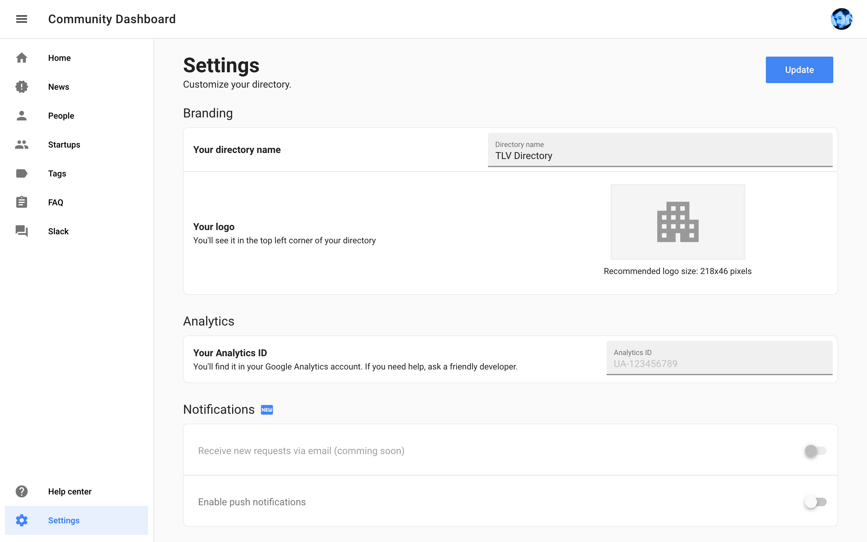
As you can see, there’s an option there to put surname before name, as requested by the Tokyo community.
Updating and maintaining the backoffice started to get complicated, so we migrated both the directory and the backoffice components to a repo (yes, we should’ve done this from the beginning). Now, both products pull components from a single source of truth that is updated at the same time as our Figma UI library. This pipeline slows down the development, but reduces the production of techincal debt and allows us to explore new designs more efficiently.
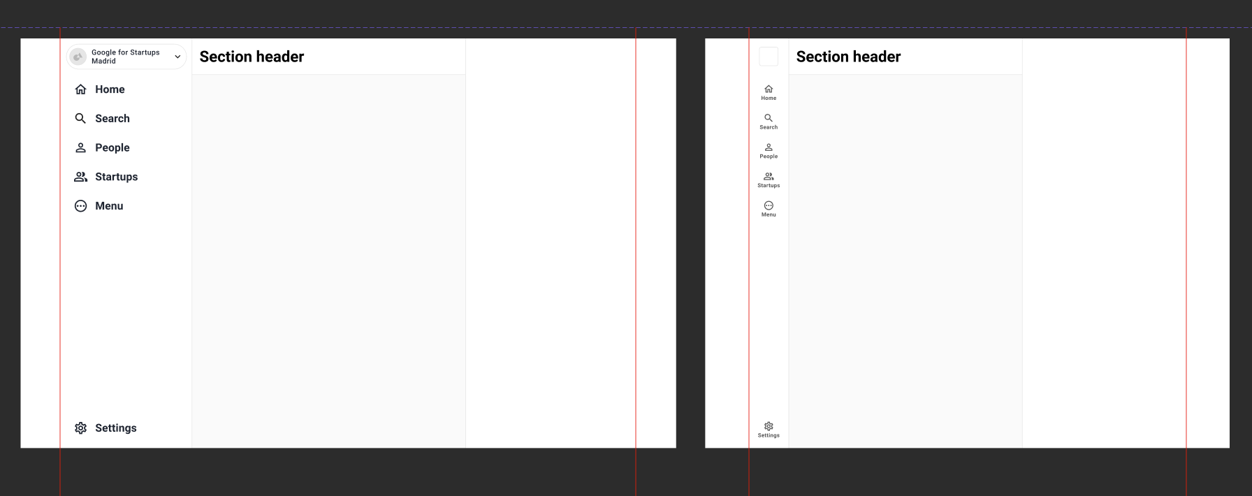
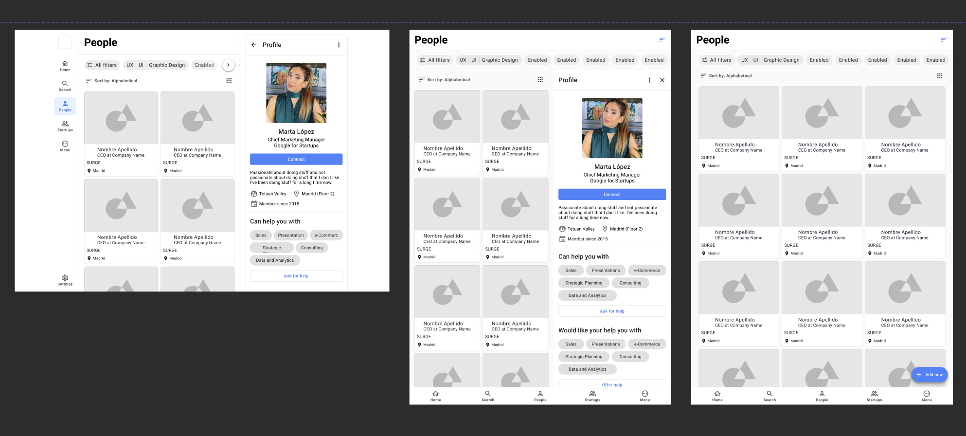
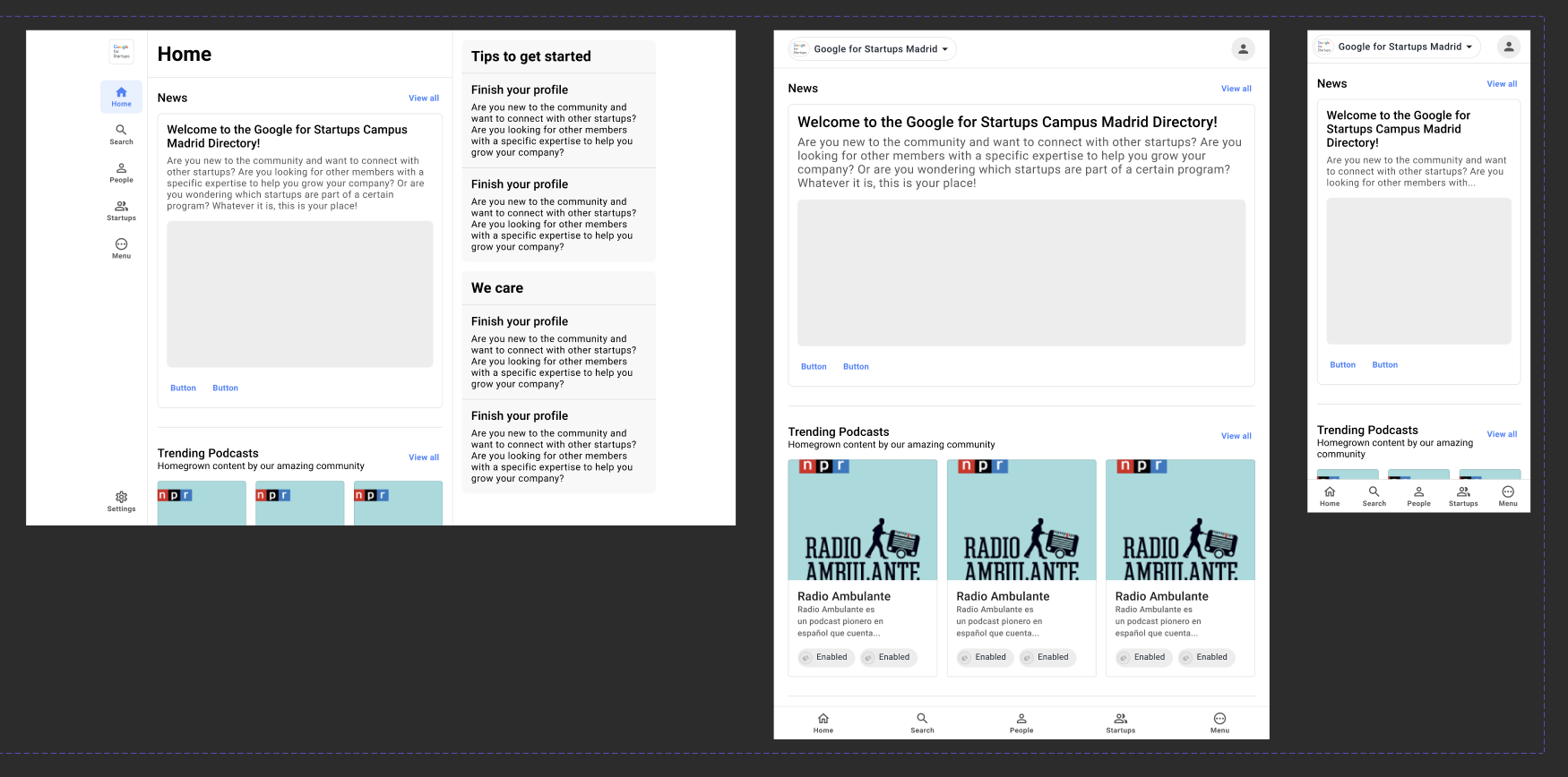
The Second Iteration: a modular architecture
The main problem with our first layout was that it was perfect for showing a big grid of cards on large viewports, but for any other menu… it just didn’t work.
 The layout was perfect… for just one thing
Subpage navigation with variable container widths was terrible, and designing and implementing new features was absurd: some components didn’t fit properly, some felt like tiny drops in a massive ocean… We really needed to rethink that initial interaction model.
A New Layout: robust and adaptive
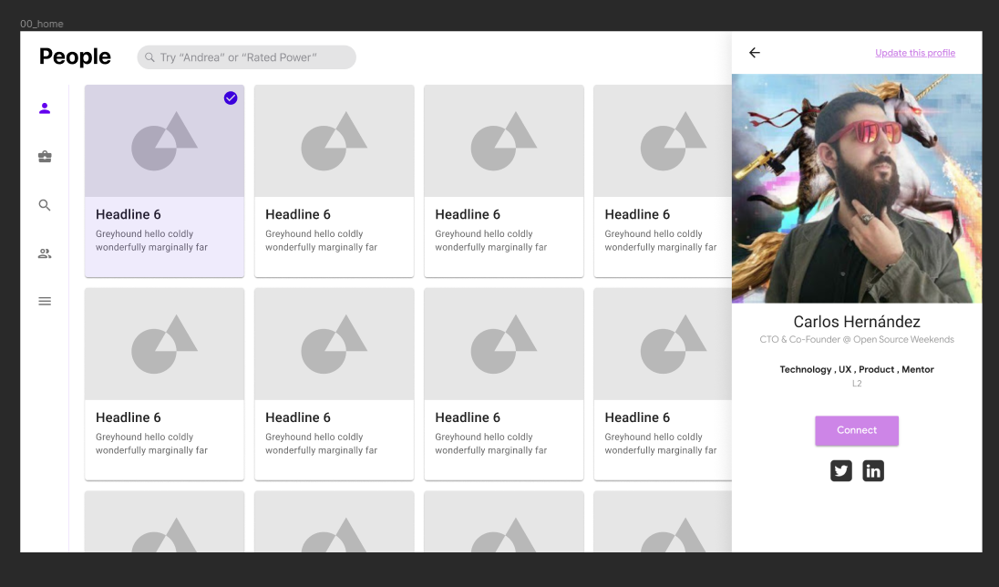
We decided to limit the width of the main content and structure the product navigation around that. We kept the left pannel to show the user all the possible navigation options and added a right pannel for the profile viewer, so the user would be able to keep browsing the list of peope without having to close it.
For the People menu (and all other menus, too), a narrower container makes it easier to focus on the results: it’s not an infinite list of randome people anymore–it feels like a curated database.
 The second iteration
That new layout limited how we thinked about new features and also limited possible implementations; using a similar width for the main container in the mobile version, we also reduced developing workload in responsiveness–there’s no need to design and mantain XS and LG versions of (most) components.
The right pannel would be a full screen view on small viewports, and the left pannel with the visible navigation would be a fixed bottom bar.
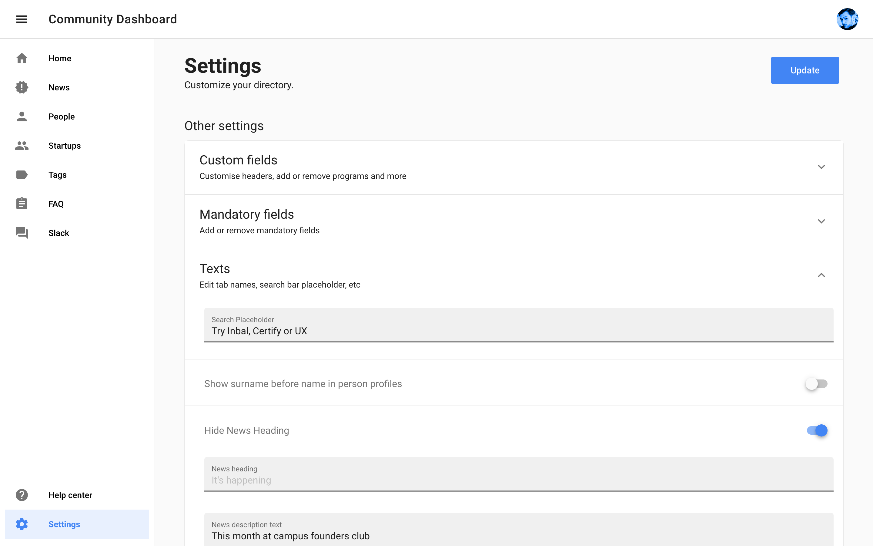
Dynamic Typographic System: a focus on content and legibility
We’re aware that some Google employees have Chromebooks or Pixel Slates –hybrid devices with not very common aspect ratios, somewhere between laptop and tablet–, and that community members can borrow one of those devices from the help desk.
Some members work with iPads or other tablets such as Microsoft Surface, so keeping that in mind, we tried to put some love into the usually ignored MD viewport.
We gave all three containers a max-width, and the LG breakpoint would be the bigger one: in a giant screen you’ll still see a 1.264px wide layout. As Adam Wathan and Steve Schoger note in Refactoring UI:
“Not every container has to be flexible.”
A “mini” variation of the main navigation menu component would show up in laptops with narrower screens and in tablets in landscape orientation. In portrait mode, the tablet layout would work more or less like a scaled up XS UI with a two main tweaks: 1) the $base-spacing-unit (16, as we’re using an 8pt grid) would be multiplied by two, and 2) a little ace up the sleeve…
That ace is a typographic system that scales: a $base-font-size that is multiplied with media queries. The base font size is 14, making it great for mobile but too small for laptops and tablets, so we scale it to 16 and 20, respectively (14 * 1.250). Here’s an example:
It’s as simple as picking a base size that’s a multiple of 4 (because the layout grid is in base 8) and multiply it for a standarised constant:
media only screen and (min-width: $tablet) {

			font-size: $base-font-size * 1.250;

  }
where
$base-font-size: 14px;
That way, in viewports where we really can’t control our main container’s width (tablets in portrait orientation, very wide smartphones…), typography will scale to achieve optimal legibility.
Optimal legibility is achieved calculating the number of characters in each line to avoid having less than 45 or more than 70, so if your container is 600px width with a 16px padding (16 left + 16 right = 24px), with a 14px font size you’ll have ~65 words per line in your body text.
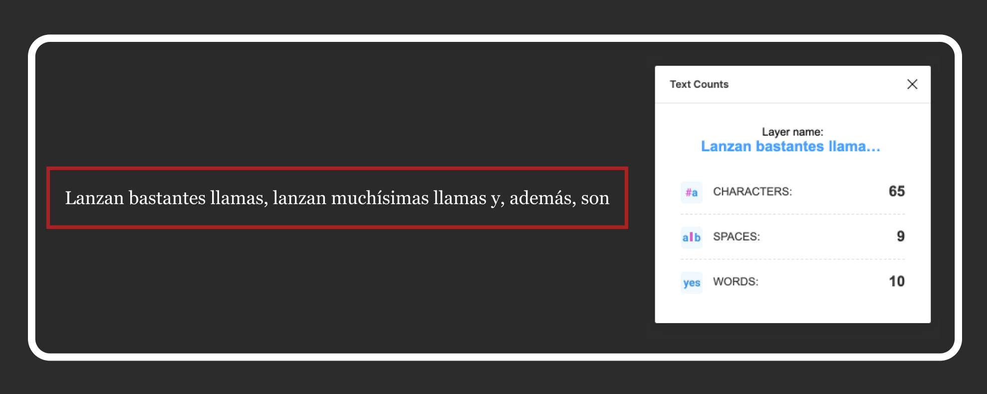 That Figma plugin is called Word Count
That way we go from “too much negative space” to perfect usage of the available space without compromising the UI and achieving optimal legibility in almost every viewport (if you have a foldable: I’m sorry in advance).
Wrapping up
Launching this product’s been a hell of a ride, and we’re still working on the new layout and the component migration to design and develp new features faster. Each quarter we talk with stakeholders and adjust our roadmap to keep improving it, and we might even explore building new products using our existing architecture and know-how (like our failed Slack integration)
We’re always open to ideas, feedback and suggestions!
Beyond Google for Startups
For the last coulpe of months, we’ve been working with other Google teams, but also with Techstars, Correos Labs, Tetuan Valley, Gaza Sky Geeks and other companies. If you need to activate your community, drop me a line and we’ll se how we can help :)
And if you need help with your design process or need to develop a new product or feature, we can help too! Click the banner below to schedule a meeting ⤵️