- The client: a matryoshka of startups
- The product: visit properties whenever you like
- The process
- The design
- Wrapping up
The client: a matryoshka of startups
7r Ventures is a venture builder or, in other words, a company that builds companies. They start with a pilot, and if it gets market traction, they hire a team and scale operations. That’s how Ringo was born in 2018 to help particulars visiting properties for rent without depending on an agent, and real estate companies minimising the time that one of their properties is not generating value.
In the initial team they had Carlos Santos as CEO, Irene Pérez and Camila Maya as back-end and front-end developers and Vanesa Barrero as PM. The design side was intermittently covered by Sergio Leiva, Jimena Catalina and a external agency.
When their design needs started escalating, Vanesa reached out to ask me if I wanted to build cool things with them.
The product: visit properties whenever you like
Ringo partenered up with Raixer, a manufacturer of intelligent locks, to build a digital product that allowed people to request a visit to an apartment and unlock the door remotely. That way, companies could stop wasting human capital on an easily automatable activity, and people could visit properties whenever they like.
That product was called Visitame, and it actually was two products: one for the primary user (the app) and another for the secondary user (the dashboard for companies).
I worked on the backoffice for companies, as they were facing the classic chicken-egg problem: without a way to add and manage their properties, companies wouldn’t be able to use the product, and without listed properties, there would be no users. On the MVP, they manually imported a batch of properties, but it was time to level up the product.
The process
Learning about a new industry (again)
Each time I start working with a client of an industry that I’m not familiar with, there’s always this initial awkward phase where they have to explain me their business model and, subsequently, how the whole industry works (you do learn a lot of stuff working as a designer)
The first thing I did was sitting down with Carlos, the CEO, ask him a lot of questions and take a lot of notes on the Jamboard.
Then, they sent me the Sketch files that Sergio and/or Jimena and/or the agency created and I imported them to Figma for easier collaboration. This was pretty straightforward, as while Visitame had already a few components and screens, the backoffice was bare boned:
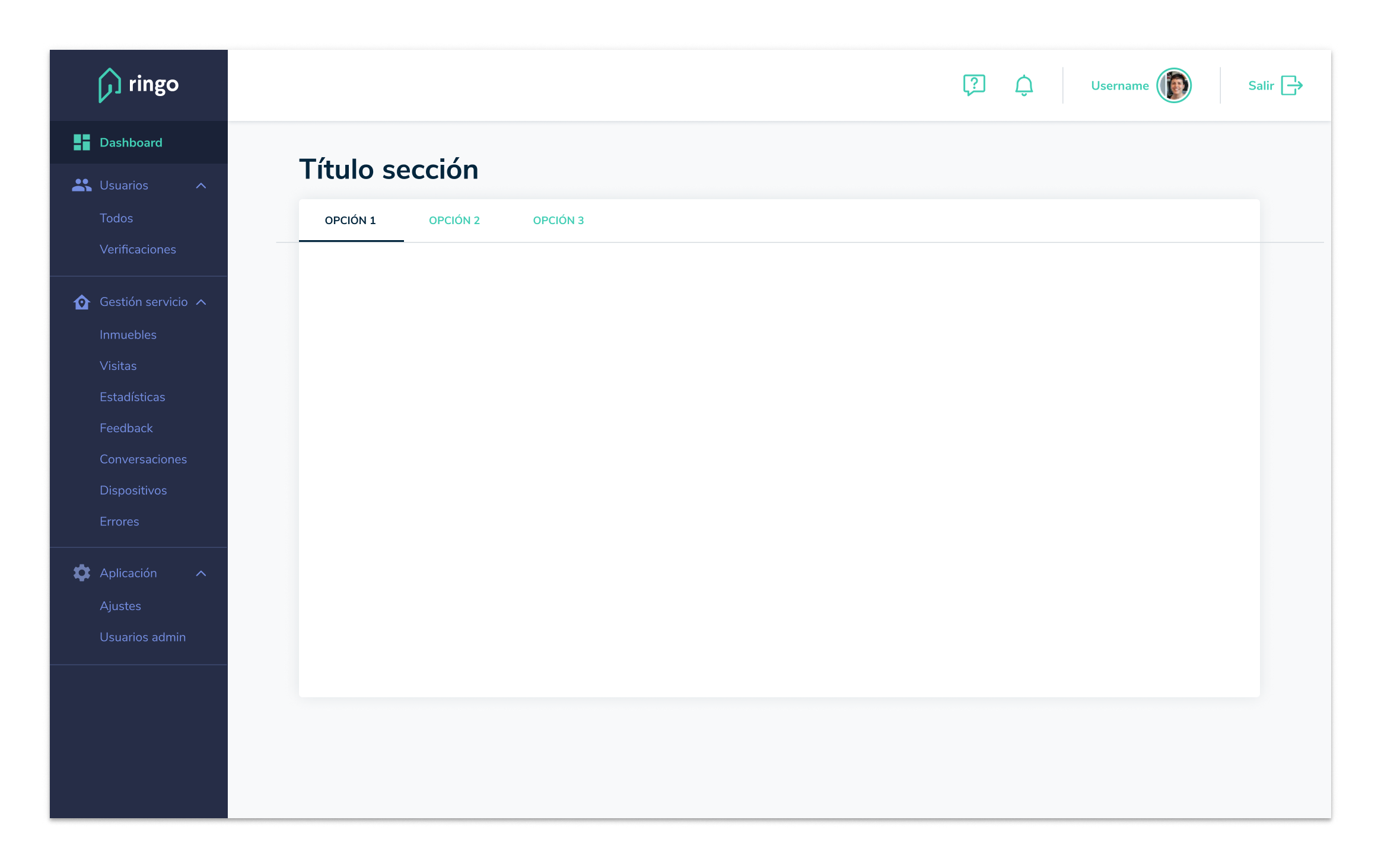
First steps
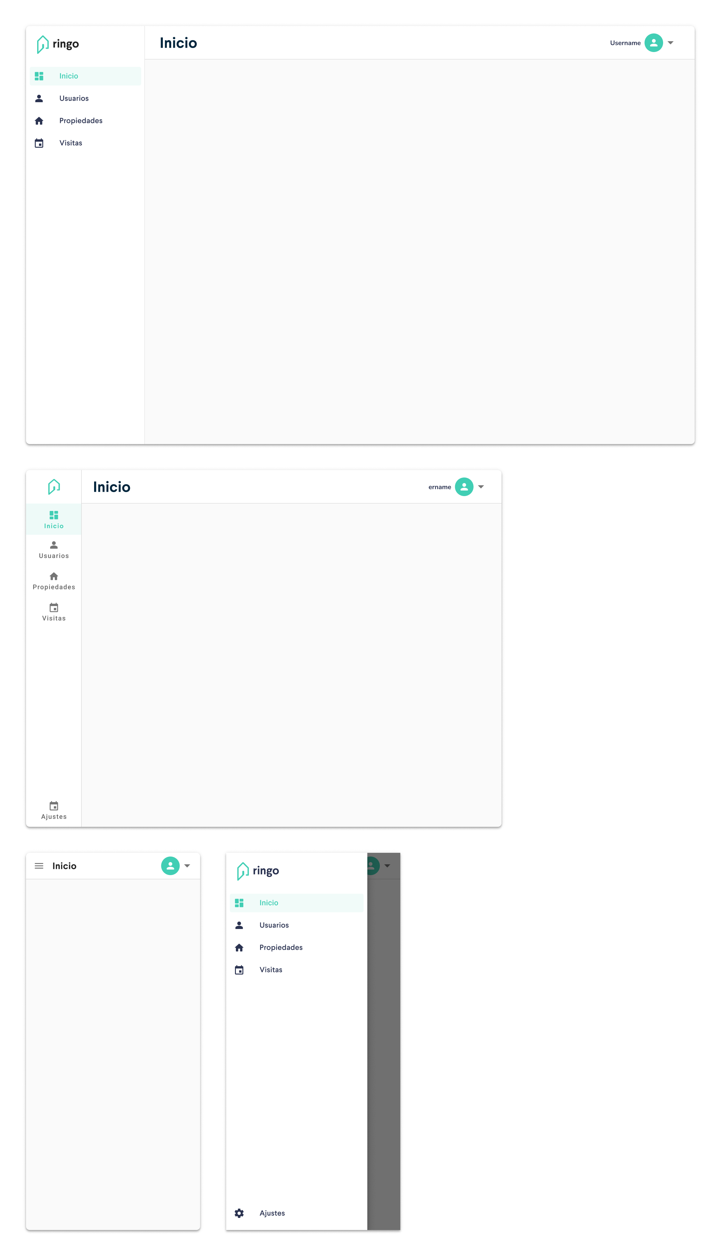
They had a massive backlog of features, small improvements and bugfixes requested by clients, and were in the middle of a major release, but their front-end was, just like the design, a blank slate. It just had the structure you can see before: a side drawer and a main container with a topbar. Because this product had a surprising variety of users (property managers, security personnel, maintenance…), we planned for it to be responsive since day 1.
When you don’t know if the property manager uses a tablet, a laptop or a big screen, or if the security guard uses a smartphone, and you don’t have the time or resources to conduct some research, the only thing left to do is to blueprint a bulletproof plan.
The design
The interaction model
I designed a new interaction model with responsiveness and simplicity at its center. Because the content would be complex enough (numbers, bars, lists and tables…), we’d use the topbar only to indicate the user where they are. I always try to avoid hamburger menus for mobile navigation, but timing was tight, and using a library such as Material-UI for React with components that behave like this by default was a huge time and resource saver.
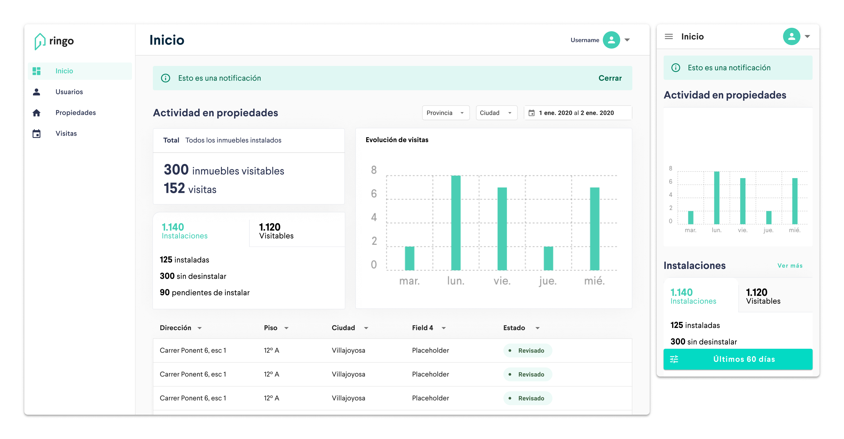
For the main container, the Home dashboard would be a grid of components to show key information for the tenant/property manager, pretty easy to scale to smaller viewports.
From both the Home page and the Properties page the user could open the property view, which was on a 2nd level navigation.
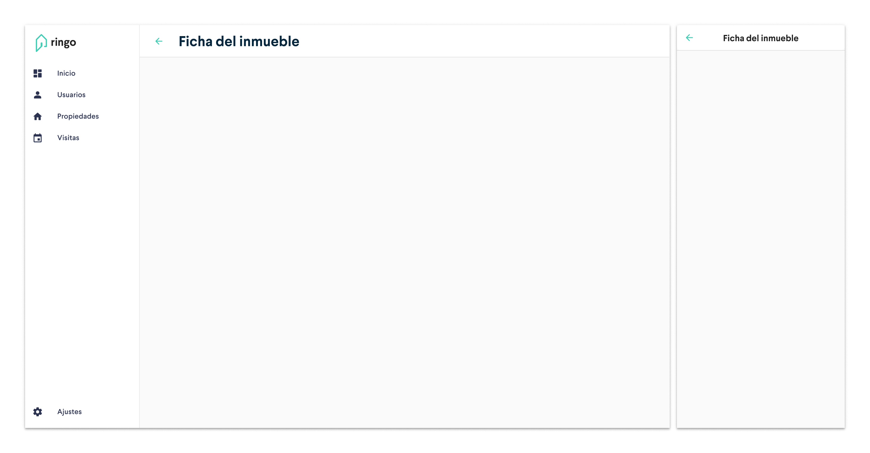
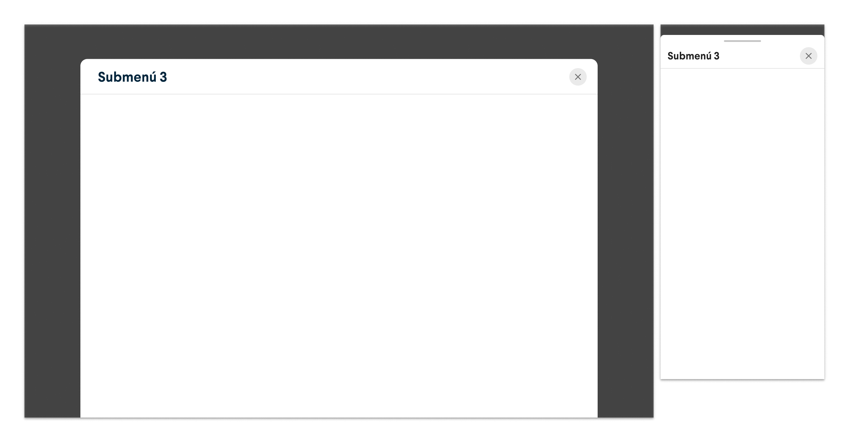
For this 2nd level, on desktop we kept the side drawer visible for easier access to other product sections, and in mobile we hide the option to open it to help the user focus in such a limited screen space. This was an exploration for a 3rd level of navigation that we finally didn’t use.
The app bar extension
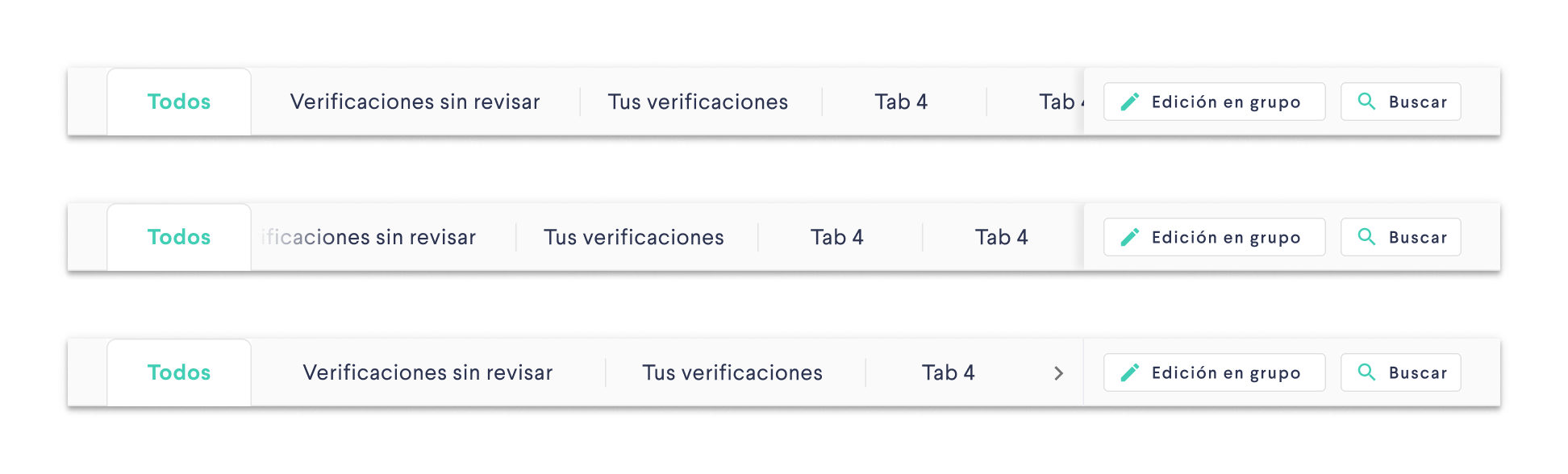
Removing all the side drawer submenus of the initial design lead to a more complex navigation on the main container, but we had plenty of space there, so the next step was to decide how to structure the submenus. We explored different components, mainly tabs and chips.
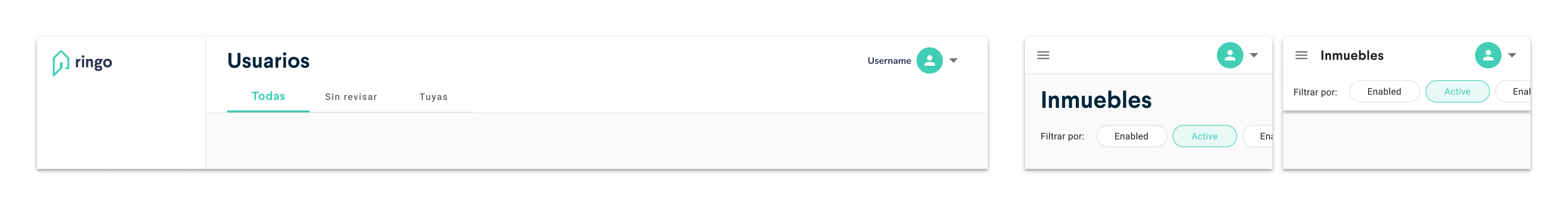
Because the chips were going to be used in other menu to filter content, we went with the tabs. Nevertheless, we found out that the affordance was unclear as some users didn’t percieve the resting tabs as clickable. We discussed for a short while which tabs are amazingly designed and are very popular, and we realised that Google Chrome’s design was pretty conservative in that sense, and most of people are used to work with it.
 Google Chrome tabs
So we cusotomised our Material-UI components to look like “old school” tabs.
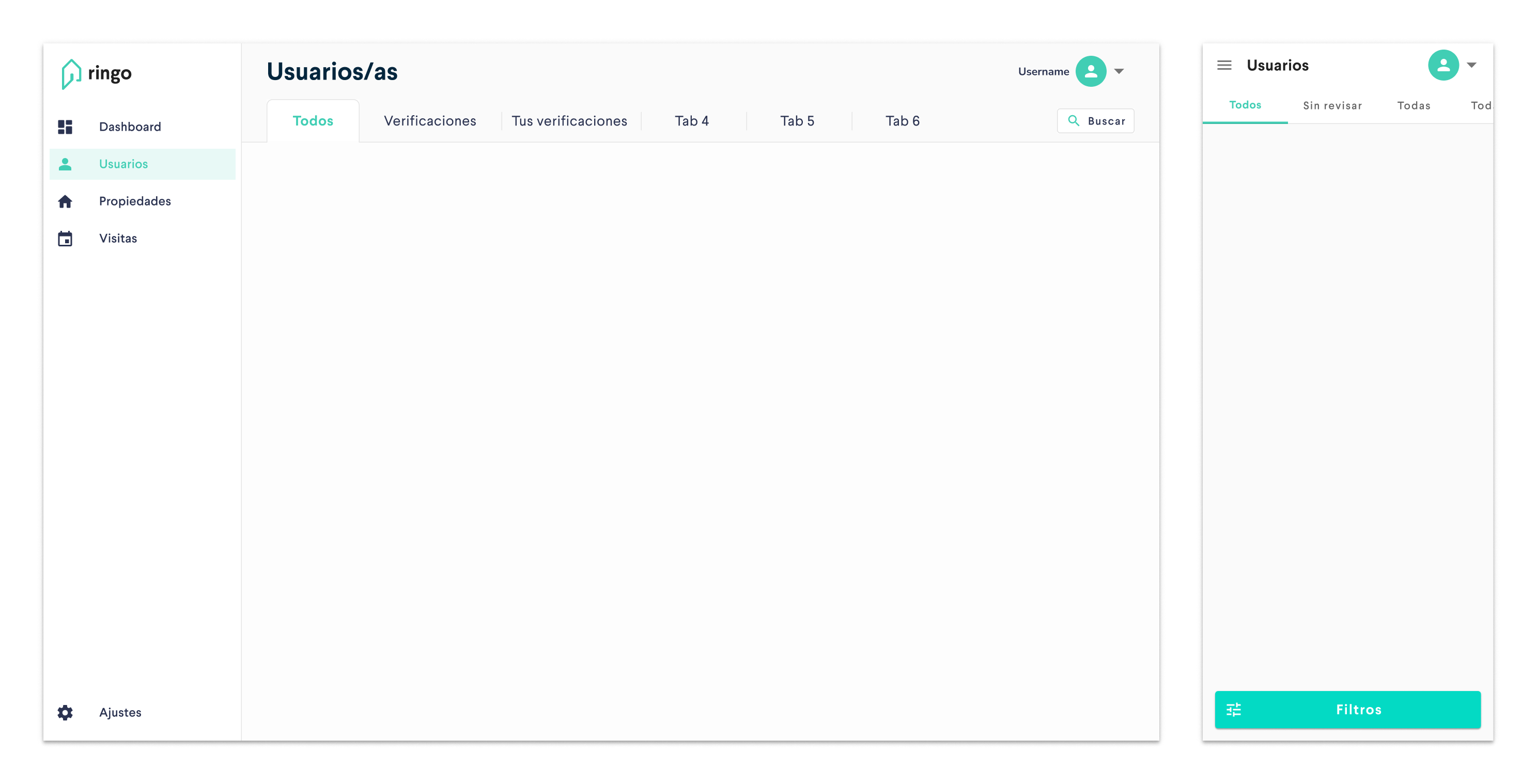
Search and filter
In the app bar extension we also placed a search button that opened a search box with filters. In the mobile layout, we moved this access to the bottom as a floating button. Here’s the search + filter menu:
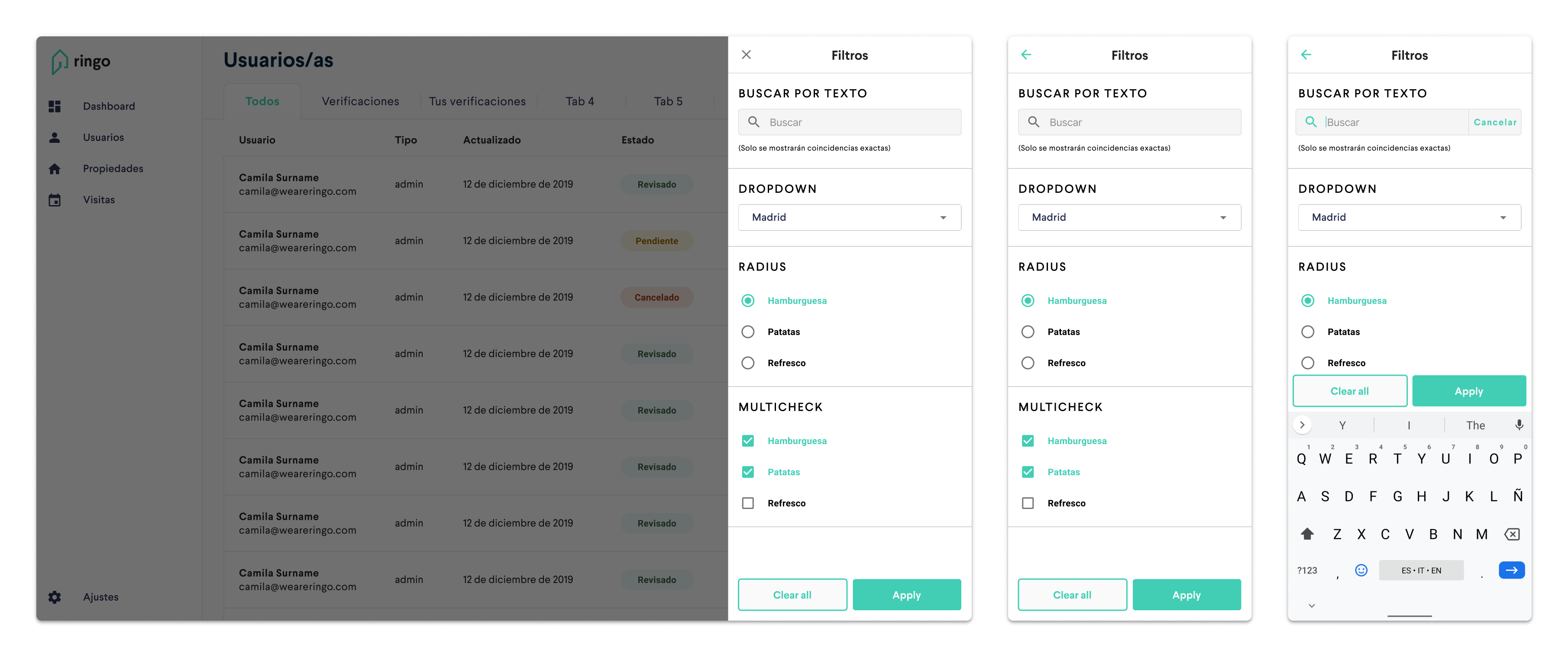
It turned out that in some menus we could have a lot of submenus (tabs), and we also had to consider how they’d behave in smaller viewports. We finally decided to make them scrollable and to keep the default Material tabs for the mobile version. It turned out that the affordance of these flat tabs was more obvious in mobile.
Here are a few explorations including a batch editing button:
We considered using this filters menu also on the Home dashboard (below), but we concluded that it added complexity to a menu that’s supposed to show you a quick overview of your properties and calendar.
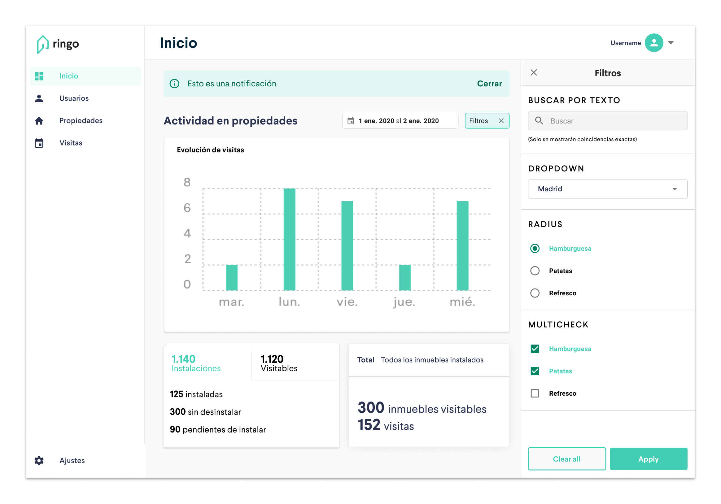 Home filters exploration
2 column layout
Following that idea of a 2 column layout (8 + 4, actually), we also designed a user profile page for the admin, so they could approve or reject new users and their permissions.
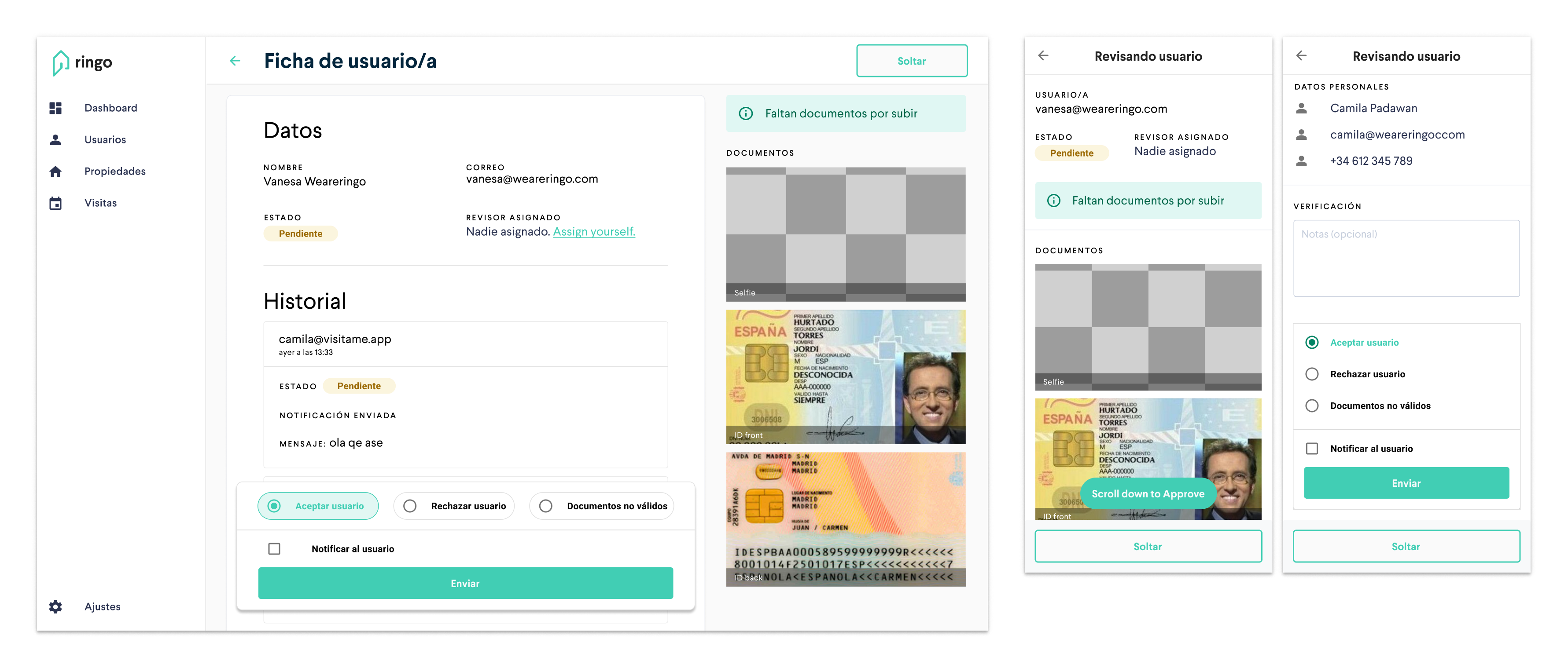
It wasn’t possible to authorise someone to access a property without requesting their national ID and other sensitive information, so this solution was put on hold before further development due to privacy concerns about a third party accessing that data.
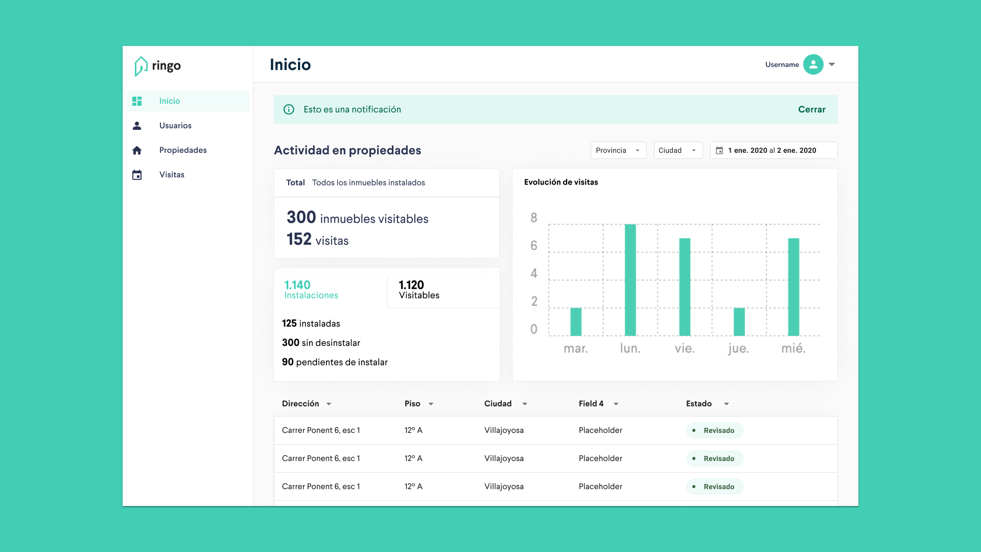
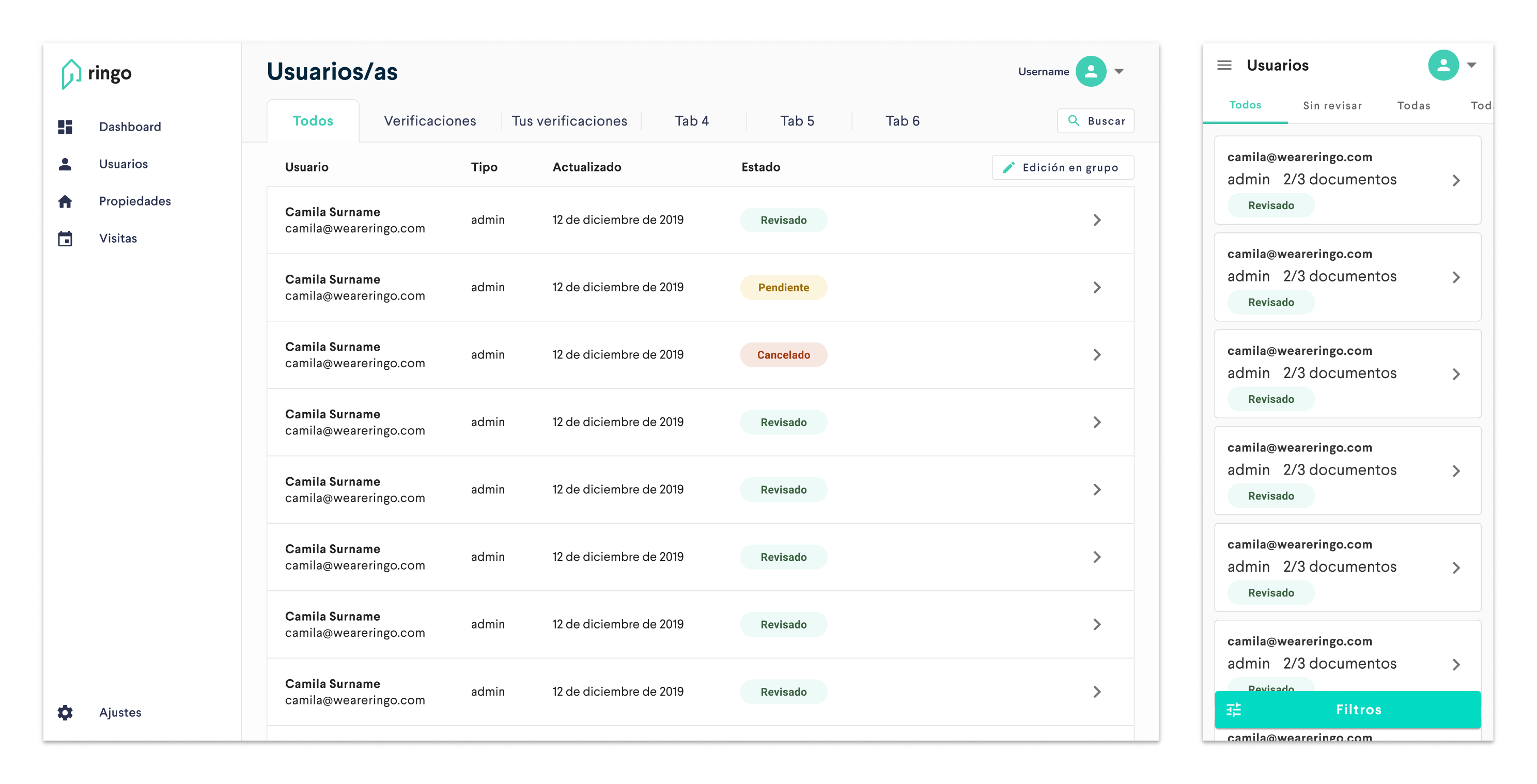
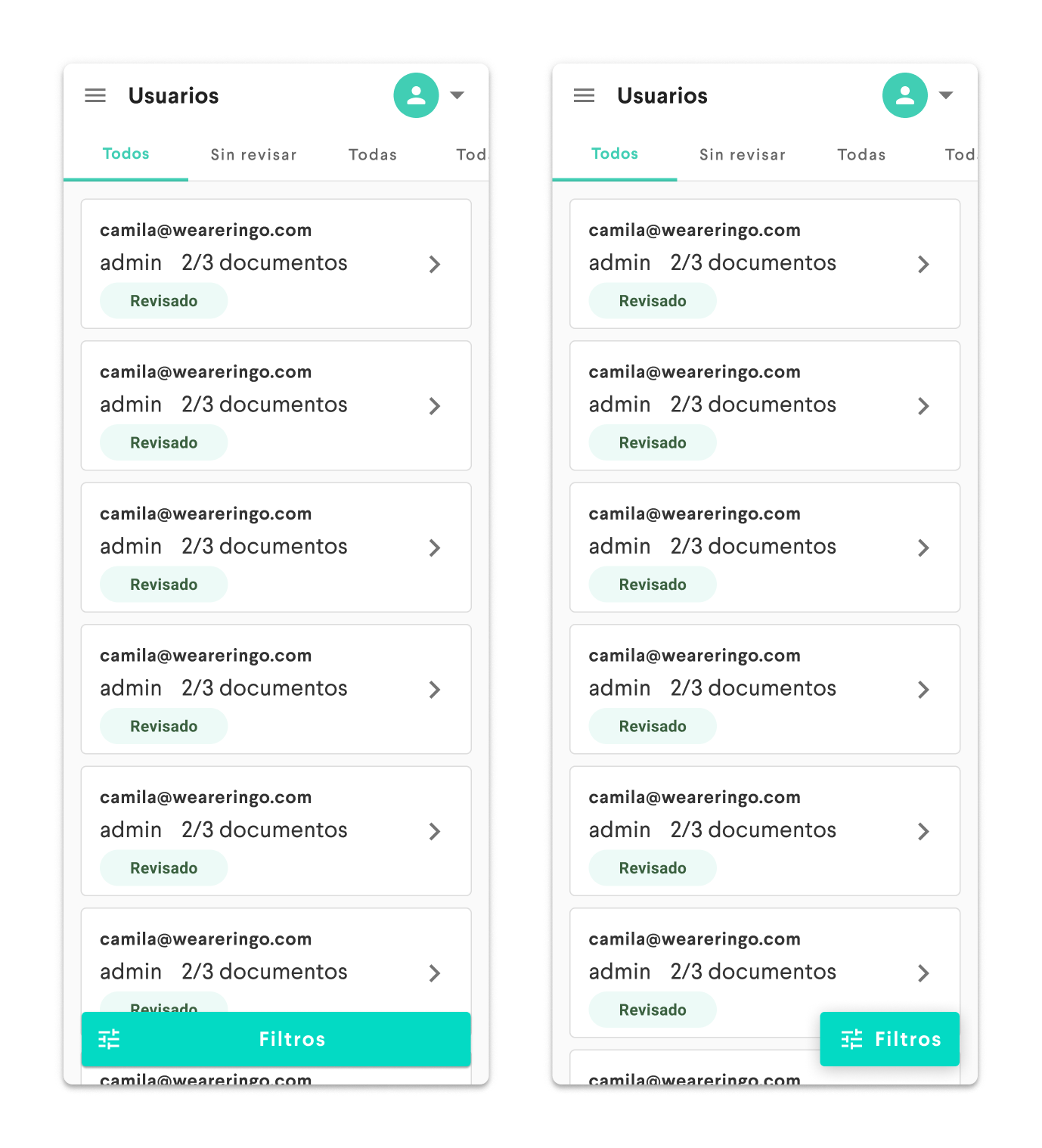
Data tables
For both users and properties, it was important to be able to identify them through certain fields: name, surname and permissions in case of people and address, floor or status (approved, on hold, rented…) in case of properties. In bigger viewports it was easy to show all this info, but in mobile it was quite messy. We explored many ways to make the tables responsive, and we finally decided to create a different component for smaller screens.
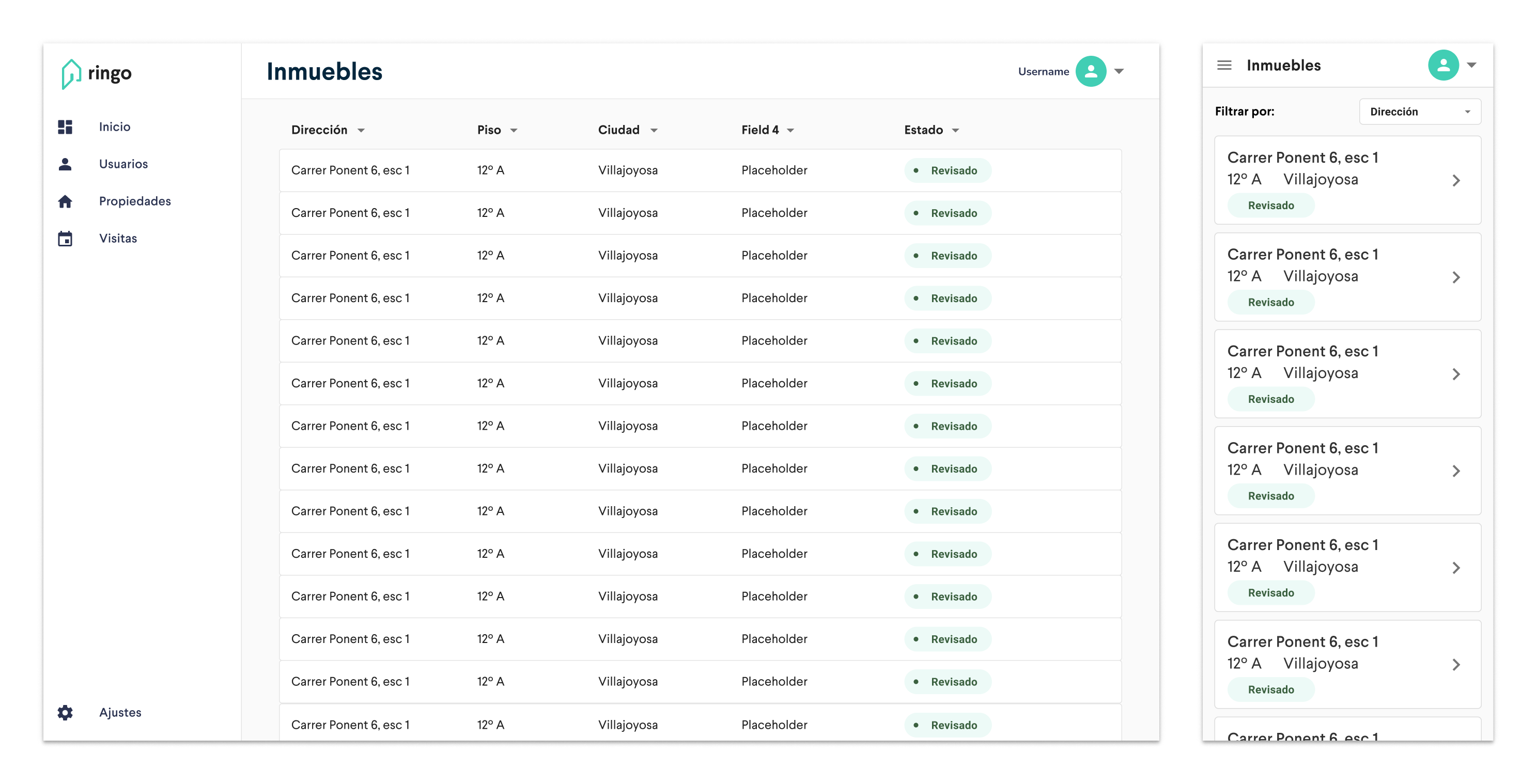 Responsive data tables
Here’s the user list with the new tabs + the “shapeshifting” table:
We did another small exploration for the filtering list, as in mobile it looked a little bit too big, but it didn’t last too long…

…because the solution was way, way easier:
Wrapping up
My collaboration with Ringo was pretty nice. I really enjoyed working with Irene, Camila, Vanesa, Carlos and all the new people they hired during that time. Sadly, with the COVID-19 pandemic we had to put it to an end. I learned a lot about venture builders and about the real estate industry in Spain.
If you operate in this industry an need some help with your design process, drop me a line at ivo@commitsans.com or book a meeting through Calendly in the banner below :)