- Context
- How does Arbor work?
- What does a designer do in an early stage startup?
- Design Operations 101
- Growing the team and evolving the product
- Saying goodbye
Context
In 2018 I met Nicholas Salguero back in 2018, right after he and his team finished the Tetuan Valley Design Sprint with a prototype of a brand new fintech app called Arbor. They wanted to solve a problem. A very real one: people in Spain don’t save enough money.
After living in USA & LATAM for a while and inspired by other personal finances services like Acorns, he decided to build a platform to help people save and provide them with enough financial education to turn some of that savings into investments. A very ambitious plan, if you ask me.
But that’s exactly what I liked about it.
How does Arbor work?
The main thing that prevents people from saving is, ironically, lacking the habit of saving (the chicken-egg problem), so Arbor’s main feature was The Roundup: you linked your debit card to Arbor, and with each payment of, let’s say, 1.90€, it rounded it up, charging you an additional 10 cents and automatically sending it to your savings account.
If you bought a 1.50€ coffee every weekday, in one month those 50 cents could turn into 10€. That, every month for a year, equals 120€ of yearly savings.
The difficult part, of course, was getting people to link their debit card, but… we’ll get to that.
What does a designer do in an early stage startup?
I’ve been part of Tetuan Valley’s community since 2015 or so, and when Camila (Tetuan Valley’s CEO back in the day) heard that Arbor had no designer, she introduced us. Their first prototype was designed by engineers and people with a background in finance, so it looked like this:
 Arbor’s first prototype
As you can see, they needed help with visual design, but there’s so much more under the surface that’s not obvious; I learned that a designer can help with research, visual design and media production, but also with growth, operations and even with customer success strategy.
I didn’t know all of this at the moment, but I did know that it was a great opportunity to start a design team from scratch and to learn about finance… and also that initial team seemed really nice, so I joined Arbor full time a few days after that first intro.
 Arbor’s initial team
Design Operations 101
1. Tools and workflow
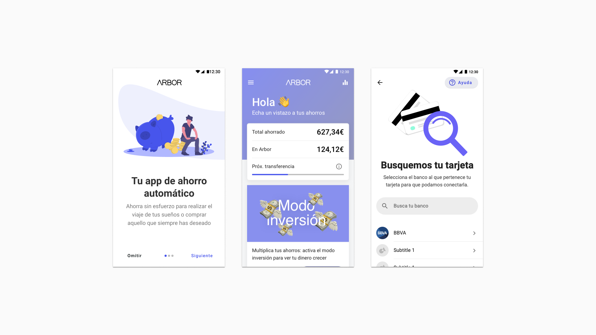
My (first) main goal was to design a UI that people actually wanted to use. But that’s not a task, that’s an Epic, and the first step was to establish a way to rapidly sketch and share iterations with the development team and with their early testers (and possible new users).
I sat down with the dev team and asked them about their product design & development process. Being used to work with visual designers, it wasn’t very polished: sharing screenshots, PDFs with notes, etc., so when I showed them an InVision prototype and the possibility to add comments and to draw over the screens without leaving the browser, they were immediately sold.
I started using Sketch to build a UI library and Craft to upload it to InVision. We reviewed the whole interaction model and, and since it was a startup, we started using Material components to build most of the UI and Angular Material to implement it.
In about two weeks it already looked like this:
 A more modern UI
We decided to apply a simple restyling so it looked more modern and clear without changing the architecture or adding new funcionality, for starters. Because it was already live on the stores we had to iterate quickly, and this looked like a good starting point. Also, setting up our design & dev operations would take a while, so… you gotta start somewhere.
2. Guerrilla Testing: learning to learn
We needed to set up a more structured needfinding process and also to show our wip to the users. Our approach was two-folded: first, guerrilla testing to validate new designs; second, using our customer success team (at the time it was just one person, but it quickly grew up to 4) to harness and organise info that we could later use to segment users and to design new features.
We worked from the Google for Startups space in the heart of Madrid; it had a ground floor with an open cafe that was always quite crowded, so I asked one of my colleagues, María, if she minded helping me interviewing people from the cafe.
 The cafe
We took our prototypes downstairs and showed them to a bunch of people. We asked them about their financial life and bought them coffee. Some people were (understandably) quite secretive about which banks they use or how, but others were surprisingly open about their personal finances, and also very interested in fintech products like Fintonic and Indexa.
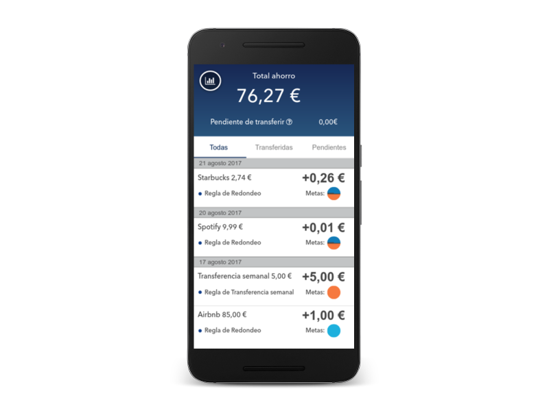
We gathered A LOT of insights. One of them was that people didn’t care that much about which transactions generated their savings; they just wanted to see the total amount, and to make sure that it is growing. This idea was fundamental in future iterations of the product as you’ll see.
The customer success part was a little bit more complex, so we’re gonna need a whole new section for it.
3. Customer Success Strategy
They were using a manual ticketing system, but in my previous startup I saw the power of using a tool like Intercom, so I suggested trying it out. We ended up using Intercom for capturing leads on our website, to send in-app notifications, to manage and send our email campaigns and to improve our research process. It soon became a pillar of our operations.
It’s expensive, but it’s absolutely worth it.
I migrated all of our early adopters and testers from Highrise to Intercom, and we asked our CS agent, Felipe, to create a few new tags: bug, idea, feature… that way, when someone sent a message saying “hey, [feature] doesn’t work as I expected and I’m [super angry]”, Felipe tagged that message as bug (and strong feelings) and we added it to our backlog, giving it a score from 0 to 4.
Everyone had an Intercom account, so no one acted as a bottleneck. Also, it was very helpful to scout people for interviews, testing and so on: we knew who’d given permission to be contacted, their age, etc., and if the Intercom integration with FullContact worked as expected, we could see their LinkedIn profile, segment by industry and so on.
Basically I was trying to maximize the quantitative data gathering in autopilot, whereas I got the qualitative data calling users and chatting with them almost every week. We integrated Hotjar on our website and used its heatmap feature to see the sections that people spent more time on and their survey tool to ask them what were they missing: more screenshots of the product, more info about our integration with banks and security…
Fun fact: on the early days, the whole brand tone and strategy was designed for young adults that are incorporating into the labor market and want to learn how to save, but in my 3rd quarter in Arbor, I started finding a surprisingly large amount of middle-aged people from the agriculture sector on our db that had some savings and were interested in investing, but didn’t know where to begin. I talk more about that in the Growing the team section.
4. Smart copywriting & CRO
When we already had a more or less polished process of design and development, were gathering quantitative and qualitative data and the designer (yours truly) started feeling a little leisurely, I realised that our website was… kinda useless.
 Their first landign page was… original
Conversion was around 0.1%, and we’ve heard about needs and worries of current users, but… what about newcomers? What are the key things that make them download Arbor?
I asked María if she had any insights, and of course she had. They conducted some interviews while building that first prototype, so we had a starting point: concerns about the security (“what happens with my bank credentials when I link my card? CAN YOU STEAL MY MONEY?”), difficulty to understand the value proposition (“but it helps me save with discounts or…?”) and quite a few more.
So, because we wanted to widen that list and to validate if those were general concerns, we started testing different landing pages designs and different copy using Unbounce, a WYSIWYG web editor that allows you to release different variants of your website at the same time and automatically split the traffic between them.
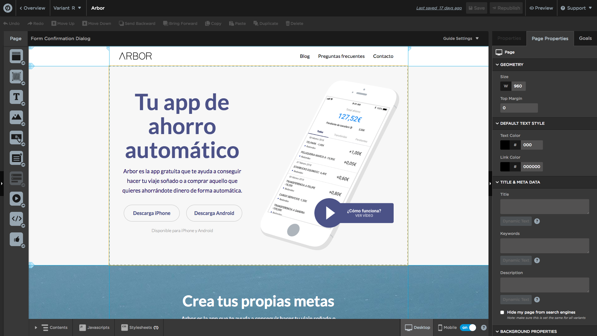 Designing one of the variants in Unbounce
If you want to know how we went from <1% conversion to >10%, here’s the case study. And if you want to start using Unbounce with a 20% off your first three months (or 20% off a full year), click here. They give you 14 days of free trial, so you can make sure if it’s the right tool for you.
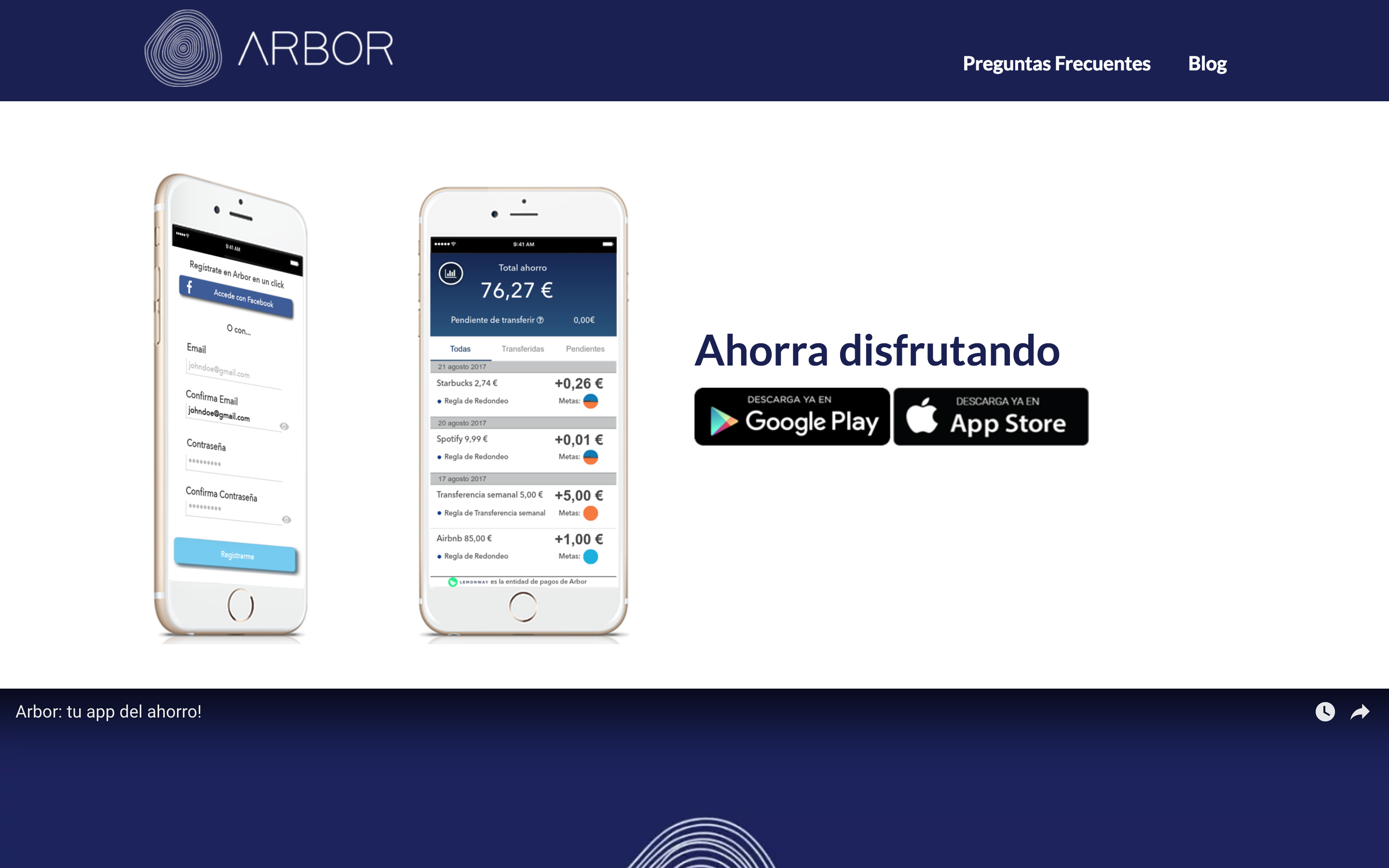
We spent some money to bring traffic to our new website(s) and after a while, we more or less knew what did work and what didn’t. The headline was something in the lines of:
Your automatic saving app: Arbor is the free app that helps you achieve your dream trip and to buy what you wish saving money for you automatically.
At some point we had half a dozen people working on the copy and our InVision proto wasn’t updated at all, so María and I developed a version control of our copy inspired by Dropbox’s Andrea Drugay. We shared those docs with the rest of the team and treated them as the single source of truth (for copy)
I wish we had Figma + the Google Sheets Sync plugin back in the day.
Growing the team and evolving the product
The customer success team grew up to 4 people, and Felipe started moving from closing tickets to focusing on optimisation & ops. Finance had 2 new employees working with the CFO, and we were working with a marketing agency that took care of some grow-related tasks; María helped me with the landing pages and I helped her with the copy & visual content.
We produced a lot of media and pulled off campaigns with CNP and EasyJet. We did pretty cool stuff.
 Poster for the EasyJet magazine
But at that point I was just too busy, so we hired a freelancer graphic designer to help María and a sociologist called Ana to help establishing the foundations of our research process. That way I could spend more time polishing our design ops and working with the dev team.
Ana was learning visual design, and between the two, we definitely made Arbor more friendly:
We set up a pipeline where she created branches of my Sketch files (no, we never heard about Abstract and files were too big for GitHub), so I created a gatekeeper file and stored it on Google Drive. Each time Ana finished a new menu or feature, I reviewed it and copy-pasted it into the gatekeeper.
Joining the InVision Design System Manager beta helped us to better structure our assets, but the CTO was understandably wary about importing the icons and the fonts from their CDN, so we put that on hold until having less stuff on our plates (and maybe until they went out of beta…)
A product inside a product
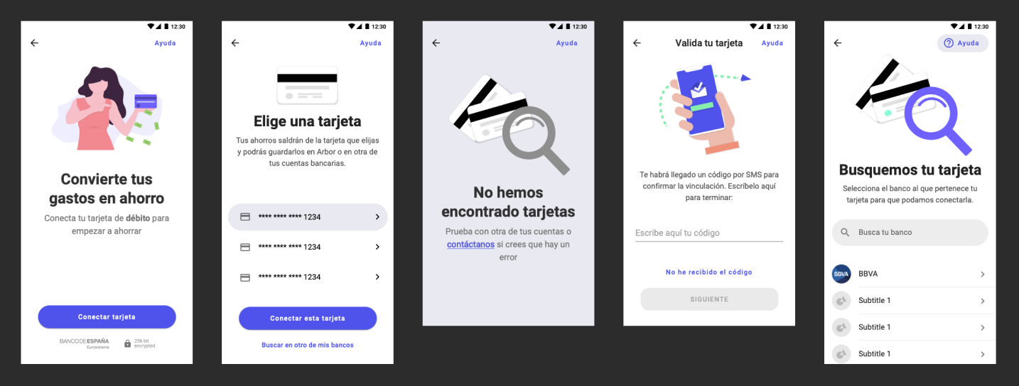
At the time, we had the upcoming release of the investment product (integrated in the regular app as a feature, but it was almost like a whole new product), in partnership with ETFmatic, so I had to spend 80% of my time on the onboarding and UI of that product. We had lots of limitations in terms of regulation and integrations, so it was going to be pretty difficult to pull off a functional yet usable first version.
Our main challenge was the onboarding: the regulator required us to provide a lot of info about the users (national ID number, full name and address…) and to conduct an initial test to evaluate their level of finantial education.
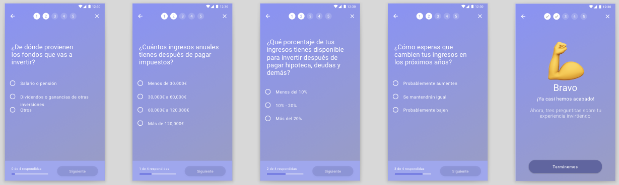 Investment product onboarding
We’d previously seen that some people are very reluctant to provide that kind of info, so we’d have to effectively communicate the reasons for us to ask, and to ensure users that Arbor was a secure service and that they had nothing to worry about. One of the first explorations was very personal(ist?), with a “letter from the founder” to inspire trust (see step 2 below)
 Investment product onboarding
The sensation of progress was also very important, so we used a stepper (see topbars in the miniatures above and below) to tell users in which step are they and how many are there left, saving the progress if the user decides to abandon, and also a progress bar that indicates progress inside each section (and that filled a little bit more than what it should during the first steps 🤫)
During that time, Ana & I conducted dozens of interviews and gathered a lot of insights for the future iterations of that product and for Arbor in general.
Spending more time with our users and having a wider context about how they use it and about the mid to long term vision of the founders, we came up with this idea of a modular home screen where we could remotely “activate” certain cards to help users with certain tasks or promote new features.
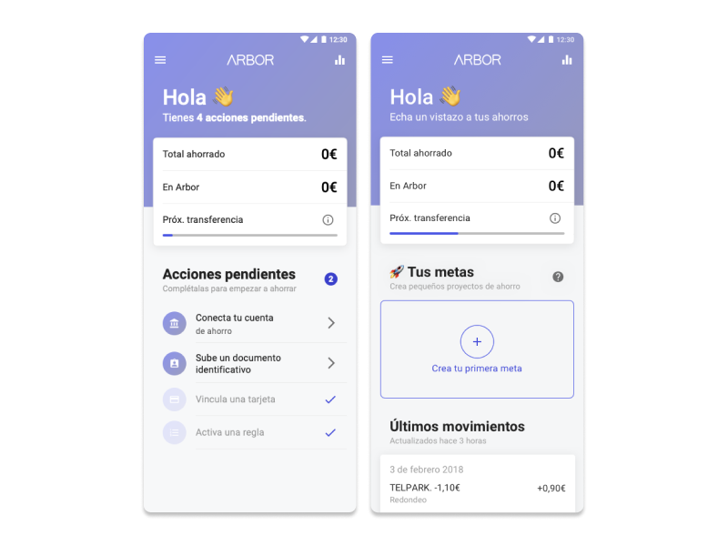 Modular home screen
A user that only saves and does nothing with their savings is effectively losing money, and so did Arbor, because creating an account and using the app was free, but each transaction had a cost that the company covered for the user. On the other hand, enabling the investing mode was a premium feature, so we used that modular home screen to promote it to our regular savers (it was totally optional, of course)
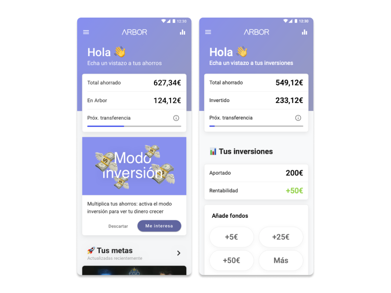 Saver vs Investor
Saying goodbye
After a year doing a little bit of everything, I felt that at some point my job started to be something between management and optimisation. And there’s nothing wrong with that, but… I missed the early days. So when a friend of mine referred me to another early stage team with more or less the same challenges that Arbor faced on those early days (and a significantly bigger paycheck, full disclosure), I couldn’t say no.
At that point Ana’d been working side by side with me for a while, and she was more than ready to pick up most of my duties (with the help of our freelance graphic designer). I left our gatekeeper in good hands.
So, answering that first question… what does a designer do in an early stage startup, then? Still today I’d say that our main job is to be advocates for the needs of the users, and that implies being everywhere all the time (until everyone in the company says things like “how would our users feel about this?”)
Of course we have to align with business goals and design interactions that are technical feasible, but usually there’s plenty of people taking care exclusively of those things, full time.
When you try to do a little bit of everything and to be everywhere all the time, many people end up asking for your input at any given time of the day, so the hardest thing one’s gonna have to learn is how to set boundaries. Here’s how I did it:
 Me, setting boundaries