- The client: Two Bad Motherfounders
- The product: POiN Places
- The reason: convenience, inspiration, participation
- The process: working side by side with business and development
- The (re)design
- The design system
- Wrapping up
The client: Two Bad Motherfounders
In 2019, Angelica and Nazareth were tired of going to restaurants with their kids only to find out that they had a “no kid policy”. They assumed that some day Google Maps and Foursquare would help them find out about those kind of places before going, but… how long would they have to wait?
Having previously worked at companies such as Groupon, eltenedor and Ticketea, they both had plenty of experience in helping people find what they need, so they rolled up their sleeves and founded Motherfounder SL, the company that would eventually give birth to POiN Places. Its mission: make life with kids easier.
 Two Bad Motherfounders
The product: POiN Places
POiN Places is Google Maps for parents. It lists restaurants, parks, etc. using Google Maps’ API, adding a new layer of crowdsourced data, based on parents reviews: does this restaurant have adapted toilets? Play zone? If it’s a museum, does it have activities for kids?
And that’s exactly the other core feature of POiN: activities. It’s an aggregator of activities for families, and you can book both activites and tables directly from POiN. The first version looked like this:
 POiN’s MVP was like the football player
This MVP was built on top of WordPress and various other services, and though it was useful, the interaction and the performance was far from ideal. The layout was inconsistent, and adding new modules or features made everything even more complex. The search experience was messy, two, and competition was far ahead (in terms of brand perception and product design), so they picked up the phone and called yours truly.
The reason: convenience, inspiration, participation
The objective was to position POiN as an ally for urban parents. We’d have to craft an storytelling that explained what POiN was, what could you achieve by using it and also inspired people to discover places and to write reviews. The core of the product was the data generated by its users, so finding ways to invite parents to review places would be our priority number one. Number two would be making the “add new place” action obvious and accessible.
That initial information architecture design resulted in an unclear product structure and navigation. It wasn’t obvious what could you do in POiN, or how and where to find places. The places section was very different from the activities section. It didn’t inspire trust, and it wasn’t easy to use at all.
The process: working side by side with business and development
At that point, the team was just Angelica (sales) Nazareth (marketing) and Irene (development). We worked together to establish the foundations of a system to build and iterate the new POiN. Irene was working on a new back-end to (among other things) make the search experience easier for the user, and the architecture for the new front-end was still a big question mark.
Getting everyone on the same page
The team was using doing almost everything on Notion and Miro, so that’ll be our shared workspace. The team listed all the elements that they considered important to include in our new components and voted. They did this asynchronously and transparently, so I could read their rationale and design the right hierarchy.
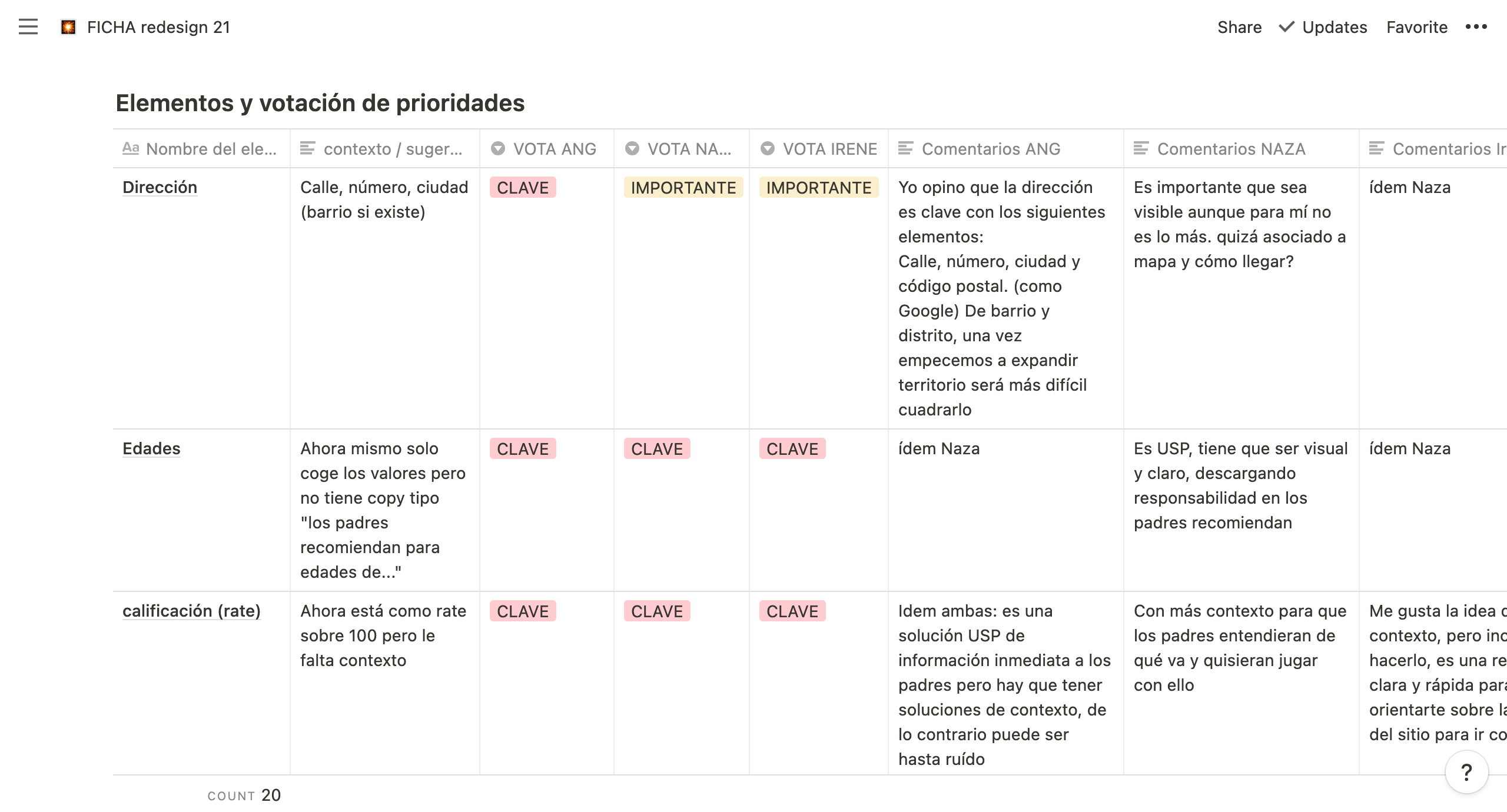 Notion: our shared workspace
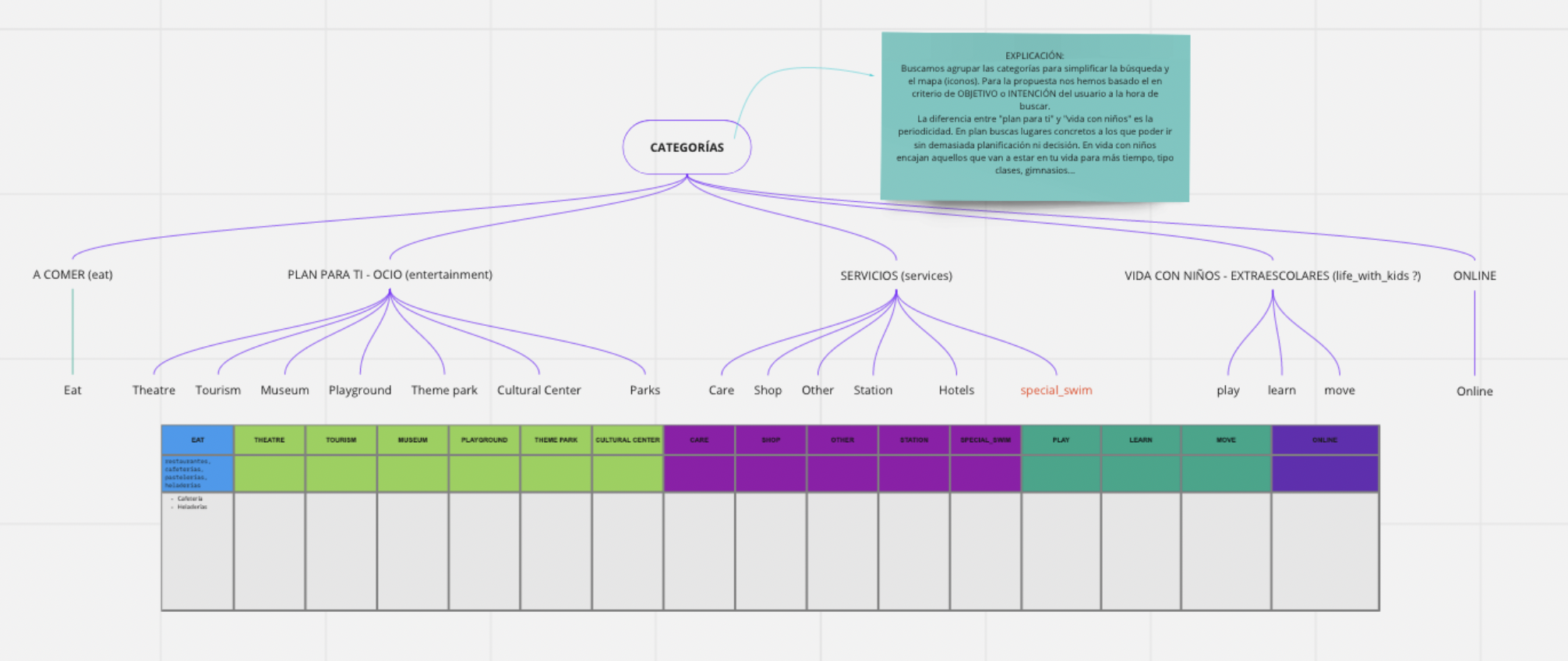
Miro helped us to group activities into wider categories and to discuss how the search feature should work.
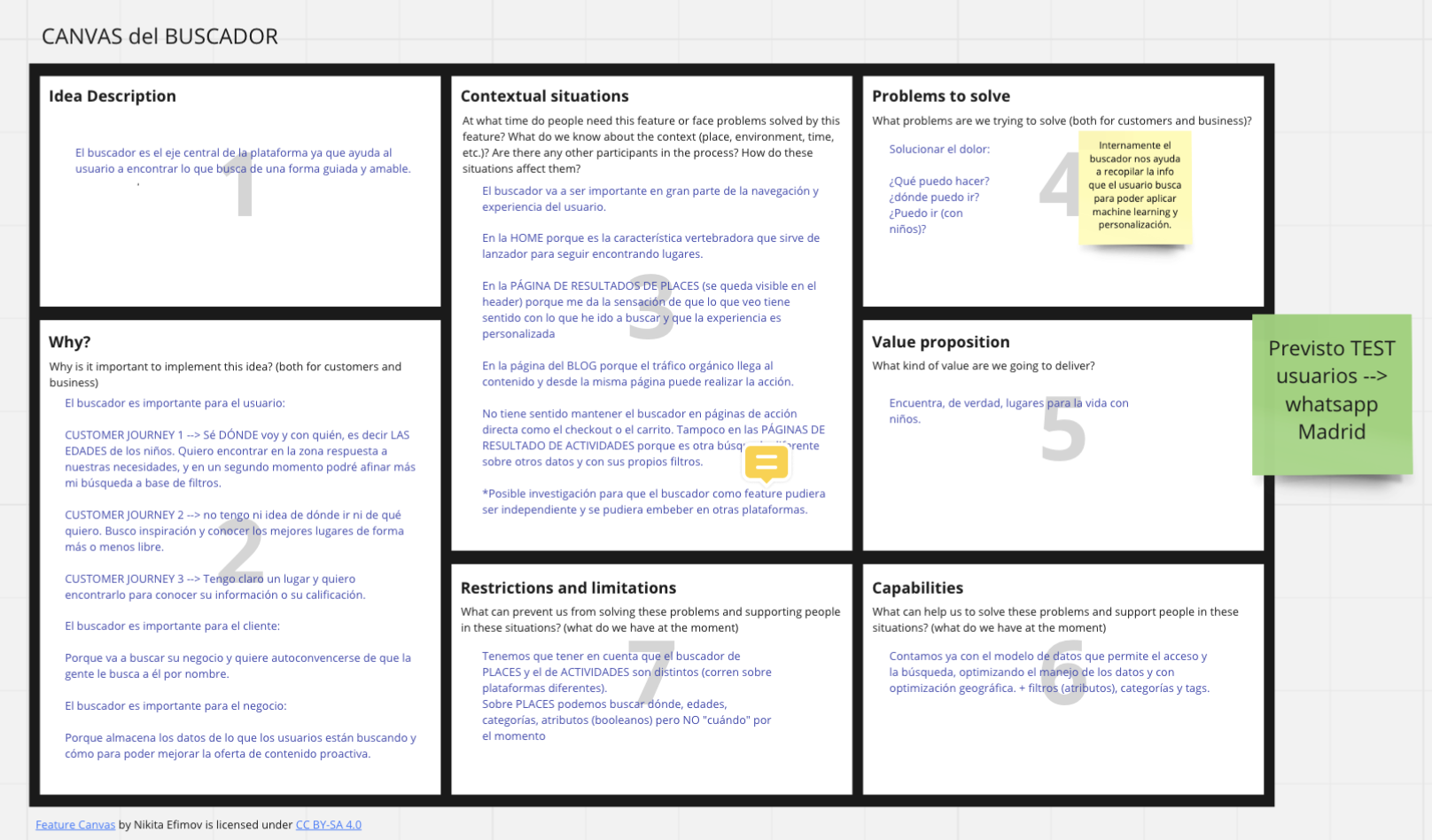
Before designing the actual information architecture, we came up with a list of things that we’d like to cover:
- Home (“Discover”)
- The first thing you should see is the map
- Carrousel with curated content
- Link to activities (€!)
- Sign up
form - Explain “poin points”
- Places
- Search + filters
- Place view with/without activites
- Save places (save for later vs like)
Login-
Login page -
My account -
My places -
My reservations
-
- General
-
About us -
FAQ -
Benefits - B2B page → B2B module
-
Legal
-
The front-end
I suggested, as I usually do in cases like this, to start using some third party library that helped us build the UI as fast as possible: it cuts the design costs and makes implementation way easier, leaving more time for me to work on the bigger picture and not just on the small details like the states for the buttons.
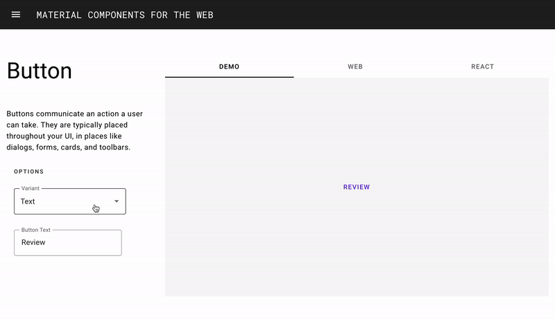
Also, you can easily find Material Design UI libraries for Sketch and Figma, so it was just a matter of adapting those pre-made components to the brand guidelines.
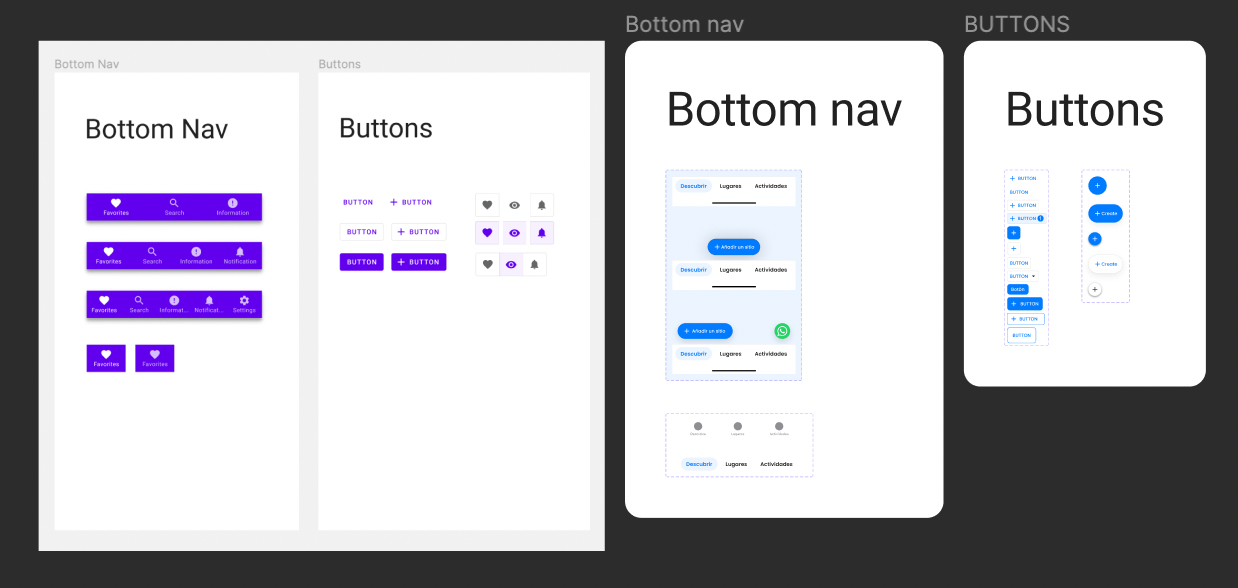 Left: Material components. Right: POiN styled components
The competition (benchmarking)
Before starting to design menus and sections, we took a look to what our competition was doing.
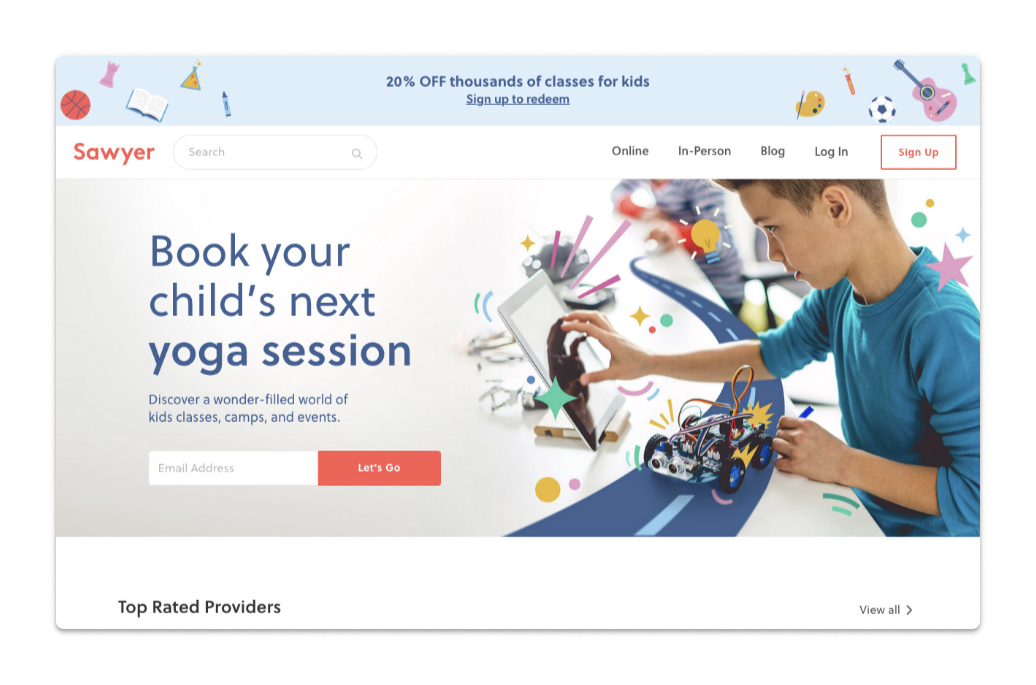
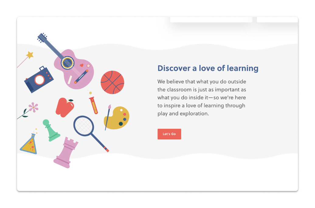
- Sawyer is a marketplace of activities for kids operating in the USA. Key inspo: online specific section since COVID.
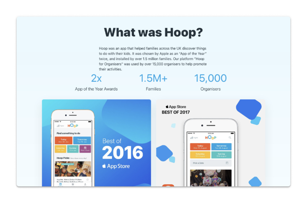
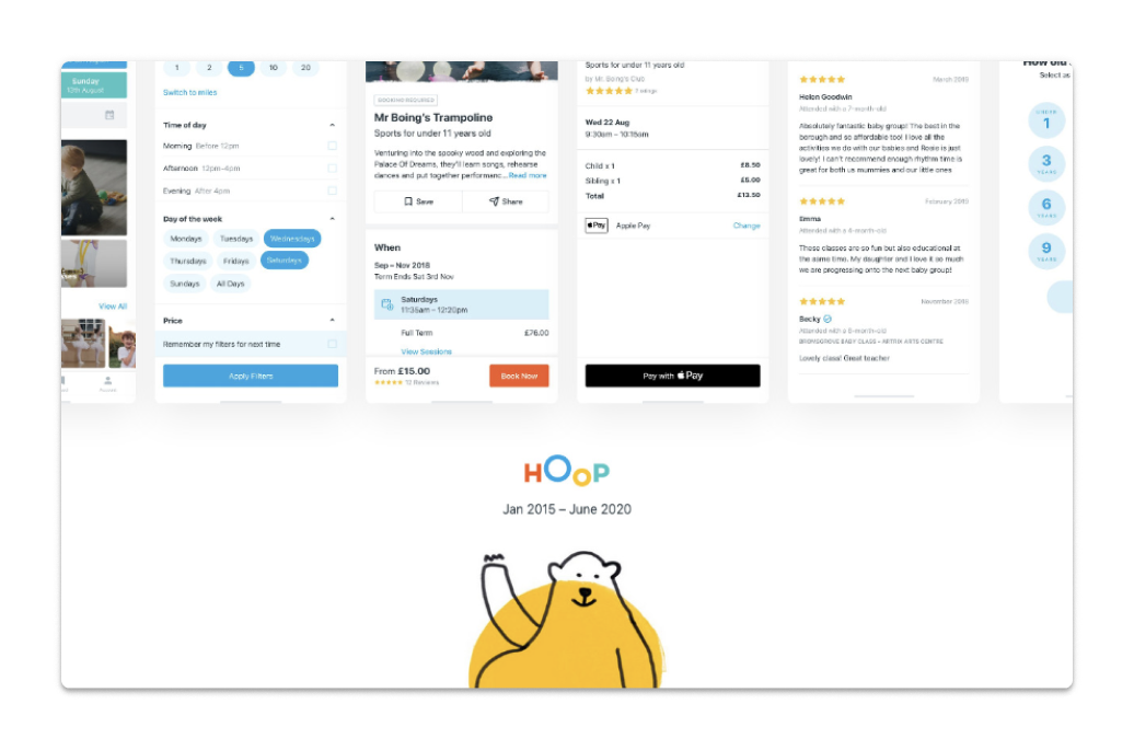
- Hoop was an app that helped families discover activites with their kids. Key inspo: playful visual identity (oriented to both parents and kids?)
- Kidelp is a marketplace for child-friendly businesses. Key inspo: operating as middleman, search menu readily available.
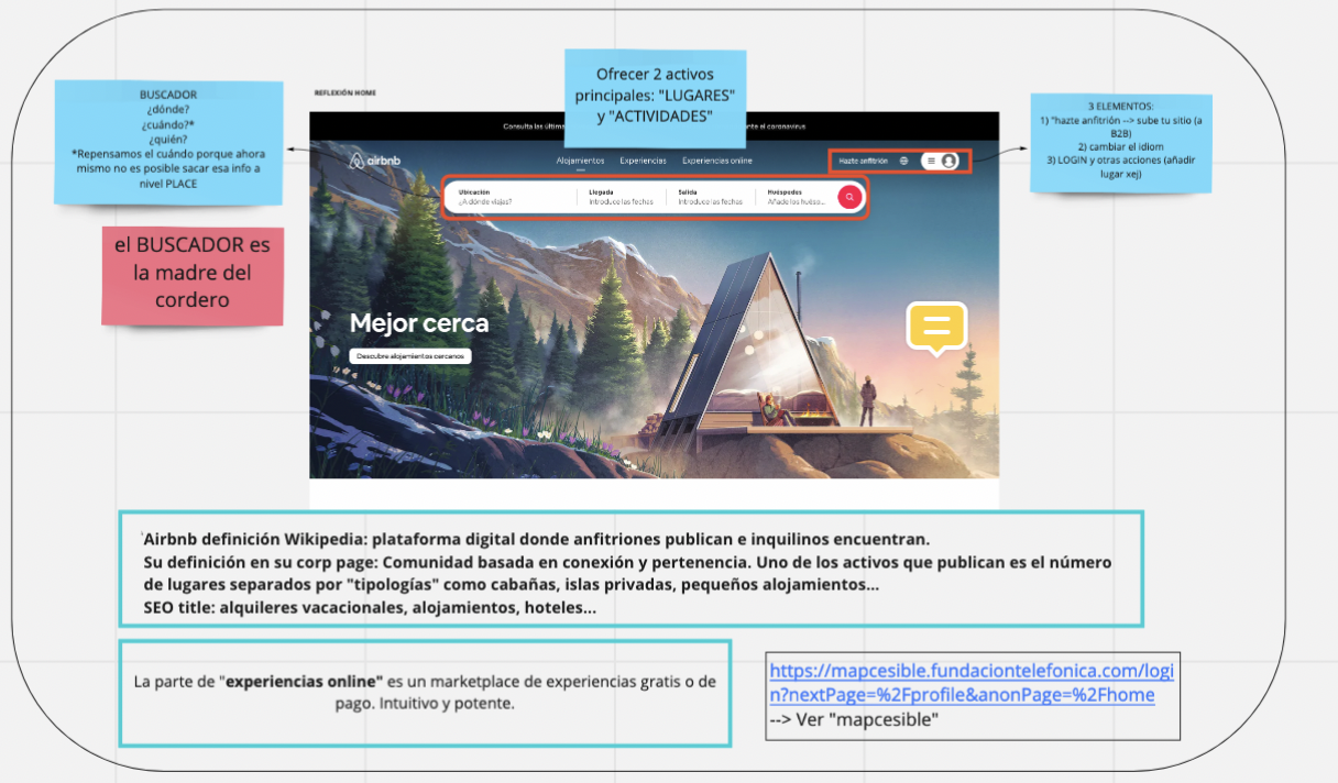
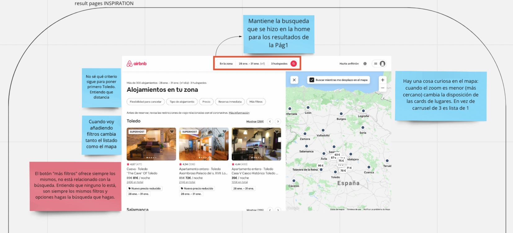
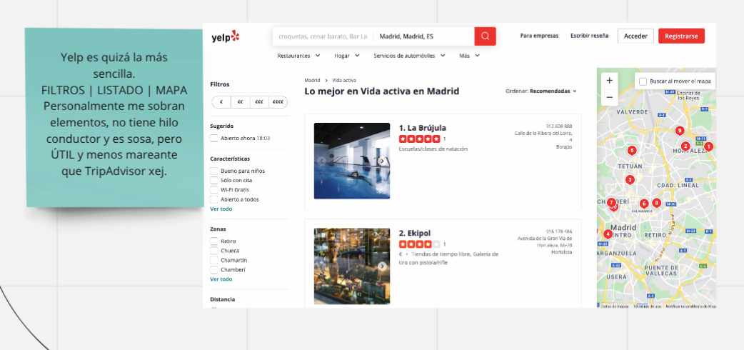
Outisde parentech we reviewed searching and filtering systems by Airbnb, Tripadvisor, Yelp and Michelin.
The (re)design
The first drafts
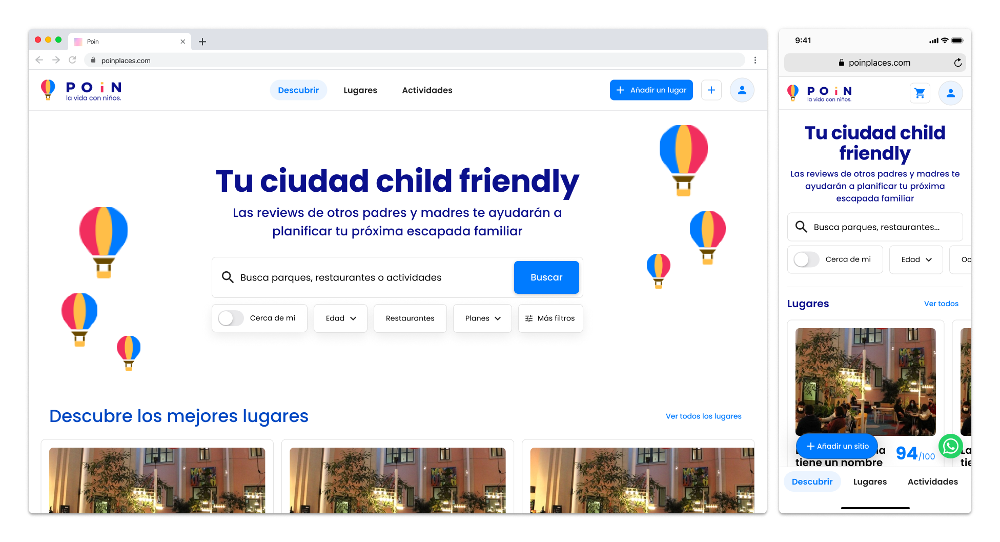
The POiN team was looking for something fresh and new, and we had few technical limitations at that moment (everything was going to be brand new). Because I understood that browsing was more important than searching, I drafted a new interaction model that relied very heavily on the map.
Those big and colorful chips were filters that took you to the search page, and with a swipe (or a scroll) you’ll see popular places around you.
 POiN 2.0 first draft
I also wanted to keep the development as simple as possible using a side menu on desktop that is more or less as wide as a mobile screen, but as soon as we started working on the place view, it was pretty clear that this layout wasn’t going to work. A friend that faced a similar problem back in the day at Spotahome told me to run away from maps, as they are the seventh circle of interaction hell.
The iteration
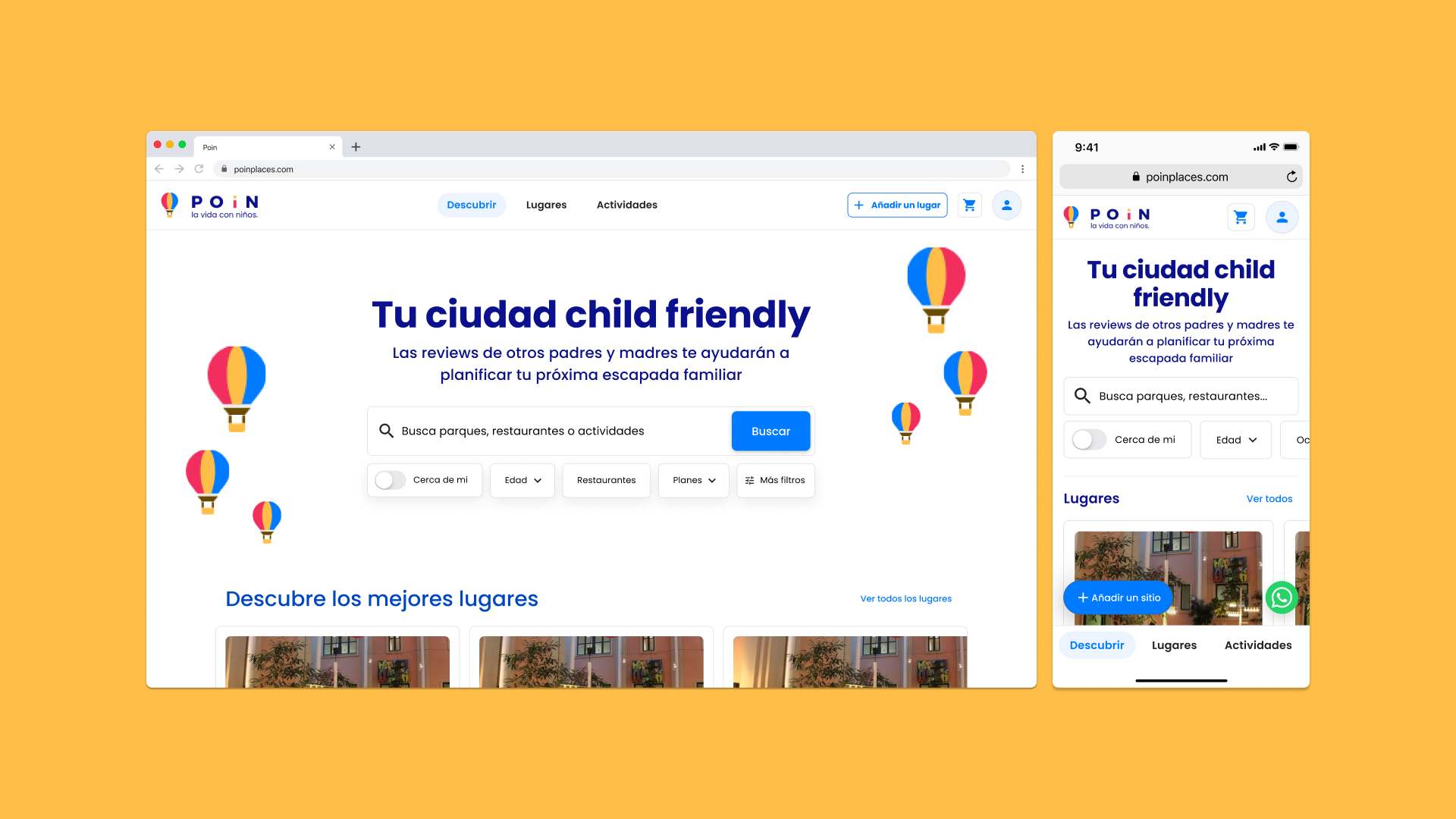
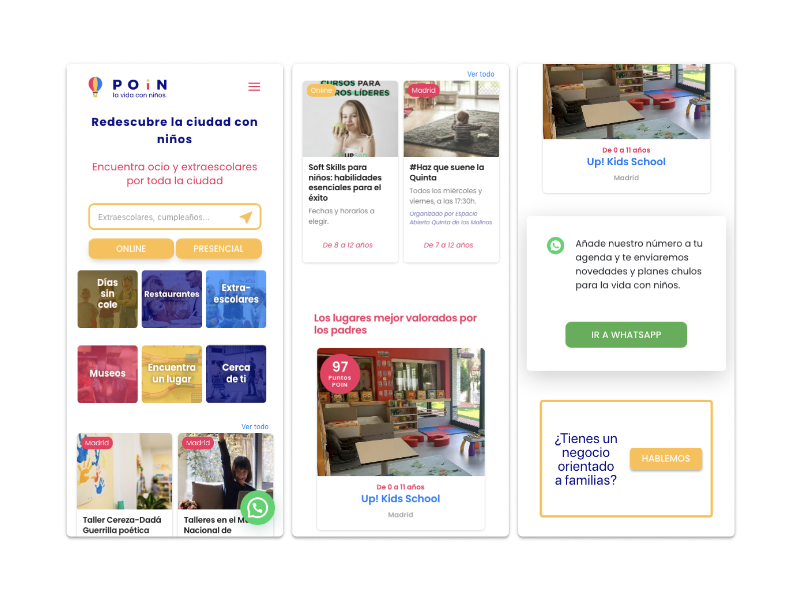
I abandoned that initial exploration and crafted a new navigation that would allow users to get to know the brand and the product on the same page: the Discover page. They could see the value proposition, search and browse curated places and activities.
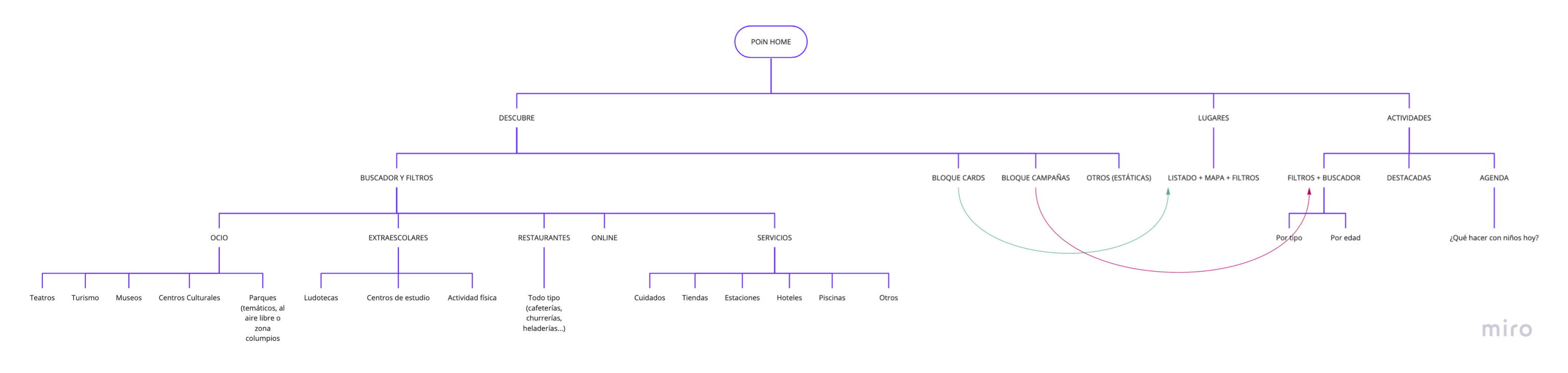
This new version took the user straight to Discover, but they could navigate to Places and Activities from the fixed navbar; and even if a user ignores the navbar, Places and Activities were accessible through the modules on Discover.
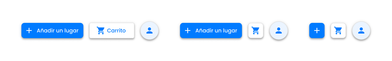
The main actions (search and add missing place) were also in the navbar, which in smaller viewports was positioned at the bottom of the screen, turning the add missing place action into a FAB. We reserved a spot for future additions like the B2B module (for companies that wanted to promote themselves on the platform)
I’ll take more about the responsiveness of these components in the design system section.
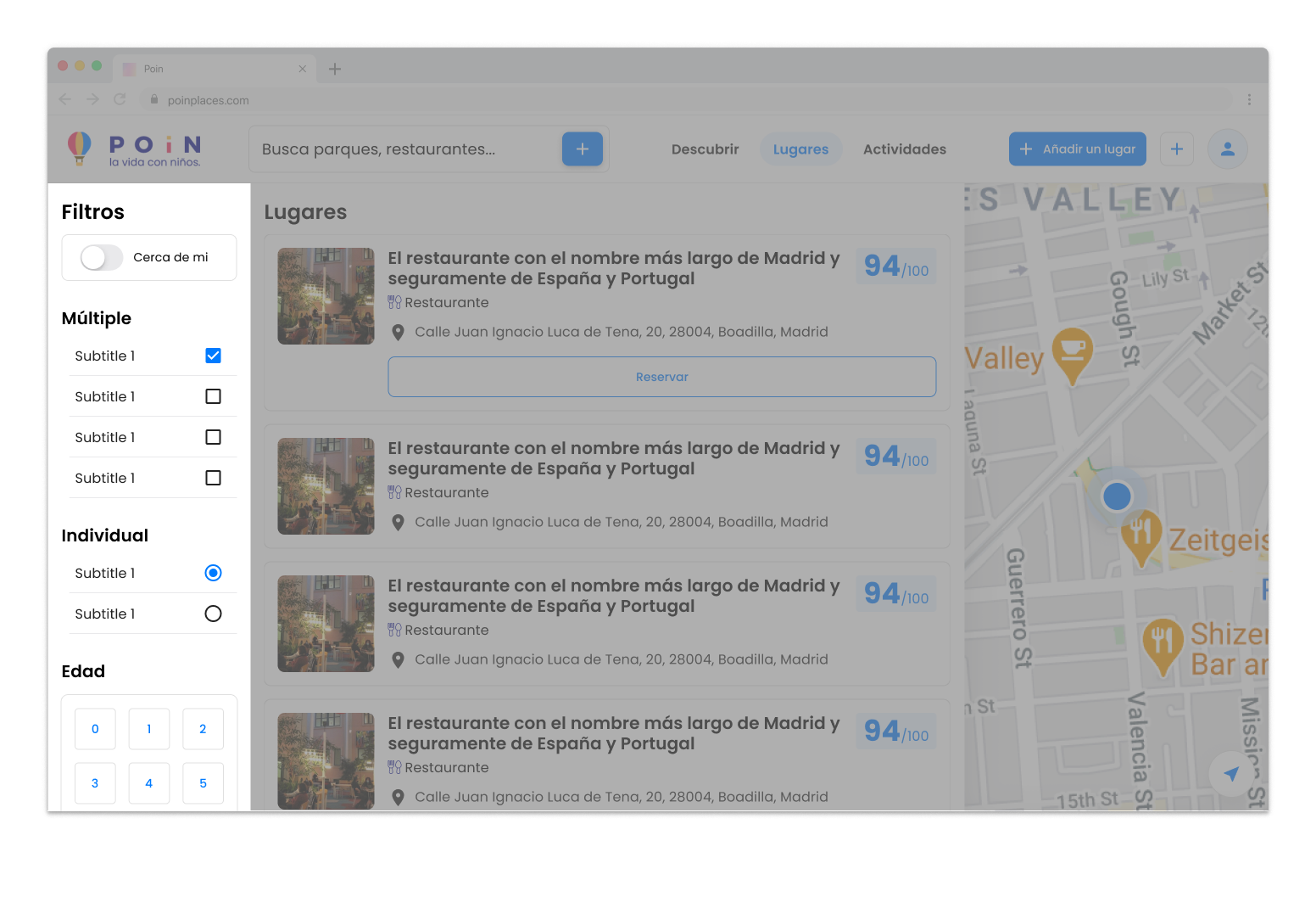
Search and filter
Search was undoubtfully the hardest part of this project. The Activities feature was running on top of a bunch of different services, and it was going to stay like that for a while, so the Search feature would work only with the Places database. We designed it keeping in mind that, in the near future, you could search in both Places and Activities from the Discover page, but for the first release, it’ll take you to the Places page after confirming a query.
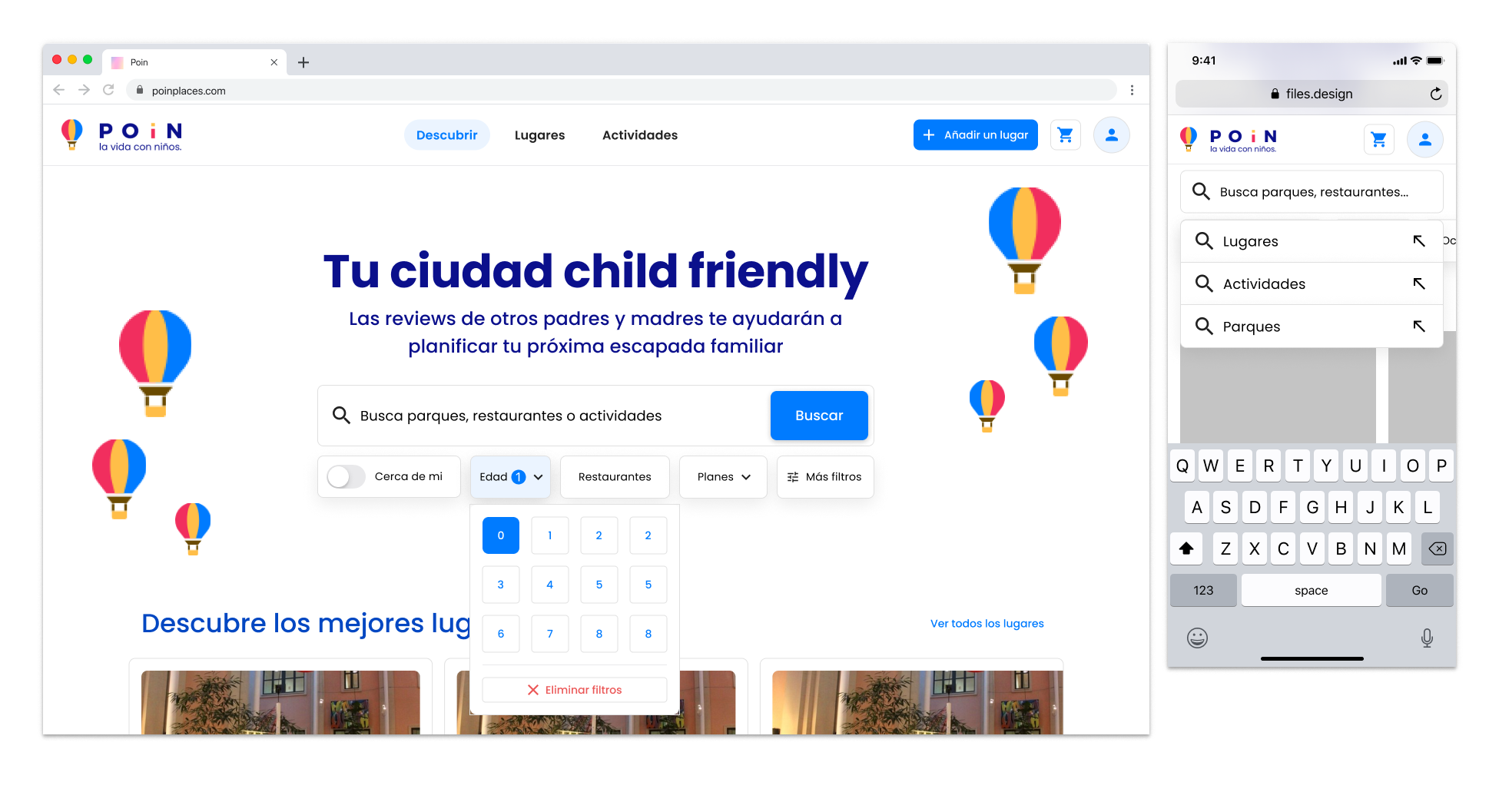
Of course, each page had its own search bar, so that left us with two different search interactions.
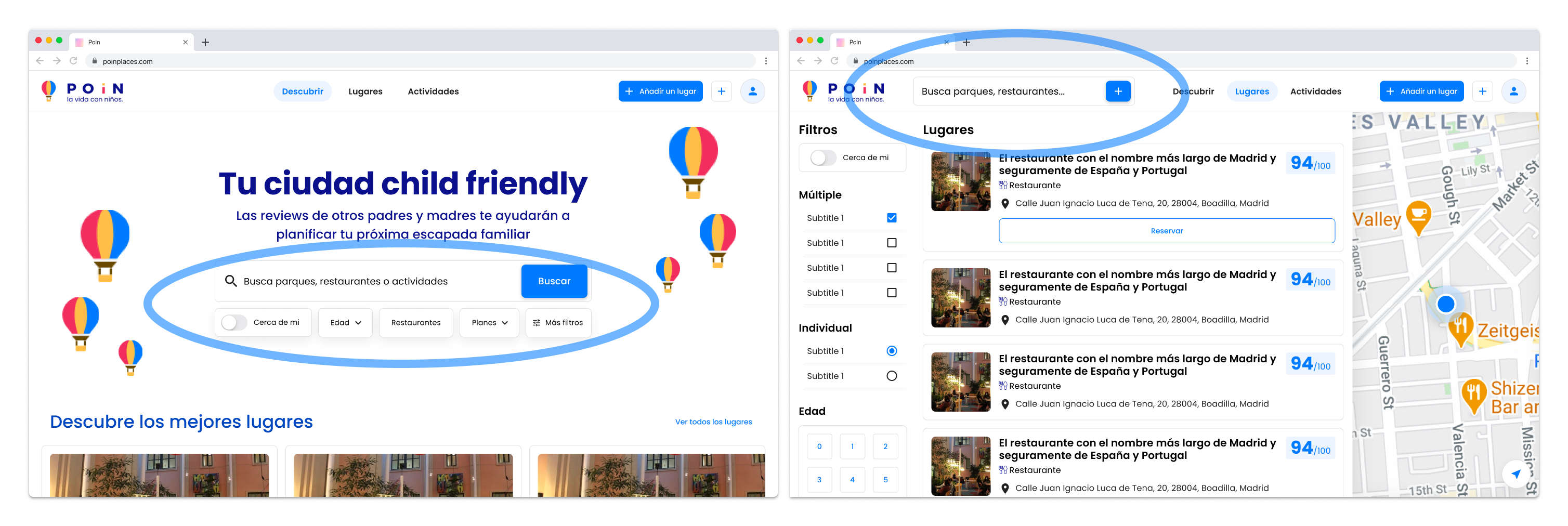
In the Discover page we had the search bar extension with all the filters collapsed as chips (an idea I started playing around with while building the Community Directory), but in the Places page they were part of the layout. Why hide them? We had plenty of space.
Note: we’ll talk about the different card explorations in the design system section
Moving on. That left us with three different filtering interactions: as dropdown menus on Discover, as a fixed side column in Places and as a full-width view on mobile.
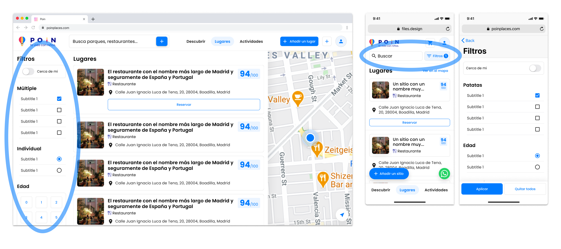
…and that’s why we built the filters as modules.
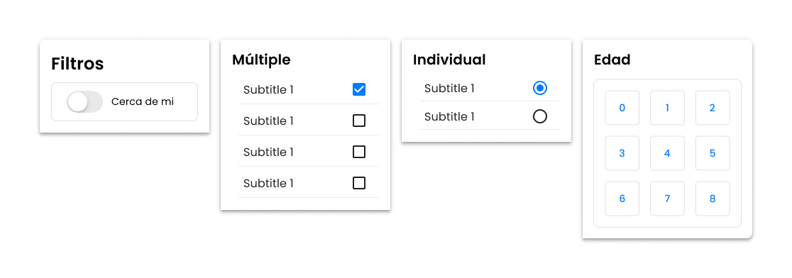
They already had this amazing age selector component (up, right) that we decided to keep (with a few small improvements)
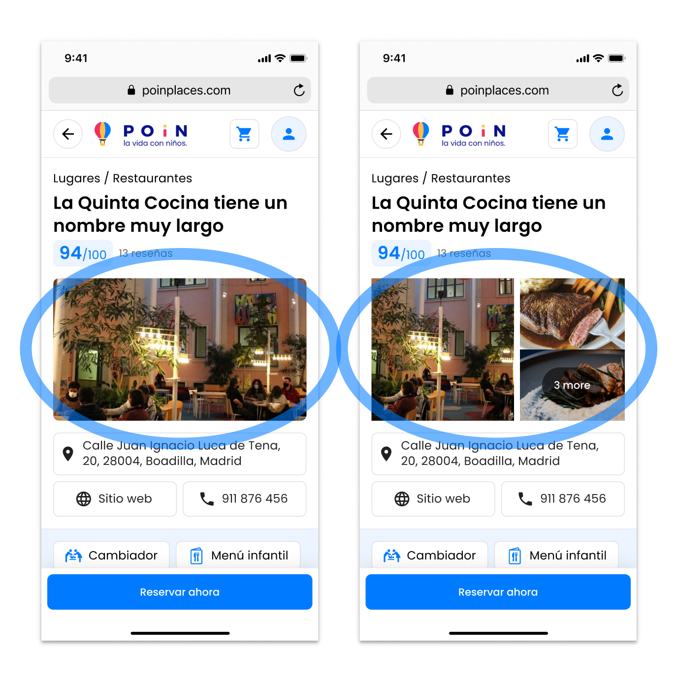
The place page
Since the competition benchmarking phase we were obsessed with the Airbnb place page. It looked stunning, but… we don’t had hi-resolution media to pull off a full width layout that looked great. Not even acceptable. Airbnb is a platform where people upload pictures to seduct other people to stay in their properties. They have a vested interest on uploading high quality pictures.
If you spend a few minutes browsing through Google Maps, you’ll see that most of pictures are really bad. Even if someone has a smartphone with a great camera, without proper photography skills, their pictures will still look amateur-ish.
That said, I tried to design a layout that didn’t rely too much on user generated content.
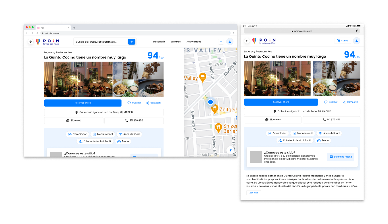
The CTA for this page was reserve now, because affiliate reservations are one of the main things that bring money to the business. On the mobile version, it’s fixed at the bottom.
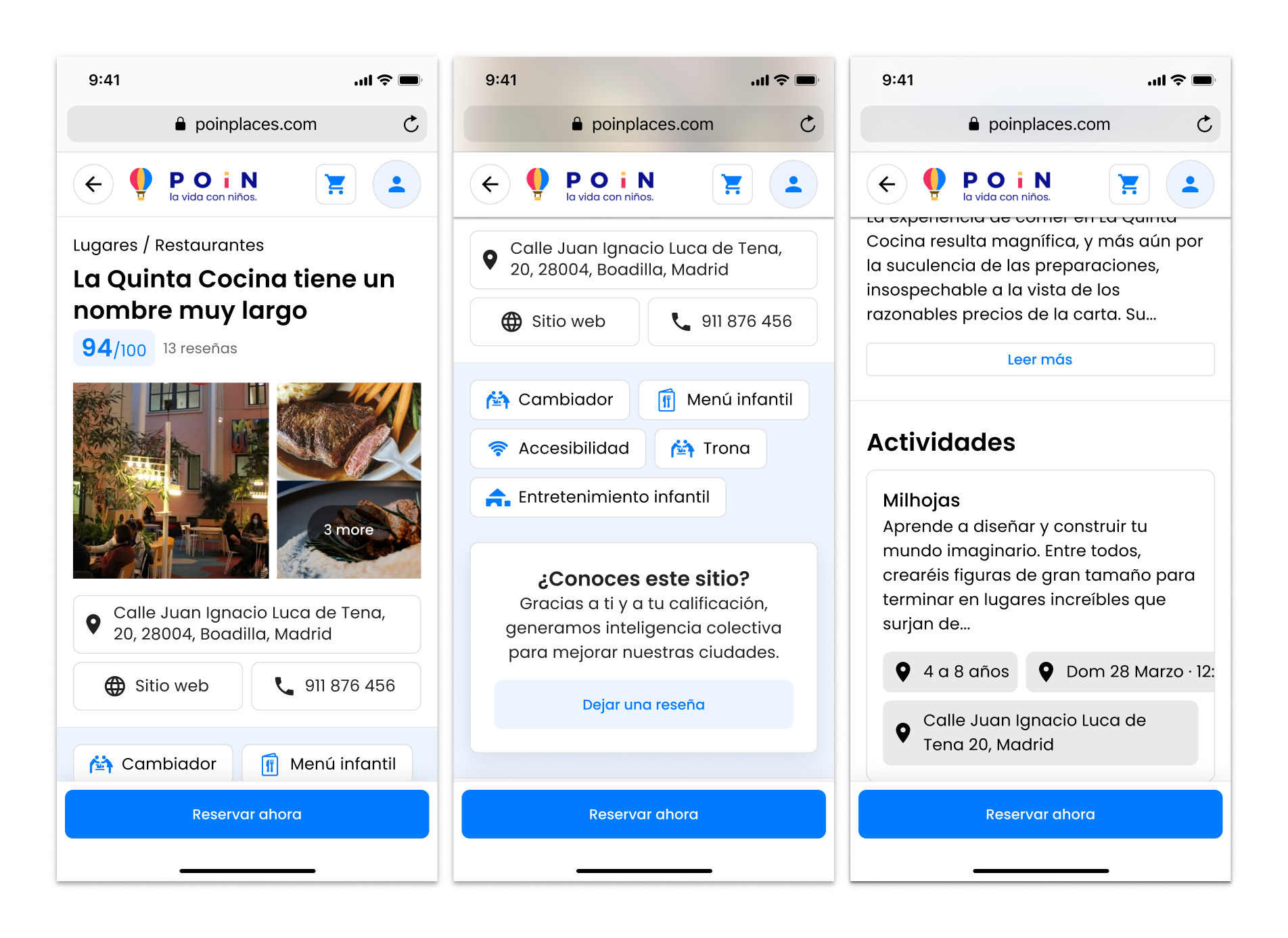
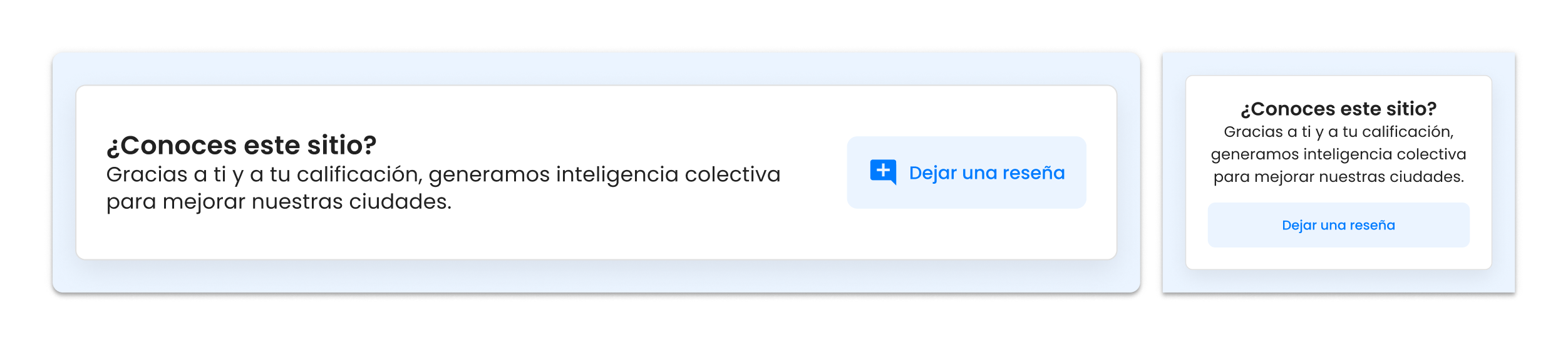
We reserved some space for the save and share actions, though the team decided to put that development on hold until further notice. In the module with blue background I added the write review CTA:
The design system
Because the nature of freelancing projects, you usually work from point A to B and then leave. Of course it’s possible to continue with a project at any given time, but sometimes it’s very difficult to coordinate schedules. So I built a very basic design system for the team to continue building without the help of a designer.
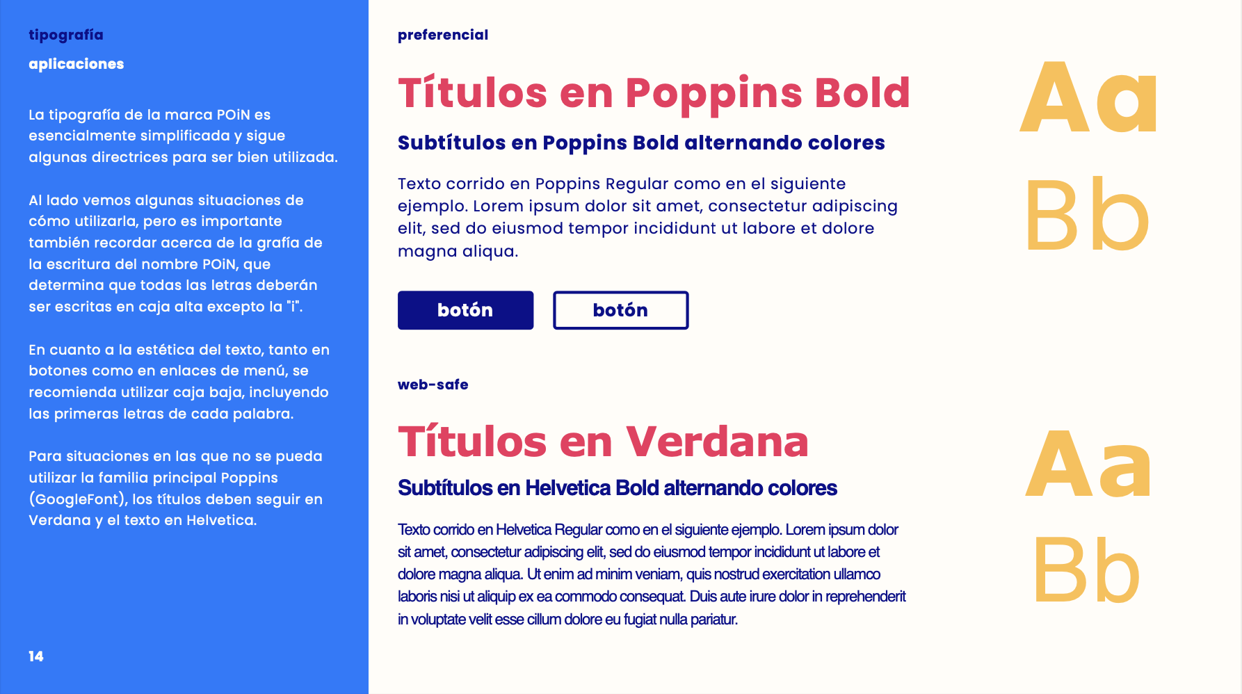
Brand: typography, colors and icons
POiN’s brand was designed by Vitor Zanirato. The selected typography was Poppins. I tested the values for our typographic system with Type Scale and generated it in Figma with Font Scale.
The colors were:
POiNBlu #0B108C
LightBlu #007BFF
POiNWhite #FFFDF9
POiNEllow #FFBE48
POiNRed #F12E5E
Brown #6A4A00
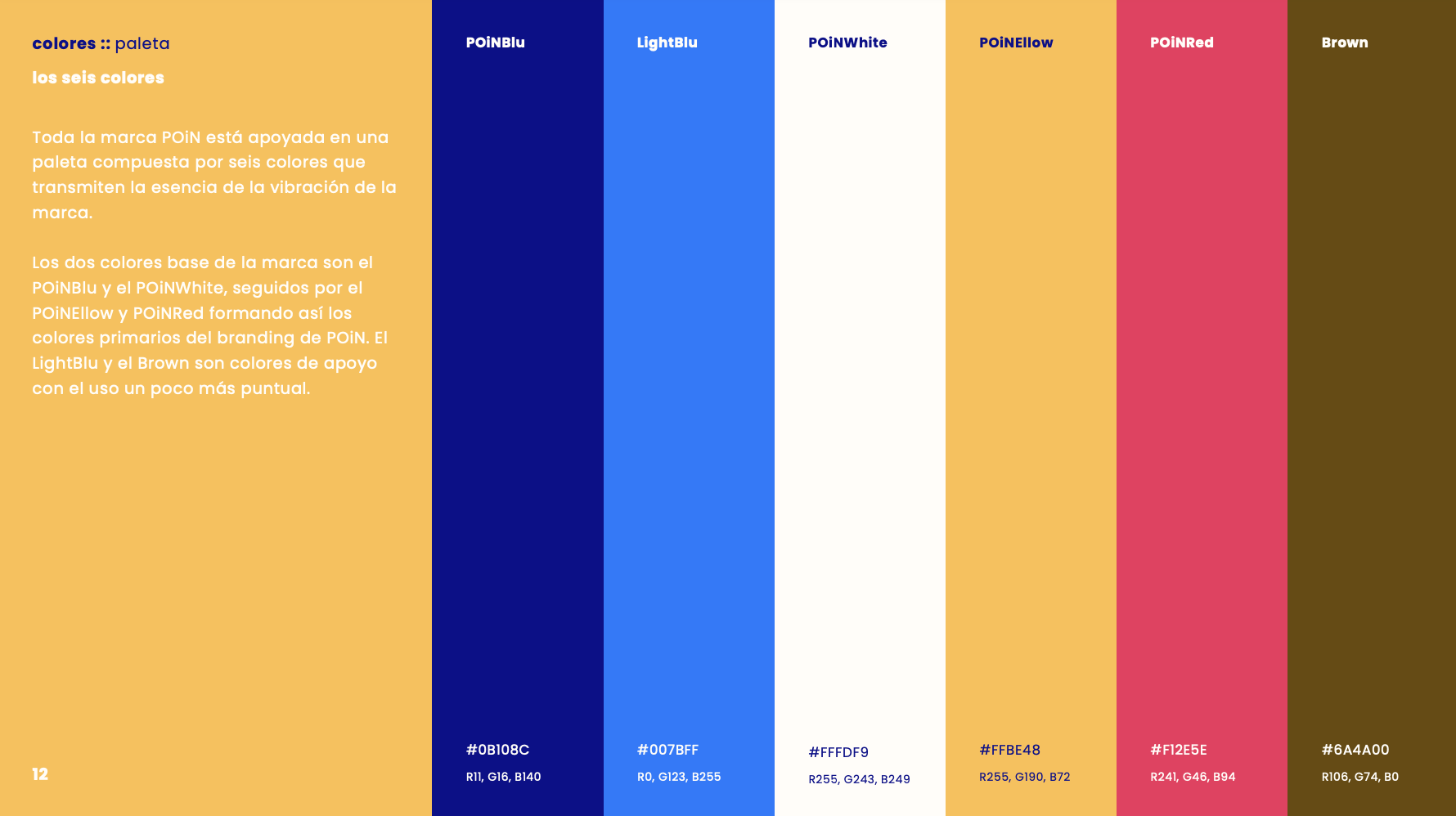
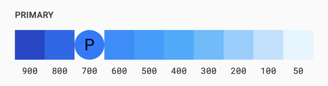
I focused on LightBlu #007BFF for the UI elements and generated some shades with Coolors and the Material Color Tool.
Most of the iconography came from The Noun Project, and for the UI elements I used the Material Icons for size and spacing consistency. For the tags, because the icons were from different sets, I created a grid to standarise paddings.

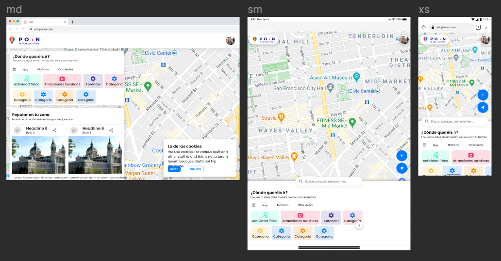
Navigation & responsiveness
We wanted to keep navigation as simple as possible, but trying to condense the search bar, the main navigation options and the actions on the same bar was a real challenge. In mobile and small tablet viewports, we’ll move some of those elements to the bottom.
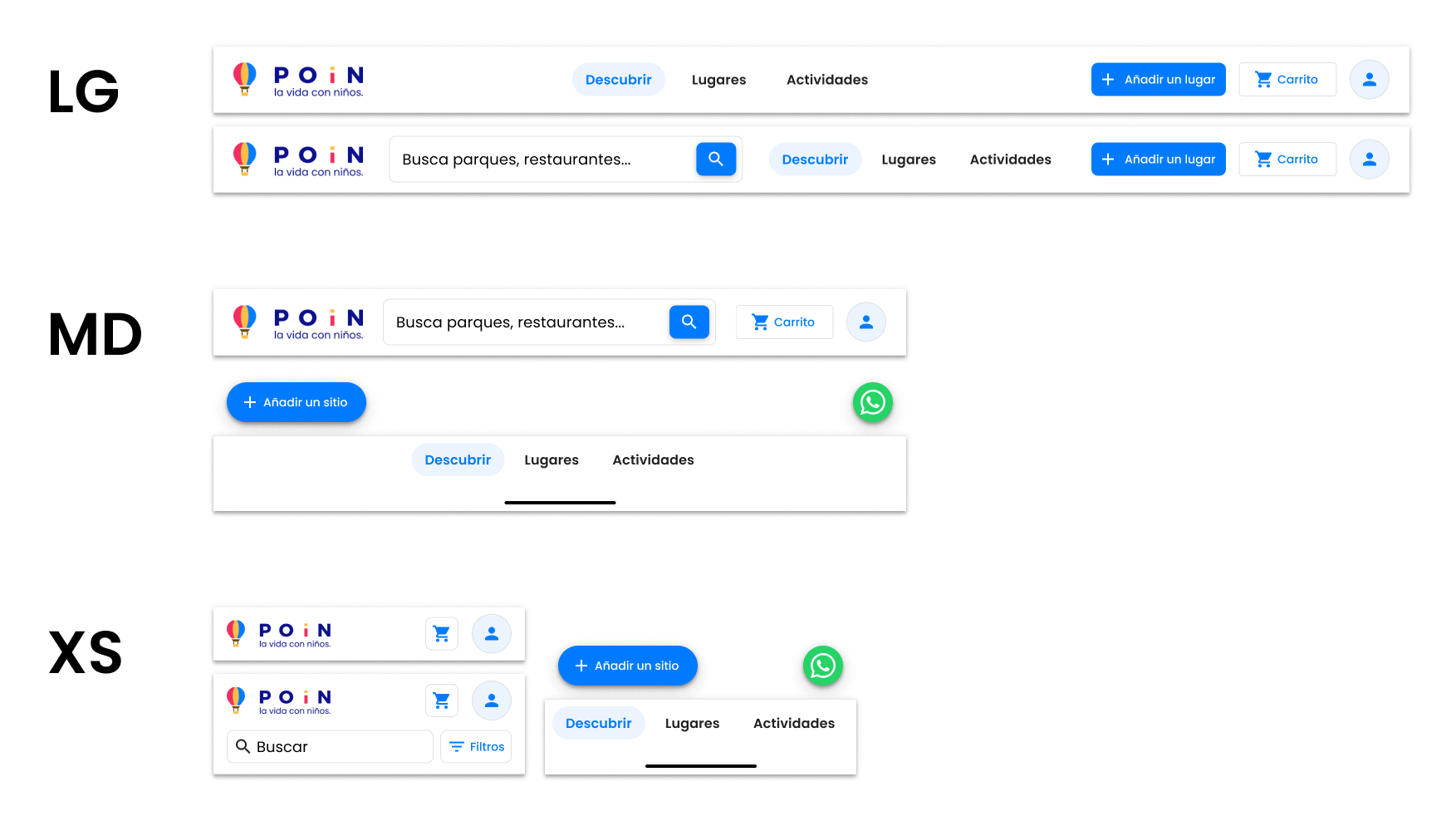
But in intermediate viewports it wasn’t that easy, so we made some of those components responsive:
I also specified container sizes and breakpoints. For the Discover page it was important that the first module, the one with the baloons and the search box, communicated that sensation of space and wonder, so its container had to be a little wider:
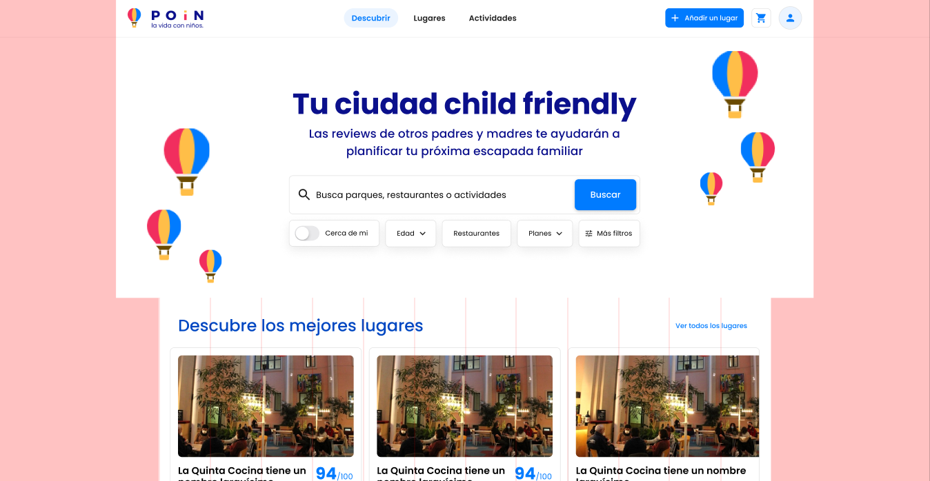
In bigger viewports it looked amazing with a safe max-width, and in smaller ones, baloons were a little bit off the screen. We did something similar to this at Commit Sans a while a go on a project with Fintonic, positioning the images at the sides as pseudoelements that didn’t interfere with the rest of the layout.
Cards
Another of the key elements of the product was the card. That’s how you discover places, looking at cards, so they should provide all the info you need in a very limited space. After prioritising which fields would be shown (name: yes, address: yes, phone: no, etc.) I created 2 variants:
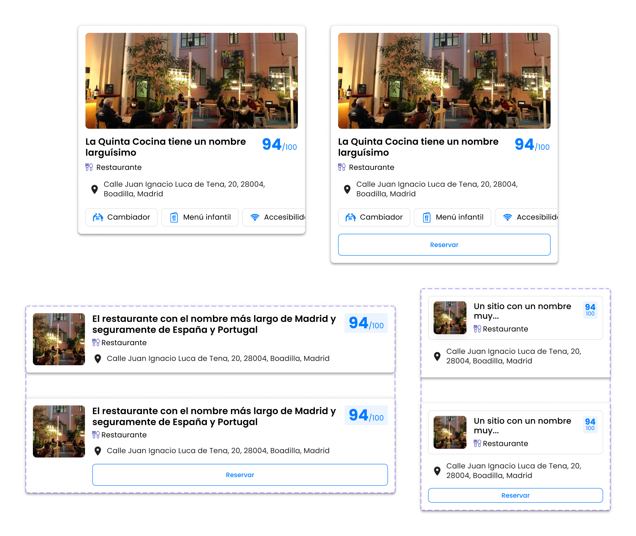
The big one is for the discover page. The horizontal one is for the Places page, and its XS variant has a border radius to indicate that that’s where you should press to see all the info (it opens the place view). When there’s the option to book a table, an outlined button appears at the bottom to make it easier and faster for the user.
If there was just one picture available, it showed at width: 100%, and with 3 or more pictures it showed a little preview with the number of pictures available in the gallery:
Wrapping up
This design’s been in the oven for a while, and as it’s still in development, I’m looking forward to see how it impacts the experience of the parents. I really hope that tools like POiN help urban parents navigate a world that, as population ages, is slowly turning its back on them. Working with Angelica, Nazareth and Irene has been a hell lot of fun, and experiences like this remind me why I love to work with small teams and to build things (almost) from scratch.
If you need help with your design, development or strategy, click the banner below to book a meeting :)